


![]() Pokémon Logo PNG
Pokémon Logo PNG
Nintendo introduced the Pokémon logo, which quickly came to symbolize a new world of entertainment and surpassed Mario’s popularity. Designed with children in mind, the logo features bright, appealing visuals and unique imagery that capture the essence of the world and its connection to Japanese culture.
In 1990, Japanese developer Satoshi Tajiri conceived a game inspired by his childhood hobby of collecting insects. His vision was to enable players to capture, train, and trade creatures in a virtual world. The concept, originally called Capsule Monsters, was later renamed Pocket Monsters due to trademark issues.
Developed by Tajiri’s company, Game Freak, and backed by Nintendo, the project took six years to complete. On February 27, 1996, Pocket Monsters Red and Green launched in Japan for the Game Boy. Their blend of collecting, battling, and trading captured players’ imagination, turning the titles into massive hits.
The success of the games sparked a full-scale franchise. In 1997, the anime Pocket Monsters premiered, following Satoshi (also known as Ash Ketchum) and Pikachu. Pokémon’s global debut came in 1998 with Pokémon Red and Blue, setting off an international craze known as “Pokémania.” The 1999 release of Pokémon: The First Movie grossed over $170 million worldwide.
Subsequent generations expanded the universe. Pokémon Gold and Silver (2000) introduced 100 new species, while Ruby and Sapphire (2002) enhanced visuals and gameplay. Each new release brought fresh regions, mechanics, and fans.
In 2016, Pokémon GO revolutionized mobile gaming by using augmented reality to enable users to capture creatures in real-world locations. The franchise made its live-action cinema debut with Detective Pikachu in 2019, achieving both critical and commercial success.
By 2021, titles like Sword and Shield and remakes of Diamond and Pearl reaffirmed Pokémon’s enduring appeal. What began as Tajiri’s nostalgic idea has become one of the most influential entertainment franchises in history.
Meaning and History
![]()
The media franchise has a recognizable yellow-and-blue logo. Most fans are familiar with its English version, although it has been translated into many other languages. All variations are similar. The Japanese logo stands out for its shape and color. Nintendo owns the trademark and trade name rights.
The project was launched in 1995, but “Pokémon” quickly gained fame thanks to its original presentation of a fictional world aimed primarily at children. Given the target audience’s age, it is essential to incorporate visual elements that appeal to them. After all, the younger generation pays attention to bright colors and unusual visuals, so the logo must stand out.
What is Pokemon?
It is a successful media franchise based on the namesake video game and ranks second in popularity only to Mario. It belongs to the Japanese company Nintendo and, in addition to computer games, includes anime, several animated series, a feature film, and various manga series. They are united by common characteristics, Pokémon, which trainers catch and train for battles.
1990 – 1992 (pre-launch)
![]()
1994 (pre-launch)
![]()
1998 (pre-launch)
![]()
1998 – today
![]()
Font and Colors
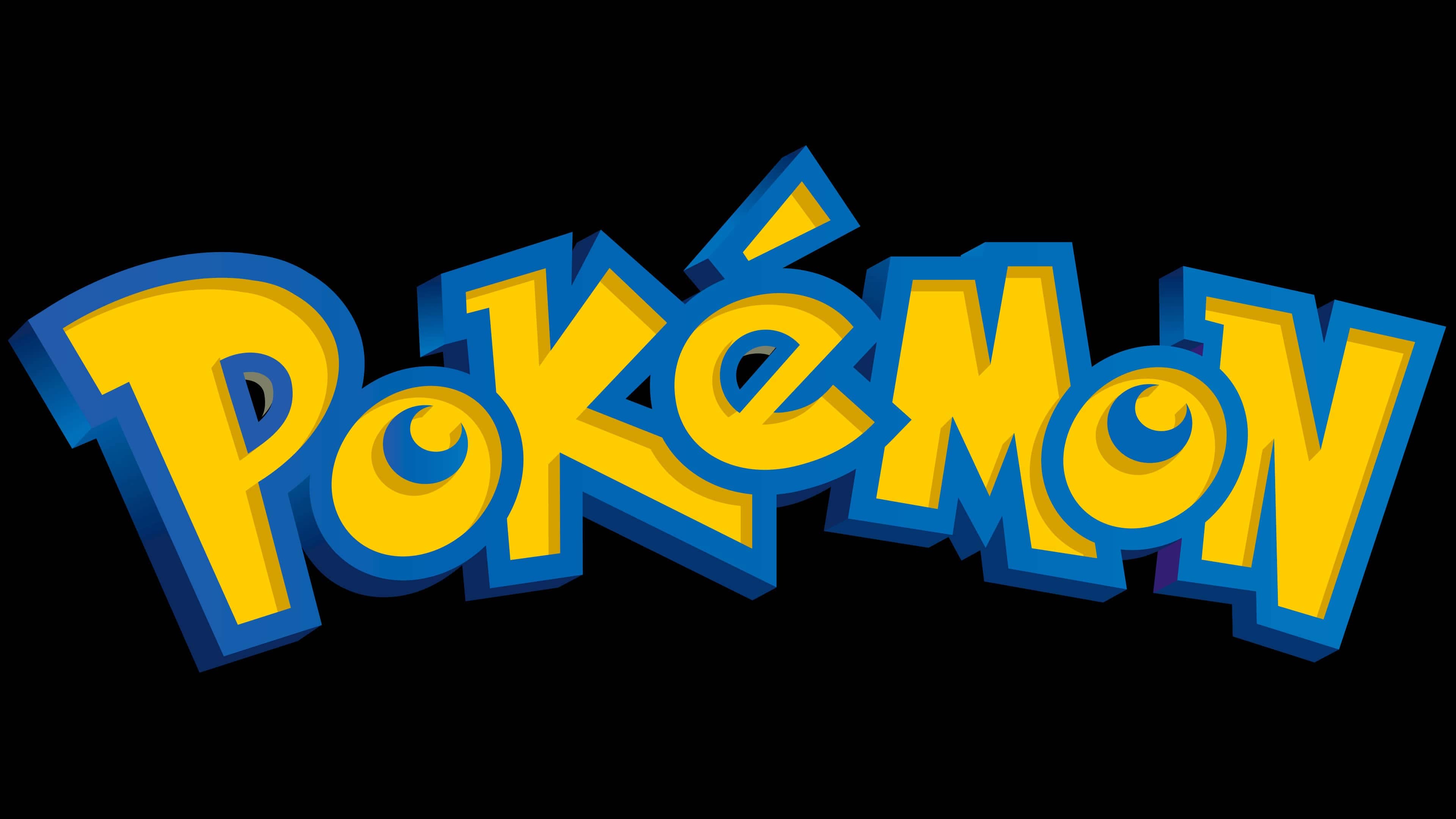
The media franchise’s main emblem is the inscription “Pokémon.” It was adopted in 1998 and became the main distinguishing mark of the products. It encodes the brand name Pocket Monster, hinting that trainers carry Pokémon in special Poké Balls.
However, secondary symbols depicting numerous characters are equally important. These include both old and new fictional creatures (around 802 types in total), including the most famous, Pikachu. The main characters from anime, films, and games are often featured.
The logo font is custom-designed. Then Pokémon Hollow and Pokémon Solid fan versions were created, modeled after the original. The brand name is written in yellow characters with a blue outline. In this case, the word bends like a rainbow.
Different letter sizes emphasize a childlike style. All consonants are written in uppercase, and vowels in lowercase. The “o” and “e” come to the foreground, partially overlapping the “p,” “k,” “m,” and “n.” They hang over the line, creating a bouncing text effect. The playful font is characterized by uneven line length and width. The spaces inside the letters are small. The “P” and “e” have semi-circular forms, while the “o” lacks them completely, replaced by blue crescent strips.
The primary colors and their shades are used in addition to the primary colors, creating a three-dimensional effect. Moreover, designers deliberately surrounded the letters with wide frames and made a gradient transition in some places to enhance the 3D effect.