The Polaroid logo holds the promise of capturing life’s brightest moments. The emblem emphasizes color printing and the popularity of inventions made by the company’s instant photography employees.
Polaroid: Brand overview
| Founded: | 1937 |
| Founder: | Edwin H. Land |
| Headquarters: | Minnetonka, Minnesota, U.S. |
| Website: | polaroid.com |
Polaroid is an American company producing equipment, film, and photographic kits for instant photography. Belongs to the Marquette concern. The Polaroid logo can also be seen on televisions, scanners, printers, and players.
The company was founded in the first half of the 20th century by the successful inventor Edwin Land, a descendant of Jewish immigrants who moved to the United States from Ukraine. The physicist was the first in the world to create polarizing film and used it for practical purposes. The camera that produced the finished images was only one of the 535 patents the scientist received.
Meaning and History
Polaroid, known for its innovative cameras and films, has used several logos throughout history. Some of these logos have become symbols of an era and are remembered by people for decades to come. However, no matter what the Polaroid logo was in any given year, it always reflected the long tradition of quality and reliability that has characterized the company. In this regard, the Polaroid logo is a sign of brand recognition and a symbol of high quality and technological progress.
What is Polaroid?
A company nicknamed “The Invention Factory” in America. Its founder Edwin Land produced products using polarizing materials: sunglasses, thermal imaging cameras, cameras, X-ray film, etc. The most famous product is the Polaroid camera.
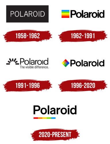
1958 – 1962
Although the company was founded in 1937, it did not have its visual mark until ’58. Unfortunately, Land was ahead of its time. Manufacturers did not appreciate the possibility of blackout windows in cars, or glasses for 3-D movies, so before the Second World War, the company was making losses, and the inventor had no time for the emblem. It wasn’t until the launch of the instant camera in 1948 that the company flourished. Polaroid was preparing to open subsidiaries abroad, and it was time to consider its trademark.
The first logo was a white name on a black background shaped like a rectangle. The composition was a polarizing material, saving it from glare and giving a blackout. The shape of the backing hinted at photographs taken with the camera. The first pictures were in black and white. Hence the corresponding color scheme of the emblem.
1962 – 1991
In the early 1960s, the company introduced the first color film. Polaroid photos now conveyed all shades of color. Along with this tremendous step forward, a new visual mark reflected the discovery.
The logo was designed by graphic designer Paul Giambabra, who was involved in creating the company’s corporate image. In addition to the logo, he designed all the packaging for Polaroid products.
The logo consisted of a name with massive, closely spaced letters and an image. The closely spaced elements looked like people grouped together for a photo to fit in the lens.
In front of the word are strips of a color palette that form the photo. It features all the rainbow colors in order except blue and purple. The composition shows the creation of color pictures—an opportunity to capture the most vivid and memorable moments.
1991 – 1996
The 15-year patent infringement lawsuit against Kodak for color film and instant cameras ended in 1991. The competitors had to stop production and pay Polaroid almost $1 billion in compensation. That same year the founder of Edwin Land died.
A new era of the company – commercial – began. The firm operated in several areas, offering cameras, film, lenses, light filters, cassettes, and medical lasers.
The updated logo was to show the heyday of Polaroid and the wide range of products.
Therefore, the color palette before the name was replaced by a rising sun with rays of different lengths. From behind the horizon, half of the sun can be seen. The image shows that the company is on the path to prosperity and worldwide success.
The sun was associated with light. All of the company’s products were based on polarizing effects, so the sun was appropriate for the entire list of products.
The fine print indicated the clarity and good visibility that the products gave. It could be used to distinguish details. Below the name was a motto: The visible difference. The slogan emphasized that only with Polaroid products could you expect perfect results.
1996 – 2020
Things were not going well for the company. With the development of digital photography, the sales of photographic materials decreased significantly. Therefore, the company was approaching bankruptcy, which was declared in 2001 for the first time and in 2008 for the second time. Managers and owners changed one after another, and production moved to China.
The late 20th-century logo idea returns to the color photography theme. The palette moved to a rhombus with nine multicolored cubes, showing the expansion of color printing. Mixing the two outermost colors in each row gives the shade of the middle cube.
The squares are associated with pixels, indicating image clarity and color gamut expansion—transmission of maximum hue.
2020 – today
The company returned to trying to revive instant photography. It introduced machines with built-in color printers as well as pocket printers. Developed the ability to print photos directly from the phone. Launched sunglasses with a built-in camera, miniature pocket cameras, etc.
The fusion of new and past technologies has borne fruit and allowed the company to continue to exist. The latest Polaroid logo is also reminiscent of the past, the most successful version of 1962, but in a new way.
The color spectrum in the form of stripes moved under the name and stretched in the form of underlining the first half of the word: Pola. The image is like a part of a picture coming out of a color printer.
Font and Colors
The main shades of the logo revolve around the theme of black and white and color photography. They demonstrate the ability of film to capture vivid colors and preserve pleasant moments in pictures.
The colors used in the Polaroid logo have their meanings and symbolism, which can reflect the ideas and values associated with the brand. Here are some possible meanings for each color in the Polaroid logo:
- Red: energy, passion, strength, confidence. Red can also be associated with importance, standout, and attractiveness, possibly due to Polaroid’s seeking to draw attention to its products.
- Orange: warmth, pleasure, friendliness. Orange can also symbolize creativity and enthusiasm, which may be because Polaroid encourages creativity in photography.
- Yellow: optimism, joy, confidence, light. Yellow can also be associated with intelligence and sunshine, reflecting ideas related to innovation and forward-thinking, and Polaroid products can capture the highlights of life.
- Green: growth, harmony, freshness, nature. Green can also symbolize stability and security, which may relate to Polaroid products’ reliability and quality.
- Blue: freedom, trust, calmness, clarity. Blue can also be associated with technology, and progress, possibly due to Polaroid being a leader in instant photography and technology.
Using different colors in the Polaroid logo can help a brand express its creation, creativity, reliability, and quality and draw attention to its products and services.
The Polaroid logo uses a simple, concise font with straight, clear letters. The company name is written in the Arial font family, which is widely used in modern design because of its readability and versatility.
Some designers point out that the logo name font is very similar to Basic Commercial Pro Bold, which is also characterized by crisp lines and strong expressiveness. However, despite the similarities, they are two different fonts, and the exact name for the font on the Polaroid logo has not been established.
The overall style of the font on the logo reflects the simplicity, clarity, and functionality that characterizes the Polaroid brand.
Polaroid color codes
| Red | Hex color: | #ff0000 |
|---|---|---|
| RGB: | 255 0 0 | |
| CMYK: | 0 100 100 0 | |
| Pantone: | PMS 1655 C |
| Safety Orange | Hex color: | #ff8000 |
|---|---|---|
| RGB: | 255 128 0 | |
| CMYK: | 0 50 100 0 | |
| Pantone: | PMS 1505 C |
| Yellow | Hex color: | #ffd501 |
|---|---|---|
| RGB: | 255 213 1 | |
| CMYK: | 0 16 100 0 | |
| Pantone: | PMS 109 C |
| Yellow Green | Hex color: | #7dde01 |
|---|---|---|
| RGB: | 125 22 1 | |
| CMYK: | 44 0 100 13 | |
| Pantone: | PMS 802 C |
| Dodger Blue | Hex color: | #0199ff |
|---|---|---|
| RGB: | 1 153 255 | |
| CMYK: | 100 40 0 0 | |
| Pantone: | PMS 3005 C |
| Black | Hex color: | #000000 |
|---|---|---|
| RGB: | 0 0 0 | |
| CMYK: | 0 0 0 100 | |
| Pantone: | PMS Process Black C |


