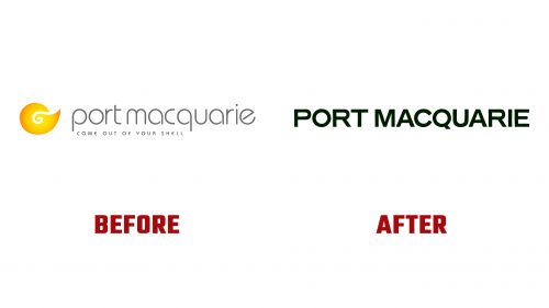
Port Macquarie-Hastings Council in New South Wales, Australia, has launched a new tourism identity designed by Swell, with a brand strategy by DMS. This rebranding aims to position Port Macquarie as a top lifestyle destination, highlighting its serene environment and unique attractions.
The new logo features a simple wordmark in BN Hamburg Hand with a touch of wobbliness to reflect a relaxed vibe. This typeface conveys a sophisticated yet laid-back tone, fitting for a seaside destination. The wordmark is clean and modern, replacing the outdated ITC Bauhaus wordmark and Nautilus shell emblem.
The logo includes a charming sun icon designed to evoke a sundial. This sun icon can be used alone or combined with the initials “PM” to create a groovy badge. The sundial concept ties into the brand’s theme, “A Gift of Time,” emphasizing the region’s relaxed pace and precious moments visitors can enjoy.
The color palette uses soothing, coastal-inspired hues to reinforce Port Macquarie’s tranquil and inviting nature. These colors create a cohesive visual identity that appeals to residents and visitors.
A notable aspect of the rebranding is the low frame-rate animation applied to the typography, encouraging viewers to slow down and absorb the message. This animation style mirrors the leisurely pace of life in Port Macquarie. The simplicity of BN Hamburg Hand allows for brushstroke-like animations, adding a dynamic yet casual element to the design.
Swell and DMS conducted workshops and consultations with local stakeholders, including First Nations communities, businesses, educational institutions, tourism operators, investors, property developers, Council staff, and Councillors. These consultations provided valuable insights that informed the new brand strategy.
The rebranding aims to position Port Macquarie as a place for a lifestyle rather than a vacation spot. The brand emphasizes the luxury of time and the unique experiences available in the region rather than just beautiful scenery.
The new brand positioning, “A Gift of Time,” is visually represented through the sundial-inspired sun icon. This symbol highlights the leisurely, sun-soaked days visitors can enjoy. The verbal identity supports this theme, with messaging centered around time and the region’s relaxed rhythm.
Comprehensive brand guidelines ensure consistent use of the logo, color palette, typography, and other design elements. These guidelines ensure all communications align with the new brand strategy.
The updated identity includes vibrant photography by Remy Brand that captures Port Macquarie’s best qualities. These images, combined with new graphic elements and animation styles, create an engaging representation of the region.


