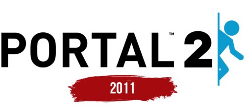
The Portal 2 logo is full of secrets and mysteries. The emblem’s apparent simplicity embodies half-empty chambers full of pitfalls and traps. The sign offers to peek around the corner and walk through the corridors of the portal lab.
Portal 2: Brand overview
| Founded: | April 18, 2011 |
| Founder: | Valve |
| Headquarters: | United States |
| Website: | thinkwithportals.com |
Meaning and History
The game’s logo has not changed since its release. The sign corresponds with the emblem of the first part and is built on schematic images used in the puzzle as landmarks. The sign creates an impression of understatement and mysterious simplicity. The color palette and designations are chosen in sync with the ambiance of the game space. The theme of portals, which the game is based on, is leading in the sign.
What is Portal 2?
A computer game in which a first-person participant travels through the Aperture Science platform using a device that opens portals. He defeats the supercomputer and passes all the test chambers, bypassing traps and obstacles. Valve presents the continuation of the story as a real perfect game, while the first part is just a test. New features have been added to the plot: light bridges, transport funnels, acceleration, and bouncing gels, as well as the ability to play in pairs.
2011
The emblem consists of a large inscription in capital letters with the name of the game and the number 2. Round elongated elements are like routes inside the test chambers, which must be followed. Each symbol is a separate puzzle. The letter O reminds of a portal.
The number 2 in the logo is multi-purpose:
- It’s the second part of the game, a sequel to the one released in 2007.
- The plot revolves around the opposition of the player and the supercomputer.
- In the second part, a cooperative mode is developed – the ability for two players to participate in the process.
- The main device creates a link between two portals. The entire game is built on this connection.
Following the inscription is a line behind which a human figure is peeping. It seems to be looking at the viewer. It feels like it will wave its hand, put a finger to its lips, and beckon to help with the game.
The drawing uses a schematic image of a person. However, the girl Chell participates in the battle. The heroine is believed to be the daughter of an Aperture Science Laboratories employee. The decision to anonymize the logo and not use a female figure was made so that every player could associate themselves with the main character and want to try their hand at solving puzzles.
The little man is also used on all schematic markings inside the test chambers. It indicates where the hero should go and what to do.
The character in the emblem seems to be peeping out from behind the corner, where he is hiding from danger. But in fact, the drawing captures the process of exiting the portal. Therefore, part of the body is not visible but on the other side. In the first logo in the history of the portal, the portal is depicted as a circle, which reduces confusion. However, overall, the technique conveys the theme of mystery, the need to be attentive.
Font and Colors
Black and blue shades are the main ones in the logo. The game space is designed in a technogenic style using blue shades. Portals and markings are made with blue backlighting, and the heart of the supercomputer GLaDOS is blue. Therefore, the logo’s color reflects the gameplay’s internal atmosphere. The second, sometimes used for the human figure, shade is orange. GLaDOS constructed two robots for experiments. She calls them: blue and orange. Therefore, the colors were applied to the logo figures.
The logo font is Hurley 1967 Sans. Black capital letters speak of the game’s popularity. Symbols stretched upwards to indicate the complexity of the levels.
Portal 2 color codes
| Black | Hex color: | #000000 |
|---|---|---|
| RGB: | 0 0 0 | |
| CMYK: | 0 0 0 100 | |
| Pantone: | PMS Process Black C |
| Rich Electric Blue | Hex color: | #0b9bcf |
|---|---|---|
| RGB: | 11 155 207 | |
| CMYK: | 95 25 0 19 | |
| Pantone: | PMS 801 C |


