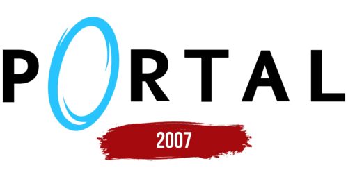
The Portal logo invites the viewer to go through the portal and enter the game. The emblem hints at adventures. It sparks curiosity and a desire to peek into the opened wormhole to explore the unusual phenomena of the future.
Portal: Brand overview
| Founded: | October 10, 2007 |
| Founder: | Valve |
| Headquarters: | United States |
Meaning and History
The emblem instantly transports the user into the game’s atmosphere and points to the main object, which plays a central role in the puzzles. The emblem shows the technology of the future. The simplicity and succinctness convey the half-empty rooms of the testing chambers and make the emblem ultra-modern. Each symbol hints at geometric shapes used in the game. The emblem’s minimalism is likely linked to the fact that the game was initially planned not as a standalone project but as part of The Orange Box collection.
What is Portal?
In the role of the main heroine Chell, the player goes through test chambers at the Aperture Science station, solving various puzzles and completing tasks using a device to open portals connecting rooms. In the end, the heroine learns that the lab was taken over by an operating system responsible for the scientists’ deaths. The struggle against it unfolds in the second part of the game.
2007
The game’s logo is simple and very clear. It’s the title with the letter ‘O’ transformed into a portal. The blue or orange color of the symbol indicates the two types of portals that can be opened with the device. The trim embodies the glowing rim that surrounds the wormhole in the chambers. The open portal seems ready to engulf the other letters and transport them into the laboratory.
The name ‘Portal’ originates from the main element studied during the game. The participant gets a special device to open wormholes and connect chambers on any flat surface. Interestingly, the portal concept was taken from a student project: the game Narbacular Drop.
Font and Colors
Blue and black are the main colors of the game. Blue signifies teleportation. All test chambers are designed in a gray-blue color scheme. The color is used for markers in the game: arrows, human figures, and inscriptions. The shade is considered technical. It embodies scientific knowledge, mechanisms, and electronics. The cool tone suggests seriousness and focus. The emphasis on the technical side is linked to the fact that the process is managed by the special operating system GLaDOS, not a human being. The light blue shade hints at lightness, the process of teleportation.
If blue conveys the theme of movement, then black embodies the stability and immobility of the main structures. It describes the system of rooms and corridors of the laboratory.
The font of the inscription is unique due to the unusual letter O. The symbol is slightly turned sideways as if it’s on an invisible wall. A vortex can be seen inside the portal, capturing and moving bodies and objects. The other letters are wide and sturdy, like the test chambers. Each symbol embodies a separate puzzle. Their font resembles Mahsuri Sans Pro Bold.
Portal color codes
| Black | Hex color: | #000000 |
|---|---|---|
| RGB: | 0 0 0 | |
| CMYK: | 0 0 0 100 | |
| Pantone: | PMS Process Black C |
| Deep Sky Blue | Hex color: | #26c3ff |
|---|---|---|
| RGB: | 38 195 255 | |
| CMYK: | 85 24 0 0 | |
| Pantone: | PMS 306 C |


