


![]() Poshmark Logo PNG
Poshmark Logo PNG
The Poshmark logo conveys the platform’s business-like nature and its services for buying and selling electronics, home appliances, accessories, clothing, and home goods. While the emblem does not communicate this visually, it delicately hints at the multifaceted nature of the online service. The name of the trading platform is encrypted in a few strokes.
Poshmark grew from Manish Chandra’s earlier experience in social shopping. In 2004, he founded Kaboodle, a service often described as a forerunner of Pinterest. After growth slowed in 2006 and money ran out, Chandra shifted the platform toward fashion and kept it alive with small checks from investors. In 2007, he sold Kaboodle to Hearst Corporation, the publisher of Cosmopolitan and Elle.
The idea for Poshmark appeared in 2010 during a breakfast in Cupertino with Mayfield investor Navin Chaddha. Chandra saw the iPhone as a new tool for mobile commerce and used the problem of unused clothing in home closets as a starting point. In 2011, he founded Poshmark in Redwood City with former Kaboodle colleagues Gautam Golwala and Chetan Pungaliya, as well as fashion designer Tracy Sun. The working name was GoshPosh.
From the beginning, Poshmark combined a resale marketplace with social networking. Sellers received prepaid USPS labels, while Posh Parties let users show and sell items during live themed events. In November 2017, the company raised $87.5 million in a Series D round led by Temasek, bringing total funding to about $160 million and valuation close to $600 million. By May 2018, sellers had earned $1 billion on the platform.
Poshmark entered Canada in May 2019, Australia in February 2021, and later India. On January 14, 2021, it listed on Nasdaq under POSH at a valuation above $3 billion. Competitors included ThredUp and Depop, which eBay bought in 2021 for $1.6 billion. In January 2023, Naver Corporation completed its $1.2 billion acquisition of Poshmark and took it private. In August 2025, Chandra moved to the board, and Namsun Kim became CEO.
Meaning and History
![]()
Business people prefer a business-like identity. This is evident in both the name and the emblem because the name chosen for the website immediately sets visitors’ expectations for something unexpected and beautiful, in a word, posh. Meanwhile, the logo suggests a serious atmosphere on the platform.
However, the lack of artistic excess in visual identity does not imply scarcity. On the contrary, designers have packed profound meaning into a small form, as the logo symbolizes several concepts: the name of the trading platform, mutual benefit for sellers and buyers, the versatility of shopping with a wide range of products, and much more.
What is Poshmark?
Poshmark is an international online platform for selling and purchasing a wide range of goods. You can buy and sell appliances, household items, and clothing. It was launched in 2011 by Manish Chandra, Gautam Golwala, Chetan Pungaliya, and Tracy Sun. Since 2023, the service has been owned by Naver Corporation as a subsidiary. The head office is located in Redwood, California, with additional centers in Chennai (India), Melbourne (Australia), and Vancouver (Canada).
2011 – today
![]()
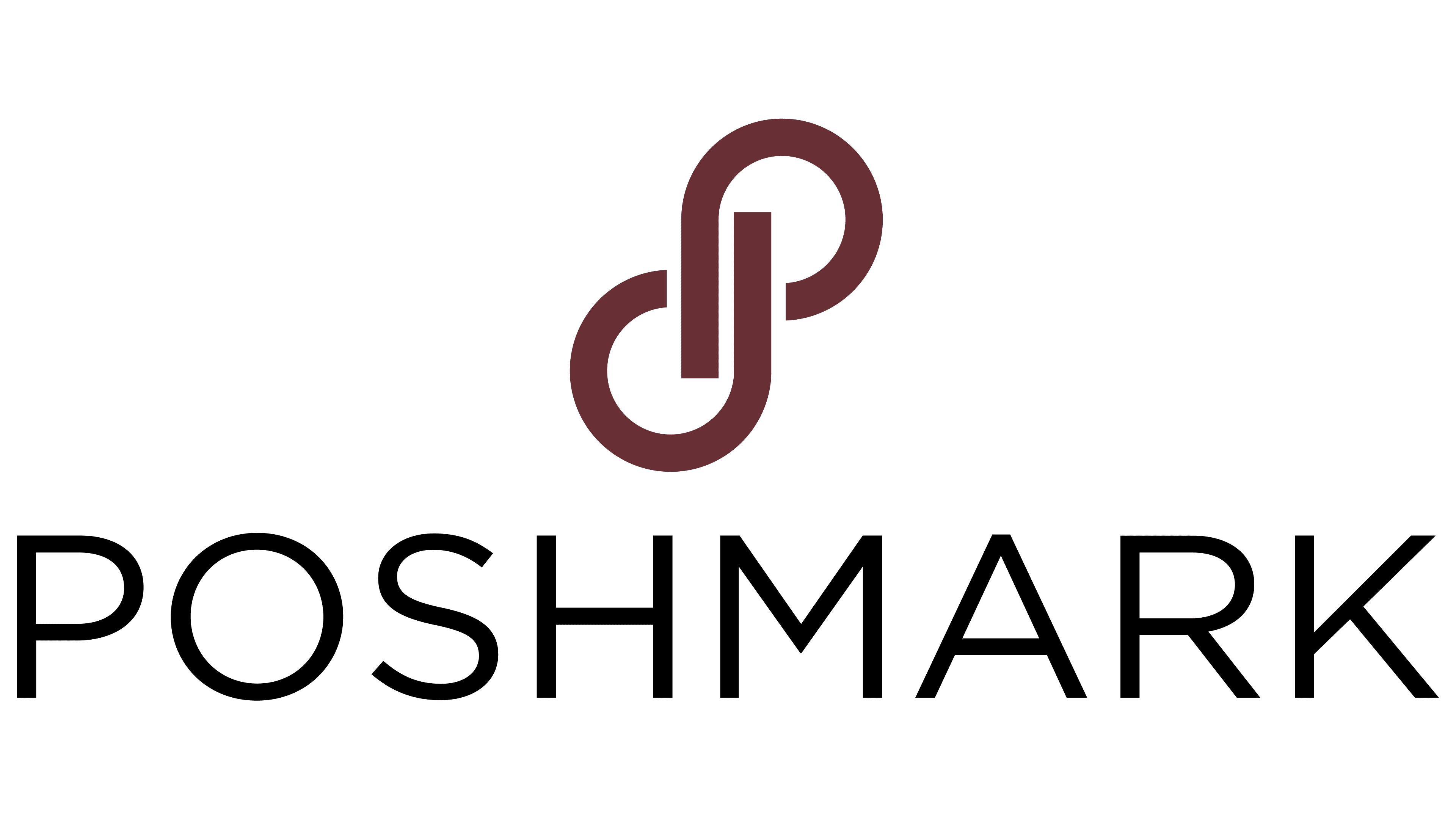
The Poshmark logo contains both graphics and text. The first is a unique symbol consisting of two rounded elements on a leg. It resembles a circular car road, but one side of it is open – meaning the curved end does not reach the opposite stripe and does not touch it. This is a stylized double variant of the letter “P”: the standard and inverted forms. It personifies the two sides of the buying-selling process, direct interaction between those who buy and those who sell. It also conveys the website name, deal readiness, and a rich assortment. The image is colored in brown.
To the right is the full name of the commercial online platform. It’s black and set in thin, sans-serif letters. Their absence speaks to the project’s openness, which does not put any obstacles in the way of its users. The wide, neat glyphs are in a geometric style. They are smooth and even, creating a sense of friendliness. The inter-character distance is small, so the inscription seems compact.
Font and Colors
The Poshmark logo inscription is clean, minimalistic, and clear. It has no serifs, just straight lines forming geometric letters. Overall, the font is reminiscent of Ridley Grotesk Regular, developed by Radomir Tinkov.

The corporate palette of the commercial platform is also modest but business-like. It includes two colors, brown and black, set against a neutral white background.