One day, Shirzad Chamine, now a lecturer and speaker at the TED Stanford Lecturer, wondered what it would be like if children were able to get the right mental development by activating the positive forces of Sage in themselves. He devoted his whole life to this problem, which resulted in the emergence of a program – Positive Intelligence, controlled by the application, to undergo special psychological training. Based on a global study, the program has ensured maximum performance in achieving success and obtaining happiness. More than a million users have already shown interest in the offer, “warmed up” by the correct study of informative visualization, whose update was recently carried out. Today, thousands of trainers have begun to offer their services in the established community. The new visualization from Landscape has helped increase the appeal while organizing a scalable design system that applies across all touchpoints of the updated app.
The main elements of the complex formation of a new brand’s perception were its logo, unique voice, messaging, style, typography, and illustrativeness. At the same time, a whole set of digital tools was developed that can be combined to increase the uniqueness and applied methodology for organizing the program on a redesigned website. The result is an optimistic, intuitive, and illustrative look and feel, using visual markers to represent evidence-based concepts. The minimalist style of the identity provided maximum impact without information overload.
The identity, built on the foundations of the science of positivity, with its graphic construction, font, and bright colors, conveys its spirit and direction through an originally formed visual impact. The bright color scheme of the website and applications, based on the variety of colors that evoke positive emotions, helps to block negative thoughts by activating positive reflexes. In combination with the strict contrasting black color of the logo’s wordmark, the maximum effect of creating attractiveness is achieved.
Reflecting the main idea of positivism is the created round and smooth sans-serif font of medium thickness, easily perceived both in typographic execution and digitally. The clarity of execution and color saturation makes it easy to read at any scale.
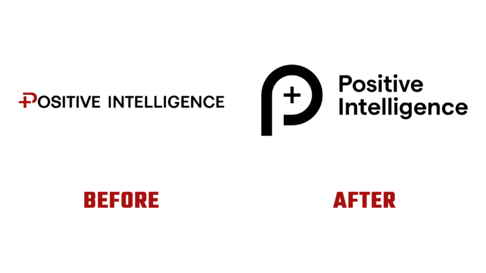
The new symbol in the form of a stylized but open letter P with the previously accepted mathematical sign “+” in the internal negative space of the letter provides a better reflection of the spirit, goals, and objectives of the brand. At the same time, the symbol demonstrates the close connection of the updated platform with its origins.


