


![]() Power Rangers Logo PNG
Power Rangers Logo PNG
According to the Power Rangers logo, law-and-order police cannot be defeated. Strength as powerful as a hammer blow, speed as lightning, and truth as pure as glass distinguish the superheroes of the franchise. The emblem promises: evil will be punished.
Power Rangers began with Haim Saban’s trip to Japan in the 1980s, where he saw Choudenshi Bioman on hotel television. The idea of a team of spandex-clad fighters battling monsters led him to make a 1985 American pilot called Bio-Man, but US networks rejected it. The project returned in 1992, when Saban brought it to Fox Kids and its president, Margaret Loesch, who knew the Super Sentai format from Marvel Productions.
For the first season, Saban used footage from Kyōryū Sentai Zyuranger, linking the dinosaur theme to the Jurassic Park moment. Mighty Morphin Power Rangers premiered on Fox Kids on August 28, 1993. The show followed Zordon, who chose five teenagers from Angel Grove to fight Rita Repulsa. Critics doubted it, and parents complained about violence. Still, the series became a hit, with Bandai toys selling fast and the episode order growing far beyond the original 40.
The franchise expanded through merchandise, live shows, home video, and the 1995 film Mighty Morphin Power Rangers: The Movie, made without Japanese footage. DIC Entertainment tried to compete with Superhuman Samurai Syber-Squad, but Power Rangers kept its lead. Saban Entertainment ran the brand until 2001, before Disney acquired it through the Fox Family Worldwide deal and moved Ninja Storm production to New Zealand.
Disney later slowed the franchise, and in 2010, Saban bought it back for $43 million. Power Rangers Samurai launched on Nickelodeon in 2011, while Lionsgate released a film reboot in 2017. Hasbro bought the franchise in 2018 for $522 million. In 2023, Cosmic Fury arrived on Netflix as the first season not to directly adapt a Super Sentai series, alongside the anniversary special Once & Always.
Meaning and History
![]()
The idea of adapting the Super Sentai series for US television viewers has been around since the 1970s. This happened after Marvel Comics, the American studio, and Toei Company, the Japanese agency, signed a concept exchange agreement. They co-created a Spider-Man television project for Japan and presented three episodes of the Super Sentai series, which was a huge hit with viewers. Haim Saban decided to convert it to the United States format.
This idea came to him in the 80s of the last century during a trip to the Land of the Rising Sun. Then he settled in a hotel, where he saw a sensational TV show. The developer was on fire with the idea of creating something similar for America because superheroes fighting monsters seemed interesting to him. He then filmed a test episode, but no American studio accepted it. The project took off only in 1992 when Saban turned to Fox Kids. A year later, the program went on air.
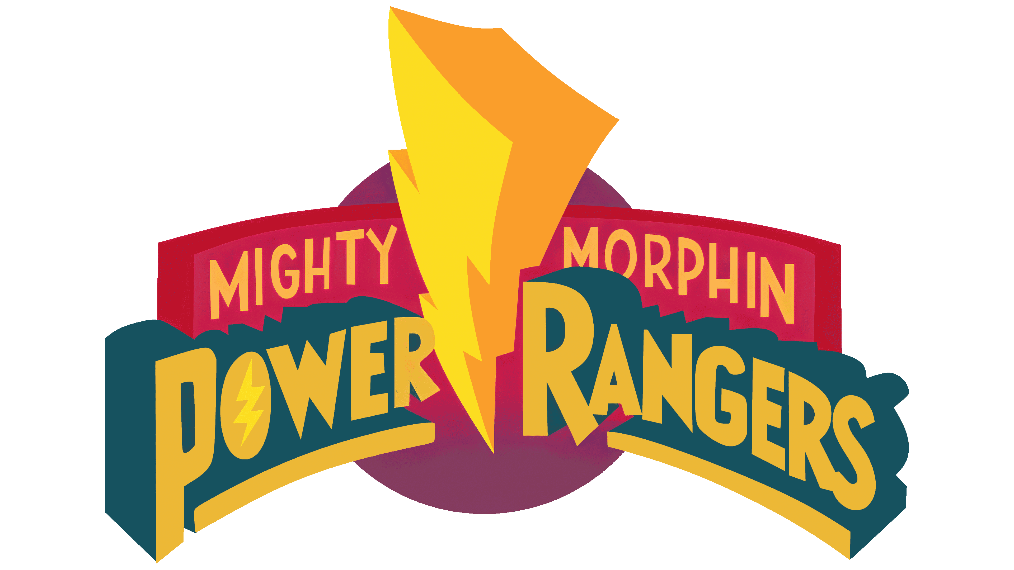
In the relatively short history of the franchise, her visual identity has been changed eight times, so she has nine original emblems. Despite the similarity at a cursory glance, they still have some differences.
1993 – 1996
![]()
The debut logo is a three-dimensional composition rendered in a rich yet delicate palette. Her main colors are gradient green, fuchsia, a restrained pink spectrum, purple, silver, and yellow. In the center is golden lightning with several zigzags. They are voluminous, with a massive three-dimensional top and a sharp bottom. In the end, a reflection is collected from chaotic strokes. It symbolizes a powerful electrical discharge. This element separates the words “Power” and “Rangers,” thereby confirming the heroes’ superpower. The inscription is underlined with lines forming a platform. A wall is located next to it in a semicircle; the text part is separated from the background, a black circle surrounded by a wide ring.
1996 – 2002
![]()
The designers changed the font, style, color, and layout of the emblem but kept the main components. In this case, the main inscription looks more brutal than before. The letters are large, massive, sans-serif, with shadows and cut corners. The plate on which they are located is not curved inward but outward. The color scheme is a cool blue with chrome highlights and an icy sheen. Lightning is not placed sideways but directly and still stands in the middle of the franchise name, dividing it into two parts. Next to it (top left) is the word “Saban’s” in small letters.
2003 – 2009
![]()
The developers have completely retained the visual identity sign this time, but changed its palette and added a few elements. Thus, a triangle appeared below, pointing outward with a sharp end and a golden flash on the lightning tip. Both the text and the background received a bold black stroke. The color from the cold spectrum turned warm, becoming red-silver. Green has also disappeared blue is used instead. The “Saban” inscription has been removed.
2010 – 2018
![]()
In 2010, the designers removed the background, so the text remained the only element of the Power Rangers identity. It is made of gradient shiny chrome. The shadow on the letters took on a rich red color, adding expressive contrast to the emblem.
2011 – 2012
![]()
The logo has gone through three changes. First, the “Saban’s” inscription was returned to its original place, as on the 1996 emblem. Second, the zipper became so large that its sharp end was as long as the protruding letters “P” and “S.” Thirdly, all elements received a common black border.
2013 – 2016
![]()
This emblem is very reminiscent of the 2018 silver/red variant. The difference between them lies in only two details: the word “Saban’s” and a thin black line that covers the entire logo. Lightning authors have been reduced to the previous size.
2017
![]()
This version is radically different from the rest of the logo. The text in it is located directly and not in the form of an arch. The letters are two-sided convex: they have shadows on both sides. The “R” at the beginning of “Rangers” has a sharp point on its left stem. Lightning is depicted as classical, smooth, with clean edges and sharp zigzags. The “Saban’s” inscription is colored red and moved to the right.
2018
![]()
Again, the logo has a wide curved zipper with a massive top and a sharp bottom. This is an exact repeat of the 2010 emblem, with the word “Saban’s” rendered in the same style as the main element. The letters are metal, with a chrome effect. The shadows are red, deep shade.
2019
![]()
The new emblem was announced three months before Hasbro acquired Bandai’s rights to goods, specifically the entire franchise. The logo depicts a signature lightning bolt with a bright reflection at the end, from which rays diverge to the right and left. The letters are geometric, large, and oblique. They do not have serifs or wide shadows; only a narrow band with rainbow-spectrum illumination. And each letter has its color. The designers moved the word “Saban’s” to the left (at the beginning of the name) and placed it behind the “P.”
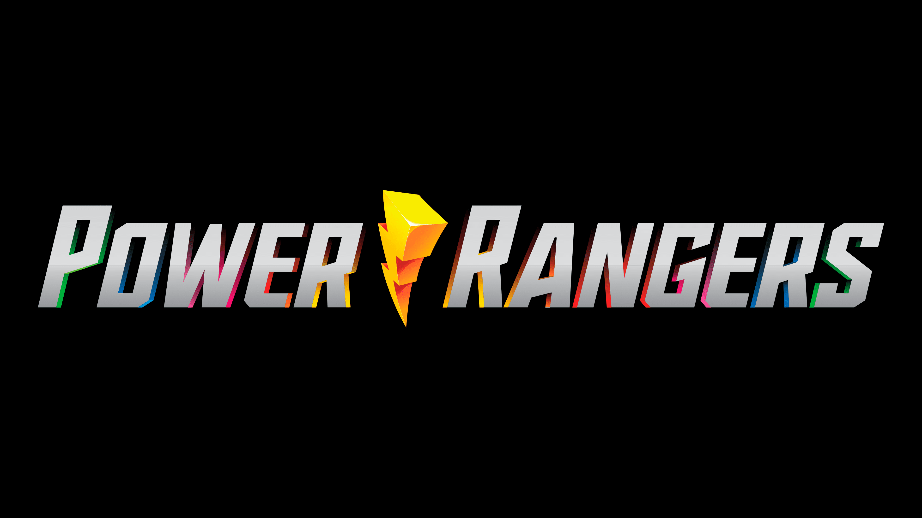
2019 – today
![]()
In the modern version of the logo, the “Saban’s” designation and rainbow-colored rays are removed, as is the shiny spot at the bottom of the lightning bolt. Gradient transitions between gray and graphite colors have been softened. Otherwise, the current version is the same as the previous one.
Font and Colors
The logo retained its original identity despite many modifications: a lightning bolt and an inscription divided into two halves. The changes affected details related to the emergence of new franchise products or their transition from one owner to another. The palette also moved from complex to simple. Therefore, at first, various bright colors prevailed, and now the color scheme is limited to silver and red.
The inscription on the emblem is individual, as it was created specifically for this project. The letters are large, strict, voluminous, with even edges and cut corners. The colors in the logo are mostly restrained, comprising white, red, black, yellow, and silver in various shades.