


![]() Powerpuff Girls Logo PNG
Powerpuff Girls Logo PNG
The Powerpuff Girls logo combines the idea of childhood and the fight against evil. The elements of the emblem hint at the charming girls who, between attending kindergarten, are ready to arm themselves and help their hometown.
The Powerpuff Girls began in June 1991, when CalArts student Craig McCracken drew three girls on orange cardboard as a birthday card idea for his brother. In 1992, he used them in his student short Whoopass Stew! The Whoopass Girls in “A Sticky Situation,” with Blossom, Bubbles, and Buttercup, were created by a scientist and powered by a can of “Whoopass.”
In 1993, McCracken joined Hanna-Barbera as art director on 2 Stupid Dogs and met Genndy Tartakovsky. Fred Seibert later launched What a Cartoon!, a pilot program for new creator-led animation. Cartoon Network would not air a title with “ass.” Hence, the name became The Powerpuff Girls, and “Chemical X” replaced the source of power.
The first pilot, “Meat Fuzzy Lumpkins,” aired on February 20, 1995, during World Premiere Toons. A second pilot, “Crime 101,” followed in January 1996. Test audiences reacted badly, but Cartoon Network executive Linda Simensky supported the project. On December 1, 1997, the channel ordered a full series. The show premiered on November 18, 1998, and became Cartoon Network’s highest-rated debut at the time.
By 2001, the franchise had expanded into toys, shirts, video games, lunch boxes, tableware, and the album Heroes and Villains. The Powerpuff Girls Movie opened on July 3, 2002, as Cartoon Network’s first theatrical feature. The original series ended on March 25, 2005, after six seasons and 78 episodes. Later projects included Powerpuff Girls Z in 2006, a 2016 reboot, a canceled The CW pilot in 2021, and McCracken’s announced return in 2022.
Meaning and History
![]()
The series has several logos that have been used at different times. Some of them were even used repeatedly to reflect the entire range of products associated with the cartoon.
What is the Powerpuff Girls?
The Powerpuff Girls is an animated series consisting of 78 episodes and special releases dedicated to girl superheroes. Created by Cartoon Network Studios, the series is distributed by Warner Bros.
1992
![]()
The first logo of the cartoon features an orange background on which the title is set. Each of the two words is written with a gradient, transitioning from blue to green, then to yellow, orange, and red. The “Whoopass” inscription is curved like a rainbow, with the three heroines of the series sitting on top of it.
Future animator Craig McCracken came up with the plot while he was a college student. The original title he gave the project was “Whoopass Stew” (which can be translated as “Awesome Stew” or “God Forbid, Stew!”). According to the creator’s legend, Whoopass was a special chemical ingredient that gave the little girls superpowers. Its name refers to the adult expression “Whoop-Ass,” meaning a call to “kick someone’s butt.”
The inscription’s gradient symbolizes Professor Utonium’s process of creating the perfect girl. He mixed various ingredients for the desired result until he made a mistake with Whoopass. The word “Stew” likely refers to the mixture from which the heroines emerged. The term “stew” also fits the plot of the first episode, when the girls “evaporated” amoeba criminals, sending them to the Sun.
The letter “O” and the dot in the exclamation mark are stylized as hearts, hinting at a girls’ world. The orange background was inspired by a postcard on which the author first drew the heroines on orange cardboard and then decided to give them superpowers.
In the first version, the girls were taller and resembled little schoolgirls.
The animator created one episode of the imagined four and proposed the cartoon to a well-known studio. Still, Cartoon Network did not appreciate his idea, and the series’ release stalled for several years.
1995
![]()
In 1995, Cartoon Network aired two Hanna-Barbera Studios-piloted episodes in its cartoon block. Accepting the project, the new owners replaced Whoopass with Chemical X and the title with the more appealing Powerpuff Girls.
Temporary logo versions were used for the pilot episodes. In the first one, from 1995, the purple inscription is made in an animated round, the chubby font in two rows. The top word is curved like a rainbow. The title is placed on a white curly substrate, resembling a cloud with stars. The entire logo image looked very cute, childish, and designed for little princesses. The image was meant to emphasize the girls’ young age and their love of dresses and toys.
The second version, from 1996, featured a white inscription with the thickening of individual letter elements in a single row on a purple background. The sign looked “older” and conveyed the participants’ innocence. Subsequently, neither of these logos was used for the series.
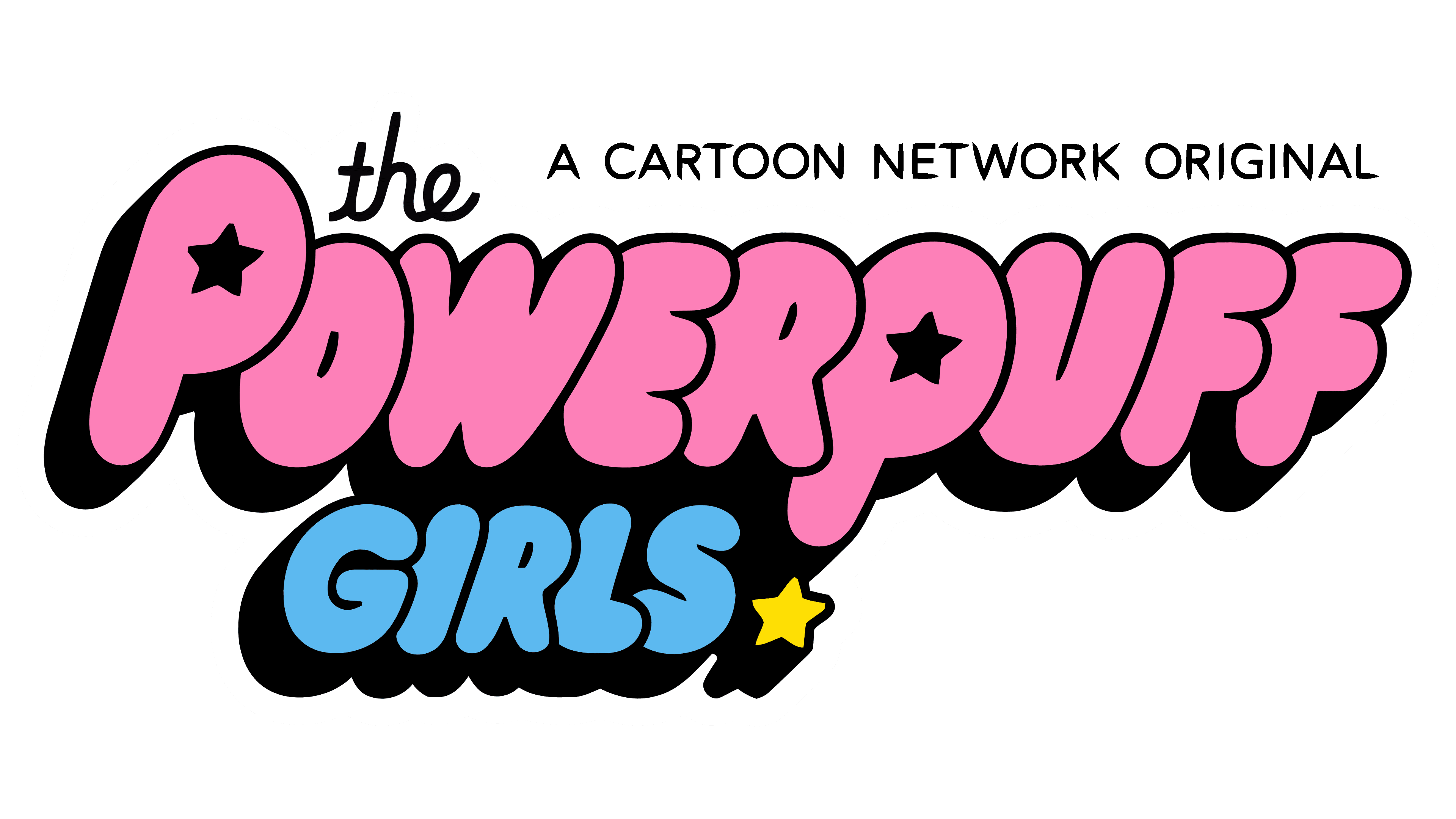
1998 – 2005, 2008 – 2009
![]()
The 1995 pilot project was unsuccessful and did not gain popularity among boys, while Cartoon Network approved the 1996 series. After that, McCracken began production on a full-fledged Hanna-Barbera series, which premiered in 1998. That’s when the real logo debuted.
The pink title in two rows was placed on a black background, outlined with a double white-black contour. The overall logo image resembled a machine, indicating the heroines’ fight against crime. The black background intensified the impression of evil and lawlessness engulfing the peaceful town.
The cute girls, as evidenced by the pink letters against the darkness, could lock up offenders in jail and stop their wrongdoings. The double contour created the effect of a sturdy fence and protection.
Instead of a store, the emblem featured three stars symbolizing the three heroines. The stars hinted at the world of Marvel and superheroes.
Despite skepticism, the premiere became the highest-rated at that time and brought the studio huge profits. By 2005, the series ended with its 6th season, and the logo was used again when “Powerpuff Girls Rule!!!” was released to celebrate the series’s 10th anniversary.
2001 – 2002
![]()
The short-lived secondary logo differed from the main one only in its darker inscription colors. Its appearance was likely related to the closure of the Hanna-Barbera studio, where the first four seasons of the series were created, and the death of its director. As a result of these sad events, McCracken left the series, and Chris Savino took over the further production of the cartoons at Cartoon Network Studios.
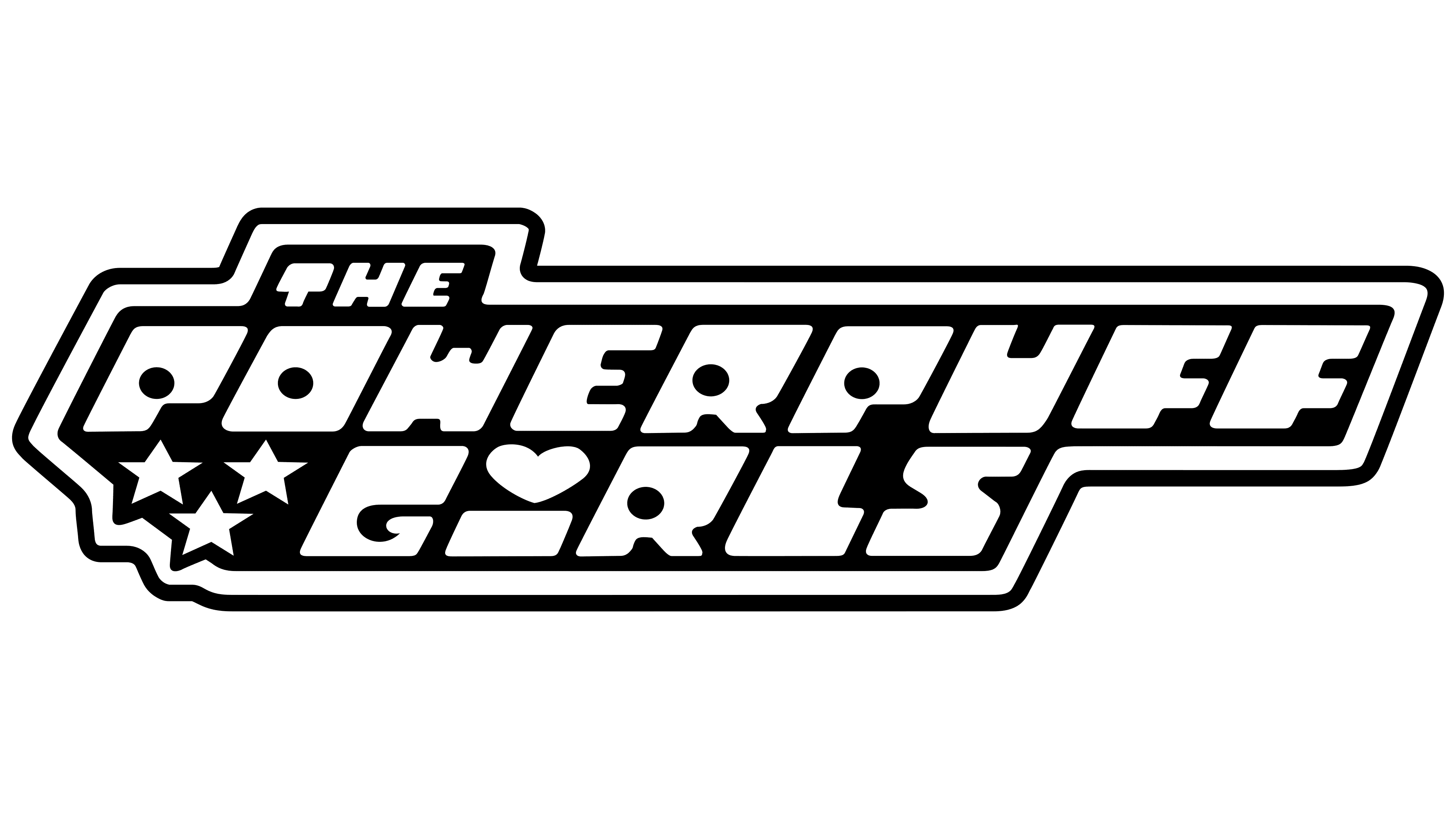
2002 – 2011, 2020 – 2023
![]()
This emblem appeared in the 2002 series and subsequently served as a secondary logo for the cartoon and related merchandise. The logo is more compact than the main one and more closely resembles a gun. All details are in black and pink with a pearlescent hue. The two-tone color scheme gives the image a stylish and glamorous look. The emblem’s appearance was related to the change of the show’s producer.
The image returned in 2020 when the idea of filming a sequel series with grown-up heroines arose. However, the project was never completed.
2014
![]()
The 1998 logo was modified to celebrate the show’s 15th anniversary and to mark the release of a new special cartoon for the anniversary. The sign is identical to the previous one, but the black background in the emblem has been replaced with light gray. The change symbolizes a significant reduction in evil in the city, resulting from the girls’ work in previous years.
2017 – 2023
![]()
In 2016, the show was rebooted. To distinguish the classic version of the series, which aired until 2005, the secondary emblem was slightly modified. The word “classic” was added below the black and pink inscription with a pearlescent hue, at the bottom front, under the “barrel.”
2023 – today
![]()
Font and Colors
The logo’s primary colors are black and purple.
- Purple symbolizes femininity, childhood, dreaminess, mobility, and restlessness.
- Black is associated with evil and crime.
The inscription font is unique and specifically designed for the series. The letter “I” is reduced in size, and the dot is transformed into a heart shape.