Primark, a major player in the fashion industry, has introduced a new brand identity created with the help of creative agency VCCP. This update aims to align the brand’s visual identity with its digital and social media presence, emphasizing modern design and sustainability.
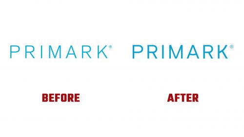
The new logo is the centerpiece of Primark’s rebranding. It features a custom-type family called Primark Basis, designed by the foundry Colophon. This typeface, an adaptation of Basis Grotesque, boasts clean, clear sans serif lines. Adjustments in kerning and weight improve legibility at smaller scales, making the logo more effective in digital and social media settings.
Subtle design elements within the typeface add character while maintaining a professional look. Small curvatures in the letters provide a playful yet sophisticated feel, reflecting Primark’s balance between approachability and modernity. This design ensures the logo stands out on various platforms.
A new graphic element, the “portal,” is a significant addition to the brand identity. Formed by two oblong shapes that create a ‘P’ when placed together, the portal acts as a window to showcase campaign assets. This technique enhances visual interaction and further connects the brand to its content.
The refreshed identity includes a new secondary color palette that complements the iconic Primark aqua blue. This update aims to improve accessibility and make the visuals more engaging and inclusive. The new colors support a modern and cohesive brand image.
Primark Basis, the custom type family, features added curvatures that bring a playful touch to the design. This adaptation of Basis Grotesque introduces characters that better reflect the brand’s personality, contributing to a dynamic and functional visual identity.
The rebrand will be showcased in Primark’s upcoming campaign, Viva Summer. This campaign will feature the new logo and portal device across various assets, ensuring a consistent and engaging brand presence. The visual elements highlight Primark’s wide offerings, from fashion to home goods, emphasizing quality and style.
Primark’s marketing strategy now focuses more on its Primark Cares initiative, highlighting its commitment to sustainability and social responsibility. By 2030, Primark plans to produce all clothes from recycled or sustainably sourced materials, cut carbon emissions across its value chain by half, and ensure living wages for workers in its supply chain. These goals reflect Primark’s vision of becoming a sustainable and circular business.
The new brand identity aligns with these values, presenting a modern and responsible image that resonates with today’s consumers. The refreshed visual elements communicate Primark’s dedication to innovation, sustainability, and accessibility. The portal framing device and updated typography create a cohesive and engaging brand experience.
Primark’s rebranding by VCCP marks a significant step forward for the company. The new logo, color palette, and framing enhance visual appeal and support the brand’s goal of providing stylish and sustainable products. By integrating modern design elements with a commitment to sustainability, Primark positions itself as a leader in the fashion industry.


