


![]() Princeton Tigers Logo PNG
Princeton Tigers Logo PNG
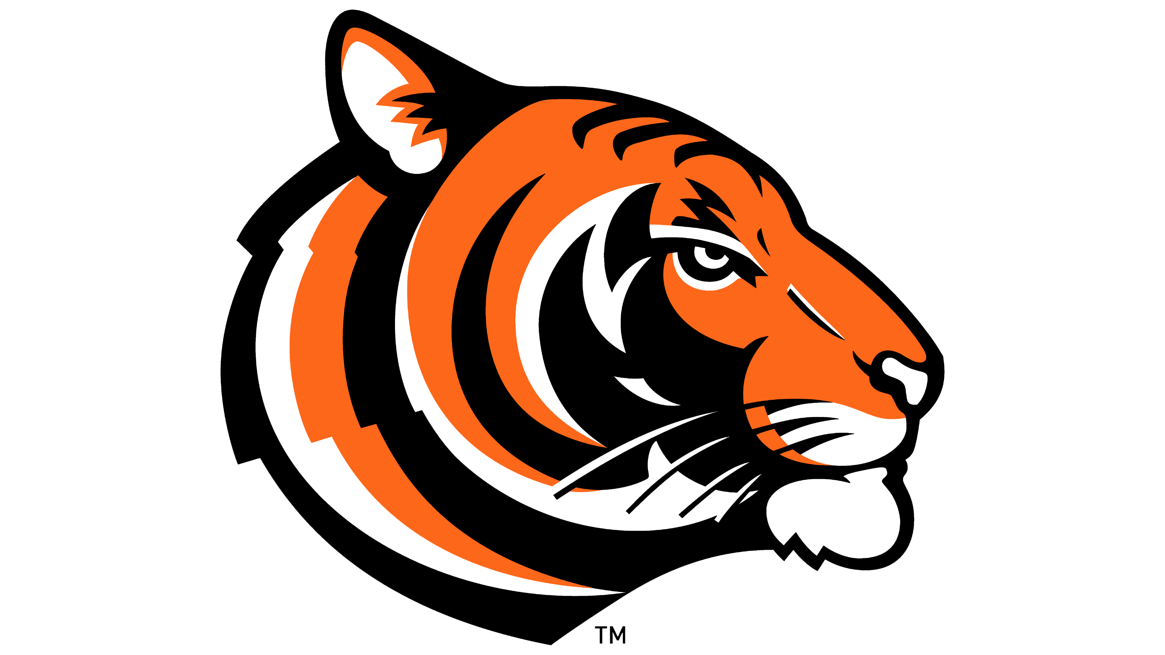
The Princeton Tigers logo is bold and snarling. Demonstrates the agility, strength, and quick, sharp throws that the players are capable of. The logo combines a love of the sport and the institutions the teams represent.
The Princeton Tigers’ history began on November 6, 1869, when the College of New Jersey, later Princeton University, played Rutgers in New Brunswick. The game drew about 100 spectators and is now regarded as the first intercollegiate football match. Rutgers won 6-4, while Princeton took the rematch two weeks later, 8-0.
The Tigers’ nickname appeared in 1880, after orange stripes were added to the team’s black football shirts. A newspaper reporter wrote that Princeton’s eleven “played like tigers,” and the name became tied to the university’s black-and-orange identity.
From 1869 to 1909, Princeton won 22 of the first 40 national college football titles. In 1893, before 40,000 spectators in New York, Princeton beat Yale 6-0, ending Yale’s 37-game winning streak. The rivalries with Yale and Harvard shaped the “Big Three” era for decades.
In 1951, Dick Kazmaier led Princeton football to a 9-0 season. He won the Heisman Trophy, becoming the school’s only winner and the last Ivy League player to receive it. Bill Bradley later became a Princeton basketball legend, scoring 2,503 points, winning Olympic gold in 1964, reaching the NCAA Final Four in 1965, and winning two NBA titles with the New York Knicks. Princeton’s wider program included men’s lacrosse NCAA titles in 1992, 1994, 1996, 1997, 1998, and 2001, women’s lacrosse titles in 1994, 2002, and 2003, a 2012 field hockey NCAA title, rowing from 1870, eight NCAA men’s golf titles, and a national title in men’s fencing.
Meaning and History
![]()
The team’s basic logo didn’t change that often. In all cases, it was an attempt to combine the university’s identity with its mascot.
What are the Princeton Tigers?
It is an association of Princeton University sports teams. It ranks in the top 10 among U.S. universities for athletic achievement.
1960 – 1984
![]()
The tiger did not become the university’s mascot right away. But by 1911, two tigers had already replaced the lions presented to the university by its famous alumnus, Wilson, who became president of the United States. The animal got into the team logo even later.
Initially, the university’s colors were chosen: orange and black. They were received from the British Crown, along with the coat of arms, even before the American Revolution. So when the mascot question came up, the tiger suited the existing “coloring.” It became the official animal in the second half of the 19th century, though it was not included in the logo for almost a hundred years.
The first emblem was a large orange polyhedral letter P with a black outline. The element pointed to the city’s name and the university and resembled a tiger only remotely.
1984 – 2004
![]()
The 1984 logo was the exact opposite of the previous one. While the first sign emphasized the educational institution, the new sign gave place to animal power and strength. The image featured a real tiger jumping.
The logo looked very belligerent and aggressive. Demonstrated the power and will to win. Only the color scheme was left from the university.
2004 – today
![]()
The final modification of the logo unified the first and second versions, presenting a synthesis of the name’s capital letter, colored in tiger colors. The emblem looks very stylish and original.
Font and Colors
Team logos and athletes’ uniforms are in the university’s traditional colors: orange and black. The hues match the tiger’s fur and the mascot perfectly.
- Orange stands for team spirit, mutual support, and friendly communication.
- Black stands for self-confidence, the ability to defend one’s positions, and diligent training.
A bold, serif-heavy font hinting at tiger teeth and claws was chosen for the title P.