Propel Fitness Water, a prominent name in the fitness hydration sector and a subsidiary of Gatorade has recently taken a bold step forward with a rebranded appearance. Designed to underscore the company’s unwavering commitment to fitness enthusiasts, the new design sports a sophisticated and athletic look. The transformation highlights Propel’s enduring pledge to provide zero sugar, zero calories, and electrolyte-rich water, reinforcing two decades of devotion to the active community.
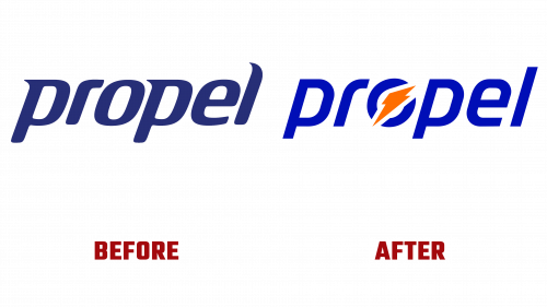
The Propel Water logo’s new design represents a marked departure from its predecessor. Once marred by a rather clinical and pharmaceutical look, the old logo was easily overshadowed on store shelves. In contrast, the new logo, though not a breakthrough, signifies a commendable improvement. Gone are the old wispy serifs, replaced by more balanced letterforms. Integrating Gatorade’s iconic bolt further tightens the connection between the two brands, bestowing added credibility upon Propel.
This resemblance to Gatorade, however, has sparked conversation. It has led some to question whether Propel is content to live as a sub-brand in Gatorade’s shadow or will strive to maintain its distinct identity. But, irrespective of this debate, the new logo’s sportier and more streamlined design aligns closely with Propel’s fundamental mission of nurturing athletic potential.
Beyond the logo, the rebranding reflects a broader revitalization of Propel’s identity. Employing a fresh and energetic color scheme of blue and neon green (and blue and orange combinations on the packaging), Propel has embraced a trending color wave in 2023. The tasteful selection of TT Hoves and Rajdhani typography from Indian Type Foundry and the incorporation of action photography contribute to a cohesive and appealing visual narrative.
The redesign also extends to Propel’s packaging, moving from an outdated medicinal look to something more lively and welcoming. The addition of a bold blue stripe, juxtaposed with thinner stripes of varying colors, lays out a visually engaging and consistent theme. The tracked-out “FITNESS WATER” tagline under the wordmark fortifies the logo, aligning all elements in parallel harmony.
The Propel Water logo’s new design and the encompassing rebranding heralds a refreshing change for the brand. While not groundbreaking, the transformation provides a more unified and attractive presence that resonates with Propel’s dedication to fitness and wellness. By relinquishing its prior clinical facade for a more athletic and approachable image, Propel seems well-positioned to amplify its market presence, reaching a wider spectrum of fitness devotees searching for a refreshing and effective hydration alternative.


