


 Propel Logo PNG
The Propel logo features a modern and vibrant design. It is a unique combination of information integrated into just three elements. How the creators conveyed the company’s philosophy with one word on a white background, and what the two additions are, remains a mystery. However, the modern logo is presentable and well-accented. It is a stylized emblem with unique individuality.
On the white background, elegant blue letters are beautifully engraved. They are consistent in style, creating an excellent visual effect. All uppercase letters are aligned horizontally with perfectly straight lines and written in italics. The brand name is instantly readable, drawing attention with its elegance. Like a burst of energy, a bright orange lightning bolt underscores the brand’s product value. Strength, health, and natural energy are encapsulated in every bottle of Propel’s refreshing drinks. This fitness water is rich in beneficial components and serves as a true helper and loyal friend.
Propel began in 2000, when PepsiCo entered the functional beverage market as consumers sought alternatives to carbonated soft drinks. The product was formulated as flavored water with vitamins, electrolytes, and antioxidants, designed for hydration with a lower-calorie profile. It first appeared in selected U.S. stores in 2000, passed local market testing, and moved to a wider launch in 2001.
The brand’s 2002 partnership with Gatorade strengthened its position in the sports and fitness category. In 2003, the Fitness Water line added vitamins and minerals connected with active routines. Propel Calcium followed in 2006, adding calcium and targeting buyers interested in bone health, including women seeking functional drinks.
As demand changed, Propel adjusted its formulas and positioning. In 2009, it introduced a zero-calorie version for consumers watching sugar and weight. In 2011, the campaign “Get More From Your 24” tied the drink to daily activity and time management. In 2015, the company released electrolyte water as a low-calorie option within the sports-drink space.
From 2017 onward, the brand refreshed its packaging and expanded its flavor range to appeal to younger buyers. Vitamin Boost appeared in 2018 with added electrolytes and B and E vitamins in berry, citrus, and apple-pear flavors. In 2019, new options included mango-blueberry and guava-peach. In 2020, Propel used virtual fitness classes to strengthen its online presence. Immune Support arrived in 2021 with zinc and vitamin C, followed in 2022 by updated bottles and a wider sugar-free range.
Meaning and History
What is Propel Water?
It is water with added vitamins and electrolytes, a healthy replacement for high-sugar sports drinks that doesn’t sacrifice taste or hydration. The water is aimed at health-conscious people with active lifestyles. It is available in an assortment of fruit flavors. The brand is especially known among athletes and fitness fanatics as a pleasant, low-calorie drink.
2000 – 2014

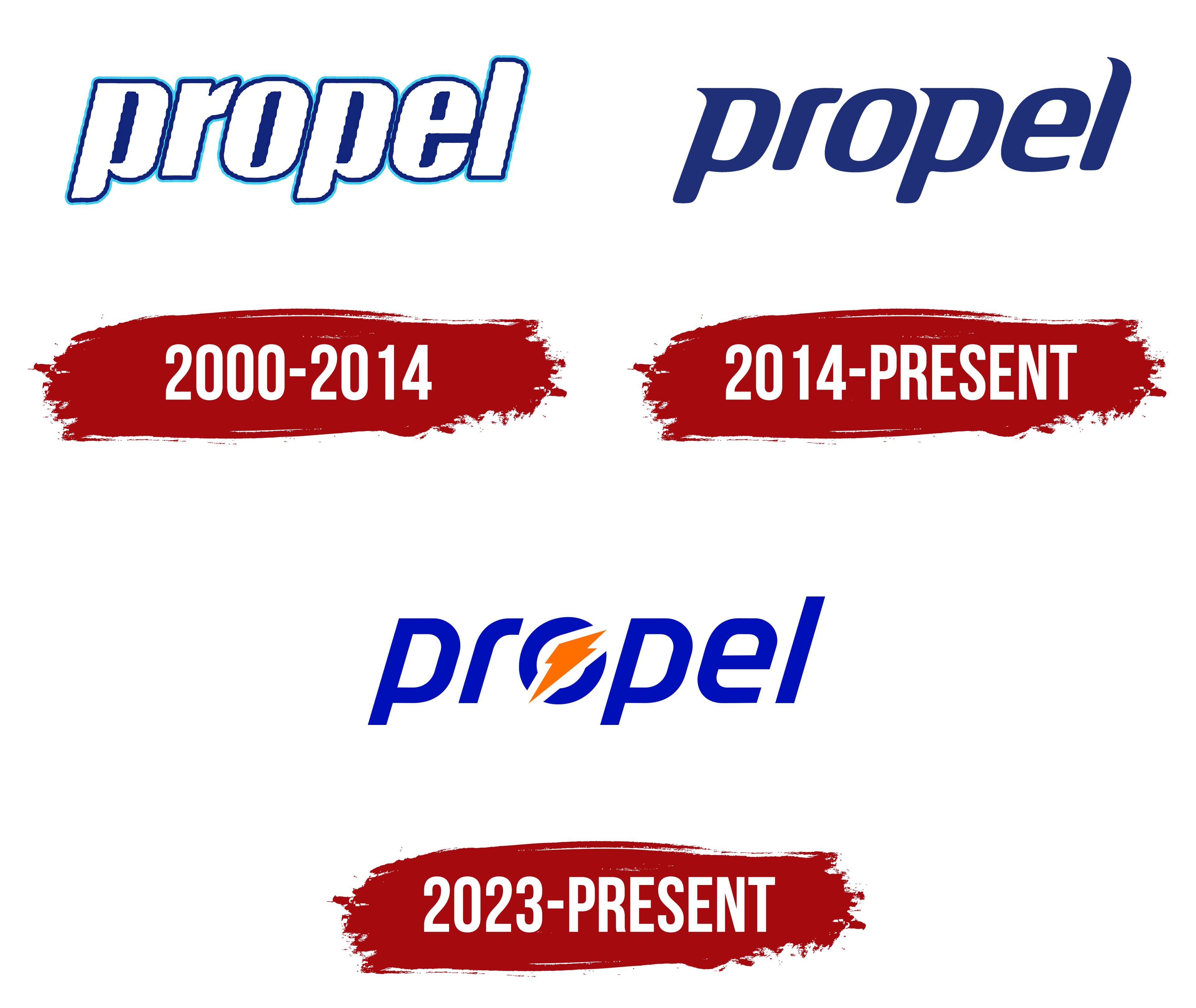
What brings health and energy? Which water helps to quench thirst quickly? The Propel brand answers all these questions with its logo. The company’s identity accurately reflects all its values and priorities.
On a white background, the logo’s letters shimmer in the sun. The bold, horizontally placed letters are visible. The capital letters are wide and italicized, giving them a dynamic appearance. In this one word, movement, water, and life are beautifully combined. The color scheme corresponds to the water element, so the blue outline looks perfect.
An interesting filling technique enhances readability and highlights the letters. The empty spaces in the letters are filled with blue, even though they are usually left blank. This technique embellishes the logo, making it even more noticeable and distinctive.
2014 – 2023
Amid internal transformations and an expanding product range, the company also updated its identity. The logo became more democratic and restrained. The brand name, consisting of six lowercase letters, was now centered in the logo.
The letters were blue and shimmered against a white background. The gaps in the letters became transparent, blending with the background. The letters acquired sharp angles and serifs, with their sides becoming wider and denser, symbolizing the high quality of the products.
The new identity’s main features were simplicity and conciseness. Excesses were eliminated in favor of innovative design trends. Yet, the logo remained multilayered in meaning. One word was associated with quality, health, strength, and reliability.
2023 – today
In its latest version, the logo has become the most contrasting. All its previous prototypes were simple, but now the focus is on contrasting colors and an original symbol.
The brand’s new logo is a minimalist yet rich creation by the design agency Vault49, which specializes in packaging and labeling. The emblem comprises marketing details and features a unique sign cleverly hidden within the letter “O.” This sign is a zigzag-shaped orange geometric figure that mimics a lightning bolt. The icon indicates high energy density in the water while maintaining zero calories. The logo features an inscription in slanted blue lowercase letters.
The zig-zag symbol (orange lightning) enclosed in the letter “O” attracts the attention of water buyers in stores. Orange is a color associated with energy, passion, and action. This subtle design moment conveys energy to consumers without compromising health by adding extra calories.
The blue color used for the text signifies trust and reliability. It is calming and associated with depth and stability, suggesting that the product is reliable and harmonious for the body. The slanted lowercase font makes the logo dynamic, hinting at the active lifestyle that the brand encourages.
The brand name conveys a sense of full energy, and the new symbol embodies the power of movement. In any case, the logo conveys the main conceptual meanings of the company’s activities and conveys the originality of Propel’s products.