


![]() ProtonMail Logo PNG
ProtonMail Logo PNG
The letters in the ProtonMail logo look as if they were carved from stone. The emblem promises reliable protection and tells of the mail that stores information deep within a mighty rock. No one will open the message except for the addressee.
ProtonMail began in the summer of 2013, after Edward Snowden’s disclosures about mass surveillance prompted Andy Yen and his CERN colleagues to take online privacy seriously. Yen, Jason Stockman, and Wei Sun discussed the idea at CERN’s Restaurant One and began building an encrypted email system. The name came from the Large Hadron Collider, where protons are accelerated almost to the speed of light.
The service entered public beta on May 16, 2014. The founders expected a few hundred sign-ups, but 10,000 users registered in the first weekend, forcing the team to pause new account creation and expand its infrastructure. That summer, ProtonMail raised $550,377 on Indiegogo from 10,576 backers, far above its $100,000 goal. During the campaign, PayPal froze $251,721, sparking a public dispute over payment controls and digital independence.
In 2015, ProtonMail faced major DDoS attacks and later lost visibility in Google search results for terms such as “secure email” and “encrypted email,” which slowed user growth for nearly a year. In March 2016, version 3.0 ended the beta period, launched iOS and Android apps, and removed the invitation system. Unlike Gmail, which had long scanned email content for advertising, ProtonMail built its position around encryption.
In 2017, ProtonMail launched a Tor onion site and introduced ProtonVPN. Its audience reached 2 million users that year, 5 million in 2018, more than 20 million by late 2019, and 50 million by 2020. In 2022, Proton bought SimpleLogin, opened @proton.me addresses, and renamed the service Proton Mail. In 2024, it acquired Standard Notes and reached 100 million users, while remaining funded by user payments, with Proton Foundation in Geneva as the main shareholder.
Meaning and History
![]()
The service has existed for over seven years. During this period, the developers made various changes, identified opportunities for improvement, and updated the software components. But one thing has always remained the same: stable, safe operation. The visual identification of the webmail service also confirms this. The logo has not changed since ProtonMail was created.
The first version of the email service was introduced to the world in 2013. During this period, reports of increased control over users’ online correspondence increased. The current situation outraged not only ordinary citizens but also scientists. One of them came up with the idea of creating a service whose content could only be viewed by its owners. It was Andy Yen, a Harvard student and a part-time employee at CERN.
He was determined to bring his development to life and turned to his colleagues Wei Song and Jameson Stockman for help. Together, they created a unique email service that surpassed all existing services in security. So, Internet communication has reached a new level, with a respectful attitude toward users’ privacy evident.
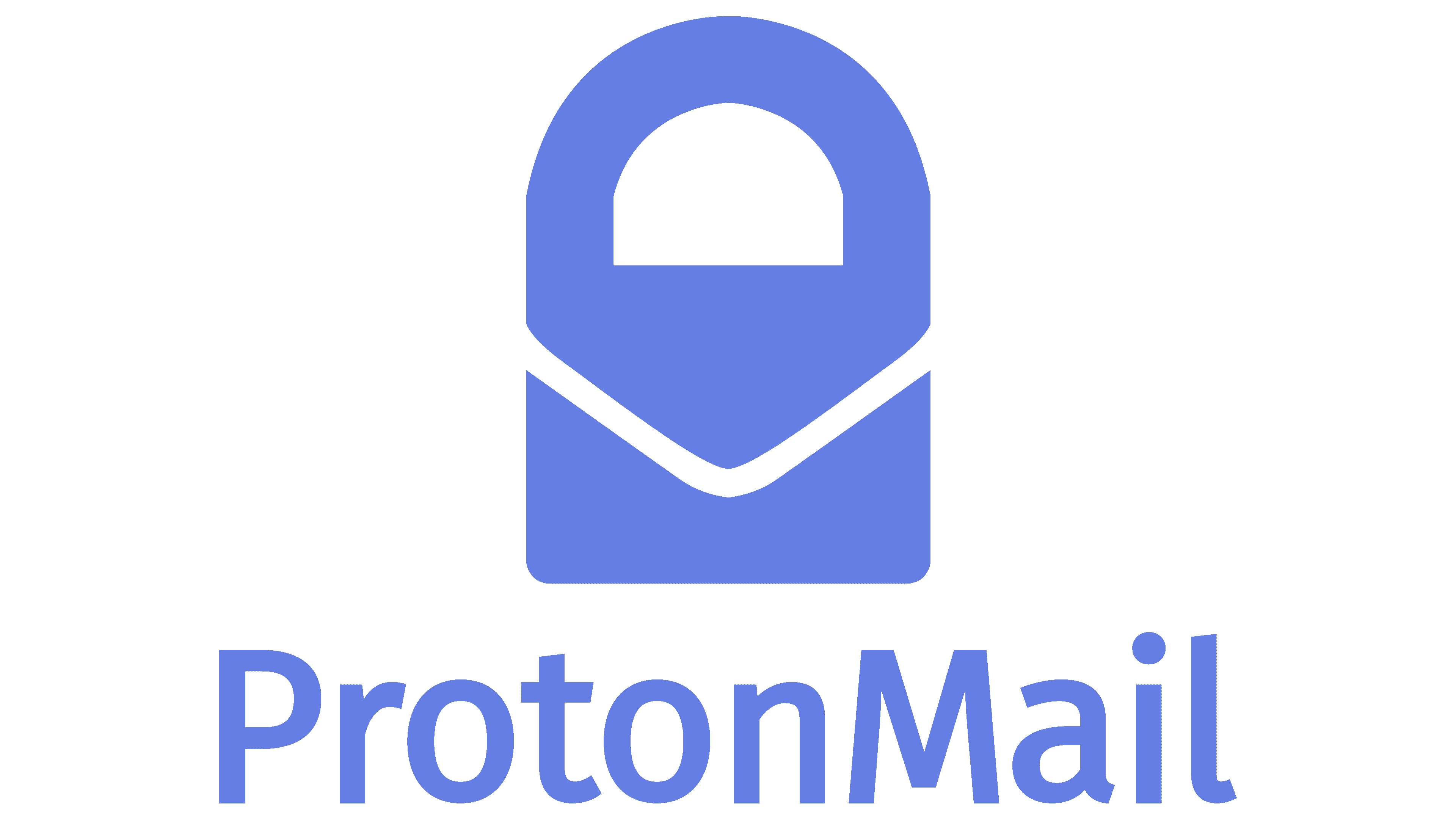
The developers acknowledge that, in creating ProtonMail, they used Lavabit’s security level, functionality, and design, as well as some Snapchat add-ons, as benchmarks. This was also reflected in the visual identification. The logo of the new webmail service was made in the best traditions of postal services.
A discreet color scheme was chosen for the design, consisting of a single rich blue. The hue is close to a deep dark gradient, demonstrating a high level of confidence and reliability. In addition, the visual identity is built on stability. This is evidenced by the uniform color of all signs and the same font. The image is complemented by a lock icon located in front of the inscription. It symbolizes the service’s main values: security and privacy.
In the following years, the email service developed rapidly. 2016 was a particularly productive year, as it was then that mobile applications were created. Add-ons still work on both Android and IOS. The logo and corporate identity have not changed.
2014 – 2022
![]()
The castle and the service name are used as an emblem. The icon is placed first to demonstrate the priority direction. The inscription is made in the same style as the castle. In general, the logo looks strict and concise, reinforcing a sense of confidence.
The ProtonMail logo is an example of visual balance. It harmoniously combines a two-word inscription and a stylish element in the form of a lock. They are made in a solid and dark color scheme associated with reliability and quality. An intense, deep shade of blue emphasizes the emblem’s expressiveness. It stands out well from other email services. This, too, lies at the heart of the idea that ProtonMail is a non-standard service.
A bold sans-serif font is chosen for the inscription. Two words, although written without spaces, stand out against each other. Both are written in capital letters. This is an important feature because the emblem makes it clear, at a glance, in which direction the service is working. In addition, the letters in the name have soft cuts, which soften the logo’s severity and inspire confidence among users.
2022 – today
![]()
At the end of May 2022, ProtonMail was forced to change its visual identity as it moved from an email service to a suite of privacy tools. This is how the Proton ecosystem appeared, with the Proton Mail brand (now spelled separately) taking its own place alongside other services such as Drive, Calendar, and VPN. To streamline the identity of all services, the designers developed the concept of “magic portals.” Allegedly, each icon is a portal to a parallel universe where users’ personal information is stored. Therefore, all icons are translucent.
The new ProtonMail symbol is based on the bottom half of the old logo. The developers removed the padlock to create a sense of accessibility, leaving only the bottom of the envelope. It is depicted in dark blue, and on the right, it is complemented by wide stripes with a light-blue gradient, making it look as if the envelope were bifurcated. Nearby, as before, is the name of the mail service, but this time the words are separated and written in two shades of blue: dark and rich-bright.
Font and Colors

Especially for Proton, the designers created a font that hints at encryption keys. This is a bold geometric grotesque with smoothed corners and many rounded glyphs. The case of the letters remained as before, but after the update, a space appeared between the words.
The color scheme has also changed dramatically: the logo is dominated by a purple hue connecting all the ecosystem icons. At the postal service, they painted the envelope and the second part of the name. Moreover, in the graphic symbol, a gradient creates the effect of depth. As for the first word, it’s dark purple. This is a nod to the muted purple ProtonMail previously used.