 PS3 Logo PNG
The console received a PS3 logo that largely echoes the emblem of the previous model. However, there is a significant difference between them. In this version, there are no straight angles – only streamlined turns. All glyphs are rounded, smooth, and sleek. This reflects the device’s high adaptability and the convenience of its application.
On March 9, 2001, Sony Computer Entertainment president Ken Kutaragi announced that Sony, Toshiba, and IBM were developing the Cell processor for a future console. The project reportedly cost about $400 million. Kutaragi framed the PlayStation 3 as a home supercomputer rather than a conventional game machine.
In September 2004, Sony confirmed Blu-ray as the main format. In December, it partnered with Nvidia on the graphics chip. PlayStation 3 was presented at E3 on May 16, 2005, with a boomerang-shaped controller prototype and a planned spring 2006 launch. The schedule slipped because Cell was difficult for developers. Microsoft released the Xbox 360 in November 2005, gaining nearly a year’s lead.
PS3 launched in Japan on November 11, 2006, and in North America on November 17, priced at $499 and $599. Europe and Australia followed on March 23, 2007. Sony reportedly spent about $800 to build each original unit and sold it at a loss. Nintendo’s Wii launched at $249 and drew widespread attention for its motion controls. At the same time, the Xbox 360 already had a stronger game library.
Blu-ray later became one of PS3’s main advantages during its format war with Toshiba’s HD DVD. The PS3 Slim arrived in September 2009 at $299, and Netflix came to the console that year. In April 2011, the PlayStation Network was hacked, exposing 77 million accounts. The Super Slim followed in September 2012. Exclusives such as Metal Gear Solid 4, Uncharted, God of War III, LittleBigPlanet, and The Last of Us helped the console reach 87.4 million units, close to Xbox 360’s 84 million.
Meaning and History
The PS3 was created in 2001, when Sony Computer Entertainment’s head, Ken Kutaragi, announced the company’s work on the Cell processor in collaboration with IBM and Toshiba. Several teams were involved in the project, including one led by Shuhei Yoshida. His group dealt with hardware for the release of next-generation video games. So it’s no surprise that in 2005, the programmers’ focus shifted entirely to them. As a result, the PlayStation 3 was released first in the spring of the same year. Its debut took place at the E3 exhibition.
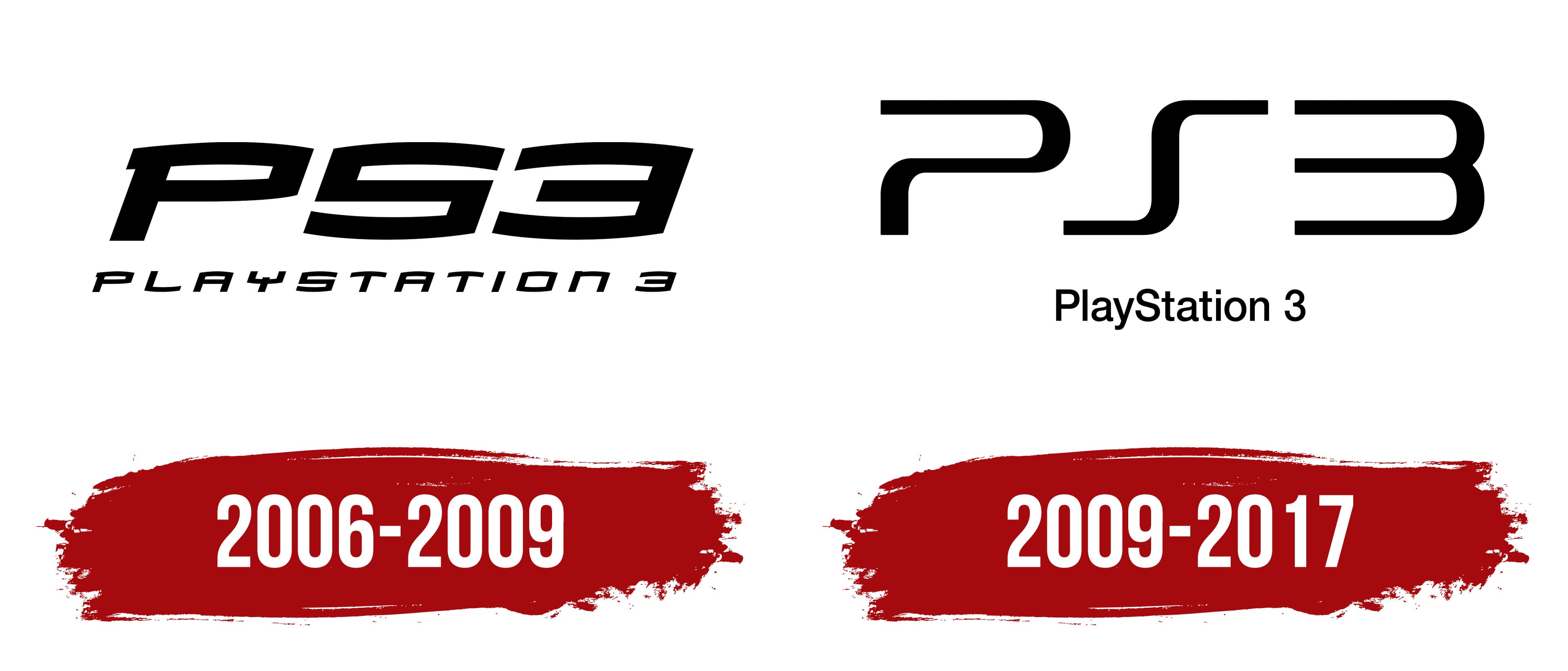
The novelty’s name remained the same, as it is another member of the same console family. However, the developers added the next ordinal number and created another logo. Thus, the familiar visual identity gained individual features. Therefore, while maintaining the previous style, the designers made a few changes to improve it and enhance its recognizability. From the moment the consoles were launched until the end of their production, the gaming brand had two original emblems.
What is PS3?
PS3 is an abbreviation for the PlayStation 3 console, released by Sony Computer Entertainment. It hit the market in 2006 and ceased production in 2017.
2006 – 2009
The Sony console was released with a text logo based on the Mata T-26 font. It served as inspiration for creating the console itself, as its streamlined, smooth, rolling shape instills confidence in control of the situation and in its safety. At the same time, the emblem contains two lines with different name formats: PS3 (first row) and PlayStation 3 (second row). At the top, the inscription is short, with narrow inter-character spacing and an attached three, and at the bottom, full, with wide spacing between glyphs and a separately standing number “3”. Both texts have a right-leaning tilt and are written in uppercase.
2009 – 2017
When Sony Corporation produced the Slim console, it updated its logo. The modernization affected the font, which was then used until the end of production of the seventh-generation gaming console. This time, the glyphs resembled the symbols from the PS2 emblem but in a more streamlined form. That is, they were just as open but rounded. The full name was placed on a separate line and executed in a grotesque style, in which the “S” looked like a step rather than a classic letter. The color remained the same monochrome.
The evolution of the PS3 logo did not deviate from the original: the same structure, the same text, and the same color scheme. The only difference was the font, but even that was later standardized with smooth lines and rounded corners. Ken Kutaragi, the head of the developer company, personally chose the design for the inscriptions.
Font and Colors
The original PS3 emblem uses the Mata T-26 typeface, created by Greg Samata. It was once chosen for the 2002 Spider-Man movie (director Sam Raimi). The corporate palette, as usual, is restrained, consisting of a classic black-and-white combination.