![]() PUBG Logo PNG
PUBG Logo PNG
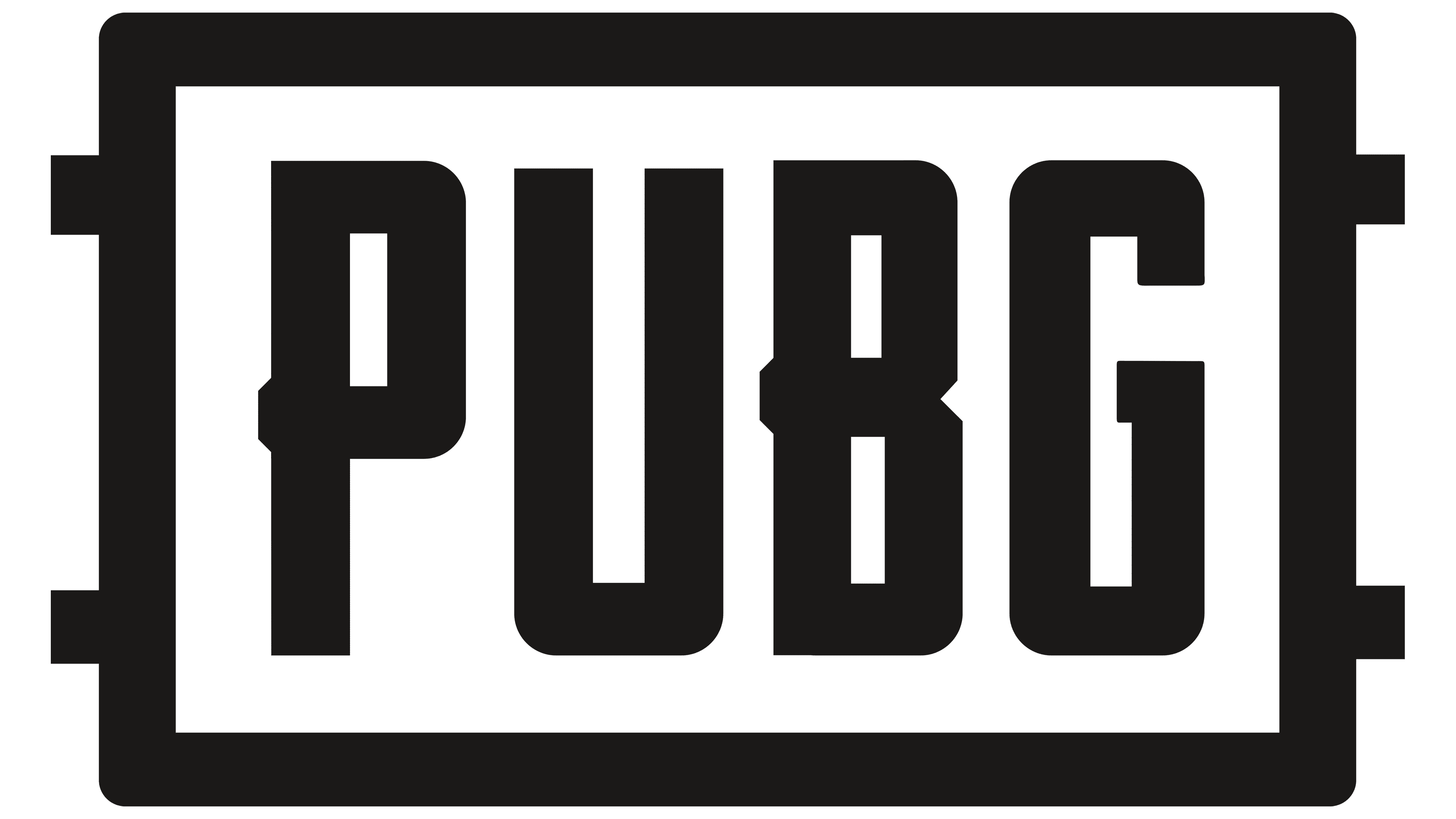
The PUBG logo is businesslike and practical, which is unusual for an online computer game. Its identity is based on block letters, an abbreviation of the phrase “PlayerUnknown’s BattleGrounds.” Monolithic design and massive glyphs convey power, confidence, and strength.
PUBG’s origins trace back to Brendan Greene, an Irish photographer, designer, and web developer who became interested in game mods. Inspired by the 2000 Japanese film Battle Royale, he created DayZ: Battle Royale for Arma 2 in the early 2010s. The mod led Sony Online Entertainment to hire him as a consultant on H1Z1.
After Sony split H1Z1 into two games in 2016, Greene’s work on the title ended. That year, South Korean studio Bluehole, founded by Chang Byung-gyu in 2007, invited him to become creative director on a full battle royale game. PlayerUnknown’s Battlegrounds launched in Steam Early Access on March 23, 2017. In six months, it sold more than 10 million copies.
The format was direct and easy to grasp: 100 players dropped onto an island, searched for weapons and gear, and fought as the safe zone kept shrinking. The final survivor saw “Winner Winner Chicken Dinner,” a phrase that became part of gaming culture. The full PC release arrived on December 20, 2017, alongside the Xbox Game Preview for Xbox One. In January 2018, PUBG reached 3.24 million concurrent Steam players.
PUBG won Best Multiplayer Game at The Game Awards 2017, while Fortnite from Epic Games became its main rival after launching Battle Royale in July 2017. PUBG Mobile followed in March 2018 with Tencent Games, and PlayStation 4 in September. Bluehole became Krafton Game Union in 2018. India banned PUBG Mobile in 2020, and Krafton relaunched it as Battlegrounds Mobile India in July 2021. Krafton held its Seoul IPO in 2021; PUBG became PUBG: Battlegrounds; Greene left; and the game went free-to-play on January 12, 2022.
Meaning and History
![]()
The South Korean company’s visual identity is consistent. Her emblem consists of three lines and still does. Even the rebranding, after which the bottom row was completely replaced, did not affect the PUBG icon. After all, despite the update, the phrase retains the same design style, typeface, and look as the previous inscription. In the history of the PUBG Corporation, two main emblems have become symbols of the online game of the same name.
What is PUBG?
PUBG is a South Korean company that develops multiplayer games of the same name. It has been in existence since 2008, when Chang Byung-gyu was founded. Now, this studio is part of the Bluehole Corporation.
2017 – 2018
![]()
The first official PUBG logo came in 2017 with the release of the studio’s multiplayer game PlayerUnknown’s Battlegrounds. It was a business and strict symbol created exclusively from the text. The inscriptions were three-level, monochrome, and typed in different fonts. The top line was the largest: it contained large sans-serif block letters. However, they had side-protruding crossbars. They were longer than the standard elements, so they went beyond the vertical legs. A similar observation was made in “P” and “B.” The capital glyphs consisted of thick lines with rounded corners.
In the second row was a horizontal rectangle with the word “Corporation” inside. The letters were printed, bold, grotesque. To the right and left of the frame were two miniature squares painted completely black. The third line was the parent company of the gaming brand: “A Bluehole Company.” The typeface of the glyphs was identical to that of the middle row, but the lettering had no borders.
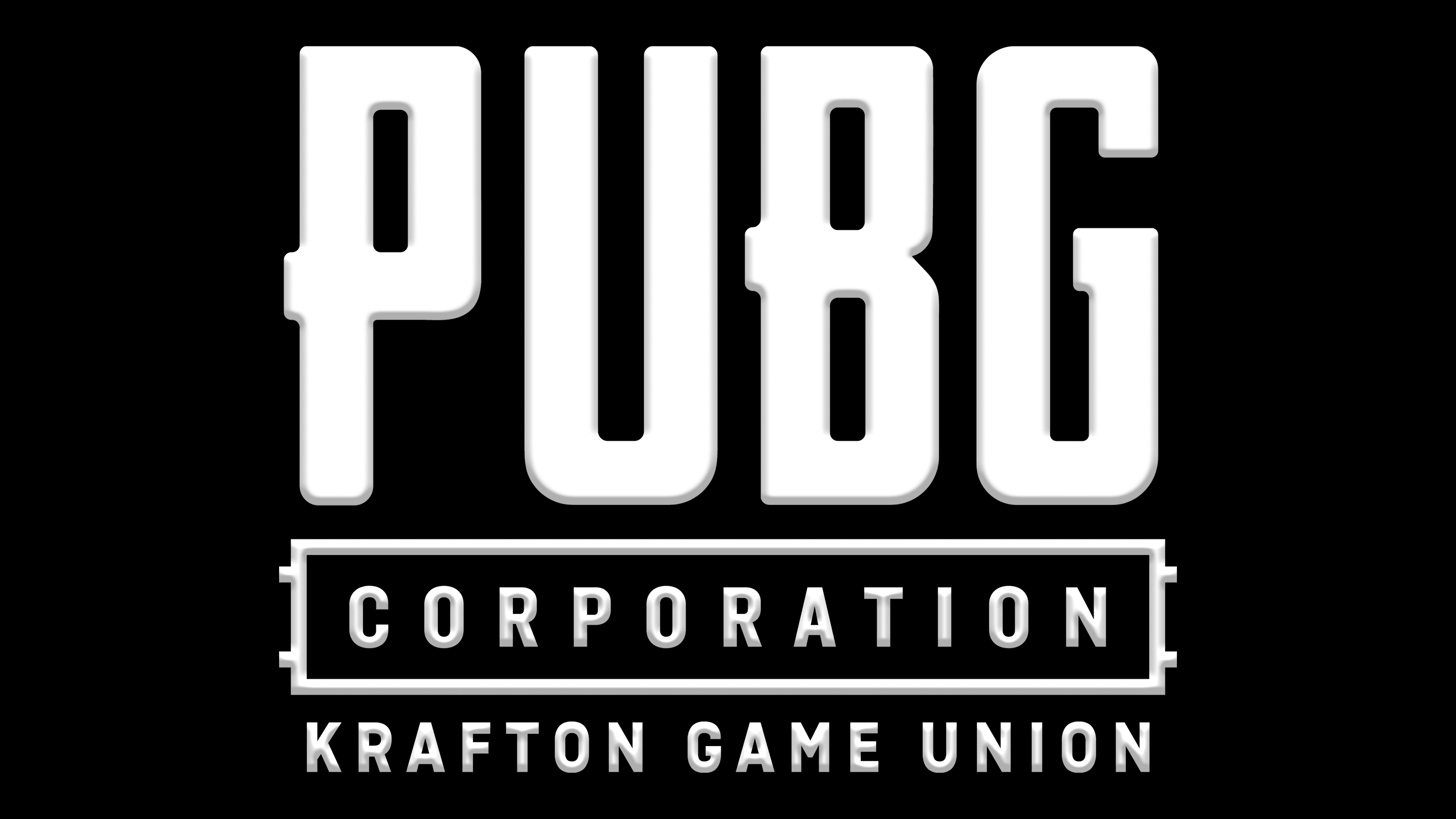
2018 – today
![]()
In 2018, Bluehole’s parent company created the Krafton Game Union, which included its brands. The new service has modernized the emblems of all the studios it has united, keeping the old identity only for PUBG. But in connection with the structure reform, she nevertheless changed the bottom line. As a result, instead of “A Bluehole Company,” the actual inscription “Krafton Game Union” appeared, indicating to which video game development agency the agency belongs. At the same time, the designers left the old font. Left and right alignment has also been preserved.
The key feature of the PUBG logo is rigor and stability. While modernizing the identity (even after the rebranding), it retained its structure and style exactly, remaining as monochrome, businesslike, and practical as before. Therefore, its evolution is just a replacement of inscriptions.
Font and Colors
The developers chose typefaces for the game creator’s visual identity that, with slight changes, resemble Flywheel Condensed Fat, Vintage Fonts Collection VFC Fantomen, and Bricked Bold. Despite the gaming theme, the PUBG corporate palette consists of a classic combination of black (inscriptions, frame) and white (background).