![]()
Qasa, a fast-growing prop-tech company focused on improving the home rental experience, has introduced a new logo and brand identity designed by Bold Scandinavia. Qasa aims to make renting a home a happier experience for homeowners and tenants.
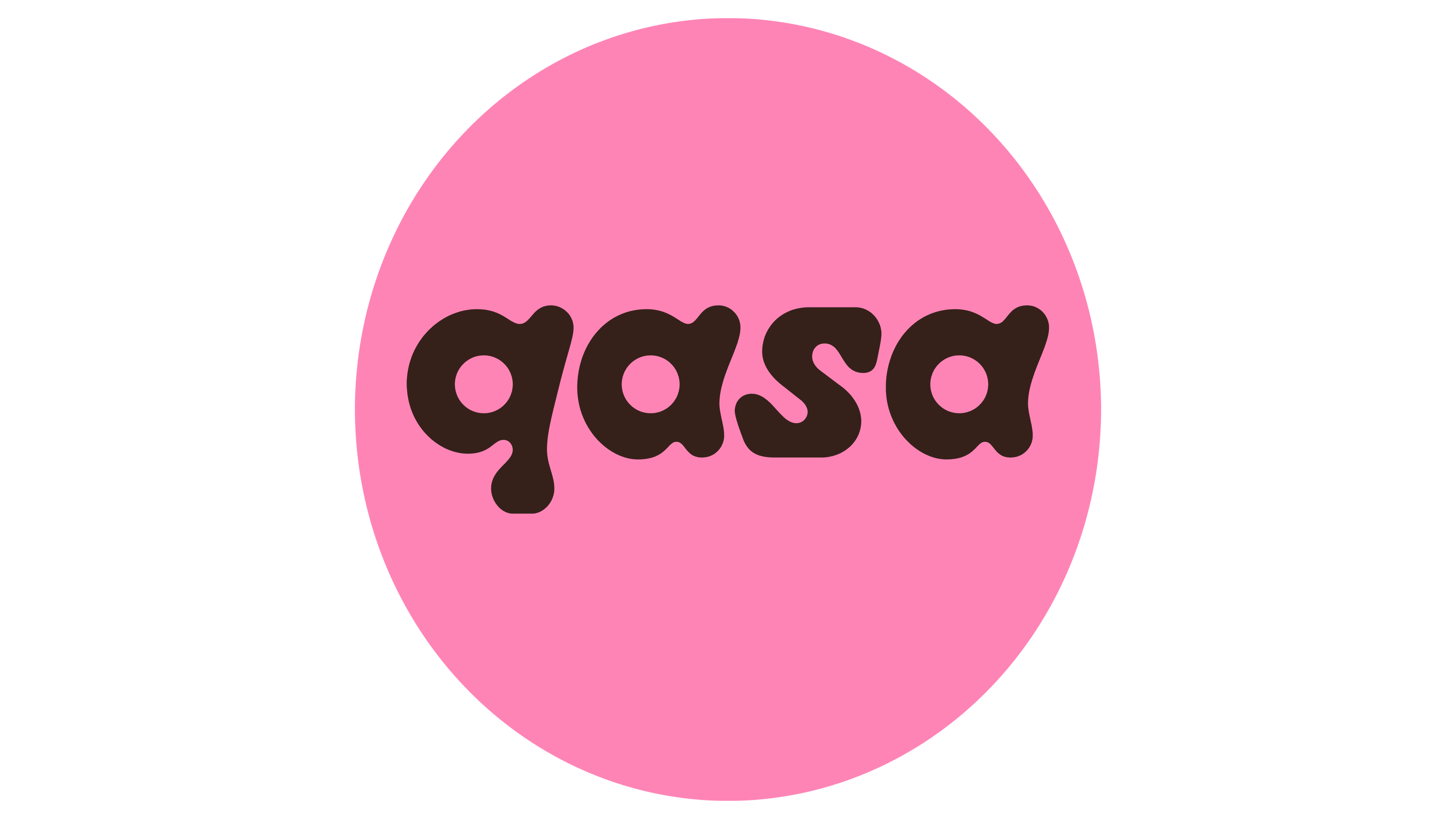
The previous logo had an abstract house icon and a geometric sans-serif wordmark. The new logo is more playful and unconventional. It features a friendly, gooey design with an italic structure, thick ink swells, and tiny descenders. The letters fit well together, creating a balanced wordmark. The “q” has a flat descender that aligns with the “s,” maintaining visual consistency.
![]()
The logo animation adds to the playful nature, with the letters moving fluidly. The 3D variations are visually interesting but may seem unnecessary.
A standout feature of the new identity is the inflatable, plush-textured icons. These icons convey coziness and comfort, embodying the feeling of home. The concept of “Lovable all around” combines structural and organic forms to reflect the feeling of being at home.
![]()
The primary typeface is Dinamo’s Diatype Rounded, which aligns with the playful logo. It avoids looking cheap on digital platforms. The Diatype Rounded Semi-Mono style balances playfulness with the trustworthiness needed for a rental service.
The new visual identity includes posters with groovy illustrations, minimalist business cards, and guides. The inflatable icons and expressive illustrations add a warm and welcoming tone, making the brand approachable.
The rebranding positions Qasa as a next-generation global home-rental experience, focusing on the feeling of home rather than just transactions. The expressive design language ties all elements together, from the logo to typography, illustrations, UI components, and graphic elements. The vibrant and friendly color palette adds warmth and welcome, aligning with Qasa’s mission to create a better rental experience.