With roots deeply entrenched in Portland, Oregon, since 1906, Radius Recycling has earned its place as an industry titan in North American metal recycling. The company exemplifies sustainable entrepreneurship with an expansive network spanning 25 states and Puerto Rico and even reaching the distant shores of Western Canada. Its impact isn’t limited to the mainland; Radius extends its reach with seven prominent deep-water export facilities from the East to the West coasts, stretching to Hawaii and Puerto Rico. Venturing beyond metal recycling, the firm has made inroads into retail with 50 outlets dedicated to quality auto parts from reclaimed vehicles, drawing an impressive footfall of over 4.1 million visitors annually. Moreover, their foray into steel manufacturing has spawned a diverse product range, from everyday rebars to specialized wire rods.
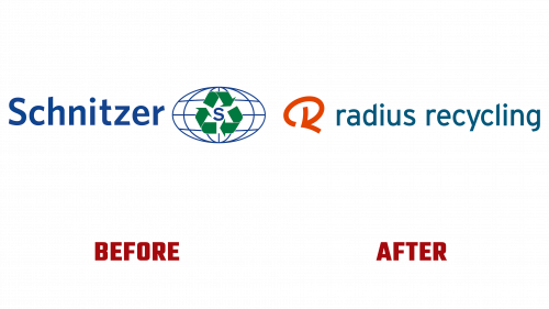
However, staying relevant in a constantly evolving market necessitates more than just operational excellence; branding is indispensable. Radius Recycling’s logo earlier, in all honesty, was a vanilla representation. Its generic design – a commonplace recycling icon crowned atop a globe, surrounded by an oddly placed “S” – often led to misinterpretations and didn’t truly resonate with the company’s ethos.
Radius entrusted the acclaimed design firm, Chermayeff & Geismar & Haviv, in a daring pivot, to conjure a fresh logo. The result? A strikingly minimalist yet impactful “R” monogram that seamlessly conveys the tenets of recycling and sustainability. This iconic symbol could easily rank amongst the firm’s best creations.
But, the subsequent branding elements fall short of this high bar. The all-lowercase wordmark, framed in the vintage-esque Frere-Jones’ Interstate typeface, feels oddly anachronistic. The decision to embrace a color scheme fusing burnt orange with a deep teal hue raises eyebrows, especially when a classic black might have lent more gravitas to the powerful monogram. Additionally, while the monogram could have triumphantly stood on its own, the subsequent animation detracts rather than enhancing its presence.
While Chermayeff & Geismar & Haviv have historically prioritized design over the application, the execution leaves something to be desired; a sentiment echoed even on Radius’s official website.
To wrap up, Radius Recycling’s rebranding journey juxtaposes sheer design brilliance and some perplexing choices. The industry and its vast clientele will determine if this new branding chapter truly captures the spirit of a century-old giant.


