The Radius Recycling logo exudes a contemporary design, reflecting the metal processing facility’s recent rebranding and fresh visual identity. The logo features a sleek inscription enriched by a compelling capital letter, the red “R,” laden with multi-layered meaning. This “R” not only stands for the company’s name but embodies the radius of a circle and incorporates an arrow indicative of the recycling process.
A unique icon is to the left of the dark blue inscription, fashioned in a lowercase typeface. The majority of the glyphs are rounded, without the presence of any serif or angular elements. The soft curves and smooth lines, particularly noticeable in the “i,” “y,” and “l” characters, symbolize a fluid, cyclical process aligning with the core operations of Radius Recycling.
The color choice is deliberate. Red, represented in the “R,” suggests energy, passion, and action, aptly describing the company’s dynamic approach to metal recycling. The dark blue of the text adds a contrasting layer of depth and trustworthiness to the logo’s overall appearance.
The arrangement of these components is not arbitrary. The solitary icon on the left acts as an inviting entry point, directing the viewer’s attention toward the company’s name, subtly spelled out in lowercase letters. The rounded design elements further perpetuate the idea of cycles and sustainability, resonating with the goals of metal recycling.
In encapsulating these various components, the emblem successfully conveys the company’s commitment to innovative, sustainable metal recycling within a modern and compelling visual narrative. The Radius Recycling logo is a complex yet clear statement of the company’s identity, mission, and core values.
Radius Recycling: Brand overview
| Founded: | 1906 |
| Founder: | Sam Schnitzer |
| Headquarters: | Portland, Oregon |
| Website: | www.schnitzersteel.com |
As the years rolled by, Radius, fueled by its vision, undertook several acquisitions, steadily expanding its footprint across steel mills and scrap metal sites throughout the Western United States. The 1990s marked a significant milestone as the company debuted on the NASDAQ stock exchange under the name Schnitzer Steel Industries with the SCHN ticker.
The subsequent decades witnessed Radius/Schnitzer stretching its wings, broadening its horizons via acquisitions, mergers, and collaborative ventures. These strategic decisions entrenched its position as a titan in North America’s metal recycling and steel manufacturing.
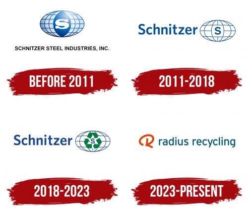
2008 was a year of mixed emotions for the company. While it commemorated a centennial of steadfast operations, the global financial downturn cast a shadow by dampening steel demand. Adapting to these market dynamics, the company underwent a strategic metamorphosis in 2011. Opting for a leaner approach, it divested several manufacturing entities, concentrating its energies on its foundational scrap metal recycling business instead. The ensuing years saw a revival, with the company ardently exploring synergies between recycling and manufacturing.
In a landmark move in 2023, after steadfastly serving the industry for over 115 years, the company embraced a rebranding initiative, adopting Radius Recycling with the stock ticker transitioning to RDUS. Radius Recycling stands tall as a formidable force in the North American metal recycling and steel manufacturing landscape, an emblem of over a century of commitment to sustainable practices.
Meaning and History
What is Radius Recycling?
Radius Recycling is a major metal recycling company based in the United States, recognized as one of the most sustainable in the world. The company collaborates with representatives from 48 states and is listed among the world’s most influential manufacturers. It was founded in 1906 by immigrant businessman Sam Schnitzer in Portland, Oregon.
