The Rainbow Six logo conveys strength and power. The emblem is a prototype of the battle between good and evil; only the user can choose which side he is on. The sign shows that the fight is starting right now. There is a labyrinth ahead, and only after reaching the end will the player be able to open the door and see the light.
Rainbow Six (r6): Brand overview
| Founded: | December 1, 2015 |
| Founder: | Ubisoft Montreal |
| Headquarters: | Montreal, Canada |
Rainbow Six is a media franchise based on the same name as a fictional international counter-terrorism department. Written and written by US writer Tom Clancy. The work began by adapting a literary text to the video game series of the same name. These are tactical first-person shooters. The project was launched in 1995. A team of the developer (Sébastien Labbé), designer (Daniel Drapeau), programmer (Jalal Eddine El Mansouri), artist (Po Yuen Kenny Lam), screenwriter (Li Kuo), and composers (Paul Haslinger and Ben Frost) worked on it. It the published by two companies owned by Ubisoft: Montreal and Red Storm.
In early winter 2015, the shooter was officially released for several platforms at once, including Xbox One, PlayStation 4, and Microsoft Windows. Five years later, in December 2020, a video game for the Xbox Series X / S and PlayStation 5 appeared. The emblems were released in parallel with computer games.
The main focus is on the destruction of the environment and the interaction between the participants. Each player takes control of a defender or attacker in any of the modes. And there are mainly three of them: control over the target in the room, defusing the bomb, and rescuing people taken hostage. Several operators in the Rainbow team and different nationalities have different ammunition (weapons and gadgets). The game structure is not equal, so the choice of individual capabilities of teams is not the same. Everyone has their skills and capabilities.
Interaction is between the base CTUs (Counter-Terrorism Directorates). They include several units: FBI SWAT (American hostage rescue), SAS (English), GSG-9 (German), special forces (Russian), and GIGN (French). Players can choose four operators per unit in each. The division takes place between defenders and attackers.
There is no campaign indication in the titles and designs of video games. There is only a series of small independent missions called situations. They can be played alone. The plot of such missions is generalized since what is happening is focused on recruits who are being trained to confront terrorists who threaten the security of the whole world. There are many video game releases, each with its logo and its addition to the shooter’s name.
Meaning and History
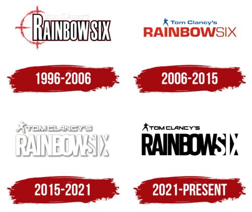
Many games have been released as part of Tom Clancy’s Rainbow Six franchise. The first tactical shooter came out in 1998, followed by several sequels with expansion packs. Until 2006, before the appearance of the sixth part called Rainbow Six: Vegas, the game’s logo had a common symbol – a red sight. Then the designers replaced it with an image of a military man with small arms. The logo was changed to white on the cover of Rainbow Six Siege 2015. But less than six years later, the developers repainted it black, using white only for the negative space that formed the letters “S,” “I,” and “X.”
What is Rainbow Six?
This is the abbreviated name of Tom Clancy’s Rainbow Six franchise, based on the techno-thriller by American writer Thomas Leo Clancy Jr., published in 1998. The first video game based on the Rainbow Six storyline was developed simultaneously during the creation of the novel. The series now includes over twenty tactical shooters, united by the history of a fictional counter-terrorist organization.
1996 – 2006
The first game and several subsequent ones had a logo with “RAINBOW SIX” in large white lettering, which used a bold, vertically elongated font. All the glyphs were capitalized, but the designers increased the “R” so the wordmark was asymmetrical. There was virtually no spacing between letters. They did not merge only thanks to the double black and red outlines.
At the top was a smaller white word, “Tom Clancy’s.” It was hard to see on a light background because the developers circled the glyphs with thin gray lines. For this part of the inscription, a contrasting bold font was chosen. To the left of the text, the artists depicted half of the sight as a red half-ring with three stripes. This element symbolizes the militaristic focus of the game.
2006 – 2015
When the sixth part of the series (Tom Clancy’s Rainbow Six: Vegas) was released, a new logo appeared – without a stylized crosshair. In the upper left corner was the silhouette of a man armed with a firearm. He aimed with his arm outstretched and one foot out in front of him. The designers made the image dark blue, and the same color was used for the phrase “Tom Clancy’s” located on the right. The bottom lettering, “RAINBOW SIX,” became dark red, while there was no space between the two words. They were visually separated only by the font: the first seven letters were bold, and the last three were thin.
2015 – 2021
In 2015, Tom Clancy’s Rainbow Six Siege was released with a new redesigned logo. The designers kept the two-level inscription but changed the fonts on both lines. As a result, an asymmetrical bold sans serif with right angles began to be used for the top phrase. And the bottom phrase consisted of vertically elongated bold letters that merged. Narrow intervals were only between “I,” “N,” and “B.” The words “TOM,” “CLANCY’S,” and “RAINBOW” were in white. They were surrounded by translucent gray shadows of uneven thickness, making the emblem three-dimensional. The word “SIX” was formed by voluminous gray shadows on a white background. In this case, the designers applied the effect of negative space.
2021 – today
The emblem has a horizontally elongated shape filled with a miniature icon and several inscriptions. There is a trademark in the upper left corner – an armed man wearing a military uniform and with a machine gun in his hands. He froze in the scope with a willingness to shoot and at any moment to engage in combat.
Next to the fighter are the author’s name and surname – “Tom Clancy’s.” Below them is the full name of the video game in uppercase. The elongated letters sit so closely next to each other that they merge. They are interconnected in the syllables “RAI” and “BOW,” and the “N” is separated from them on both sides by thin vertical stripes. The word “Six” is in negative space.
In contrast to “Rainbow,” it is painted white and appears to appear from the dark background. “X” is only half visible; the rest is absorbed by the light transition to a high vertical line. Behind it is the name of this version of the game.
Rainbow Six (r6): Interesting Facts
“Rainbow Six” (R6) is a video game series by Ubisoft, inspired by Tom Clancy’s novel. It’s known for its focus on strategy and teamwork.
- Based on a Novel: The game started with Clancy’s 1998 novel, featuring a counter-terrorism unit named “Rainbow.” The first game came out the same year.
- Tactical Gameplay: “Rainbow Six” helped popularize the tactical shooter genre. It’s different from usual shooters because it values realism, strategy, and teamwork. Players must plan, pick their equipment wisely, and carry out missions as a team.
- Variety of Games: The series includes many games, each displaying different aspects of the Rainbow unit through new stories and gameplay features. However, they all stick to the series’ tactical roots.
- “Rainbow Six Siege”: Released in 2015, this game became very successful by focusing on multiplayer action, destructible settings, and quick, strategy-heavy matches. It brought new life to the series and created a big esports community.
- Realistic Details: Ubisoft did a lot of research to make the games feel real. They talked to military and counter-terrorism experts to get the details right, from weapons to tactics.
- Esports: “Rainbow Six Siege” is a big esports event with many tournaments, including the Six Invitational. The game’s focus on team play makes it a favorite for competitions.
- Updates and Community: Ubisoft keeps the game fresh with new content and listens to player feedback. This approach has kept the player community active and involved.
- Worldwide Appeal: The game features characters from all over the world, showing the global nature of the Rainbow unit. This has helped attract a worldwide audience.
- Training Use: Some military groups use “Rainbow Six Siege” for training because it emphasizes tactics and teamwork in realistic scenarios.
- Player Involvement: Ubisoft works closely with the game’s community, using their feedback to improve the game over time.
“Rainbow Six” has greatly impacted tactical video games by focusing on strategy, realism, and teamwork. It’s not just about the action but also about planning and working together, which has influenced other games and helped grow a dedicated player base and esports scene.
Font and Colors
The logos’ content moves from franchise to franchise and always consists of an icon with a fighter at the top left, the author’s name and surname, the general name of the series, and each specific issue’s name. Sometimes the layout of the elements on the common field changes. The lettering design, logo style, and typeface remain the same.
For the top caption (author’s name and surname), the designers used an individual font obtained by modifying several analogs. The letters are rounded at the inner corners, but outwardly they have pointed protrusions. The text in the lower rows is in a typeface as close as possible to Molde Condensed Black by Letritas or Lorimer No 2 Condensed Bold Dunwich by Type Founders.
The palette is predominantly black and white, but the latest version has two new colors. These are yellow lemon spectrum (code # f9e031) and deep gray with dark blue (shade # 183b4a).
FAQ
What do the Rainbow Six Siege symbols mean?
In Rainbow Six Siege, several symbols help players monitor game performance and connectivity. These include Ping, Connection, FPS, and Host icons.
- Ping Icon: This icon shows the latency between your game and the server. A high ping means a delay that can affect gameplay.
- Connection Icon: This icon indicates the quality of your internet connection and alerts you to issues like packet loss or instability that could disrupt gameplay.
- FPS Icon: Displays Frames Per Second (FPS), showing how smoothly the game runs. Higher FPS means smoother gameplay; lower FPS can cause lag.
- Host Icon: This icon indicates the status of the server host and helps players understand if there are server-side issues affecting gameplay.
These symbols are crucial for tracking and fixing real-time internet and game performance issues, ensuring a better gaming experience.
What is the font of the Rainbow Six logo?
The logo uses different fonts for its parts. The top line, “TOM CLANCY’S,” is in a font similar to Ghost Clan Regular. The series title, “RAINBOW SIX,” uses a custom font inspired by Scout Condensed Bold. For the game’s name, “Quarantine,” the font is similar to Lorimer No 2 Condensed Bold Dunwich or Molde Condensed Black.
These fonts create a cohesive and recognizable look. The bold, sans-serif style gives the logo a strong, modern appearance that fits the tactical and intense nature of the game. Combining these fonts helps the logo stand out and maintain a consistent visual identity across different titles in the series.
What does the Rainbow Six logo mean?
The Rainbow Six logo is full of symbolism. It features an armed man in a military uniform, representing the game’s focus on tactical and combat. This figure highlights the realistic and intense nature of the gameplay.
The “RAINBOW SIX” inscription has a special meaning. The word “SIX” looks in ambush, directly referencing the game’s tactical shooter style. This design hints at the stealth and strategy players need to succeed, showing that careful planning and coordination are key.
Together, these elements capture the essence of the game, which requires precision, teamwork, and tactical skill. The logo conveys the game’s spirit, giving players a clear sense of what to expect regarding gameplay and experience.
