


 Random House Home Logo PNG
The Random House Home logo reflects both the brand name and its essence. The designers filled the emblem with bright colors, reflecting how the company brings stories from books to life by producing a range of entertainment shows, films, and cartoons based on them.
Random House Home Video grew out of the publishing house Bennett Cerf and Donald Klopfer founded in 1927. Before launching Random House, they had bought the Modern Library series from Boni & Liveright. Cerf later explained that the name referred to publishing books “at random.” Rockwell Kent drew the house logo.
Random House became a major U.S. publisher, with authors such as Dr. Seuss, Truman Capote, and William Faulkner in its catalog. RCA acquired the company in 1965, and Advance Publications took control in 1980. In 1983, Random House created a video division, initially called Random House Video, which was renamed Random House Home Video in 1984.
Its first major move was to buy the rights to 17 years of Sesame Street episodes, a logical step because the related books were already in the Random House catalog. In 1986, the company worked with Children’s Television Workshop on My Sesame Street Home Video, a preschool series with 16 releases that continued until 1994.
The catalog later included The Berenstain Bears (1988), The Busy World of Richard Scarry (1993), and Arthur (1996). In the children’s home video market, it competed with Disney Home Video. From 1994, distribution was handled by Sony Wonder, which continued to use the Random House Home Video logo on Arthur tapes and DVDs until 2004. Bertelsmann bought Random House in 1998, and Penguin Random House was formed in 2013 following the merger of the Penguin Group. The division’s logo kept the parent brand’s house image, adding a rainbow and serif lettering.
Meaning and History
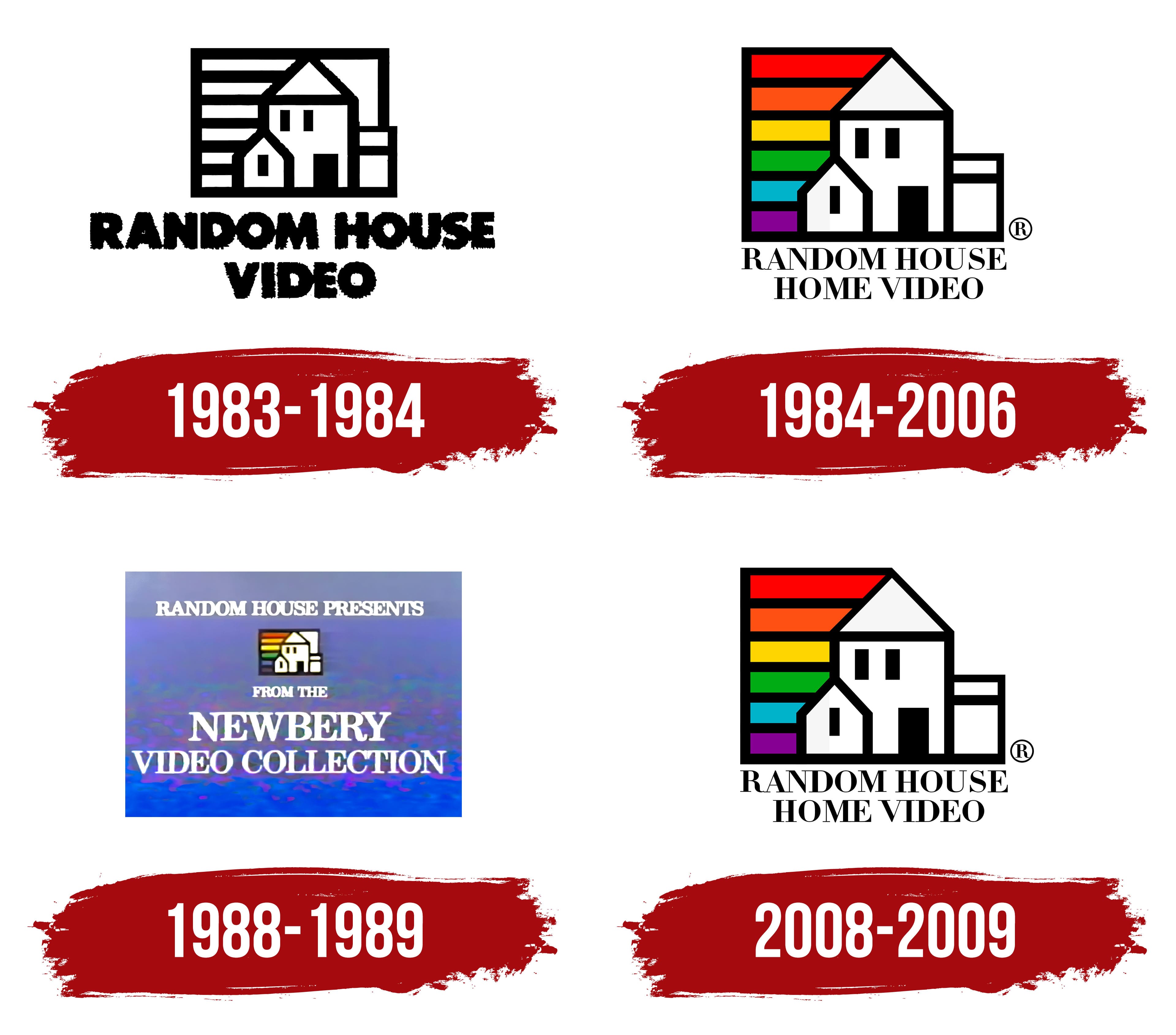
The parent company, Penguin Random House, was established almost 60 years before the subsidiary film studio was registered to produce video content based on novel plots. Throughout Random House Home’s period of operation, users were presented with several logo variations. New options complemented the previous ones, making the logo more modern and friendly to the target audience.
What is Random House Home?
This is a subsidiary of Random House, which produced films and TV series based on plots from books published by the publishing house.
1983 – 1984
The original Random House Home logo was introduced in 1983, almost immediately after the subsidiary’s launch. However, this option lasted only a few months before a redesign was carried out. It was a lively, eye-catching black-and-white logo. It consisted of two elements: the emblem and the verbal inscription beneath the image. The emblem featured several painted houses inside the square. The left part was divided into several horizontal lines. The brand name was set in two lines: on the top, “Random House,” and on the second line, “Home Video.” The wordmark used a classic, bold sans-serif typeface with thick lines. All letters in the name are capitalized, adding confidence and strength to the logo and making it more attractive to the target audience.
1984 – 2006
The first redesign made the logo more elegant and modern. The element layout remained identical, but the wordmark was set in a new font. It used a modern serif typeface with tall letters. Although the bold type remained, the characters’ lines became much narrower, making them look more convincing and confident to users.
The graphic part received a new color palette. If the first version of Random House Home had placed horizontal lines only on the left side, the space between them would have been colored. All colors of the rainbow were used. The houses in the image also became clearer.
1988 – 1989
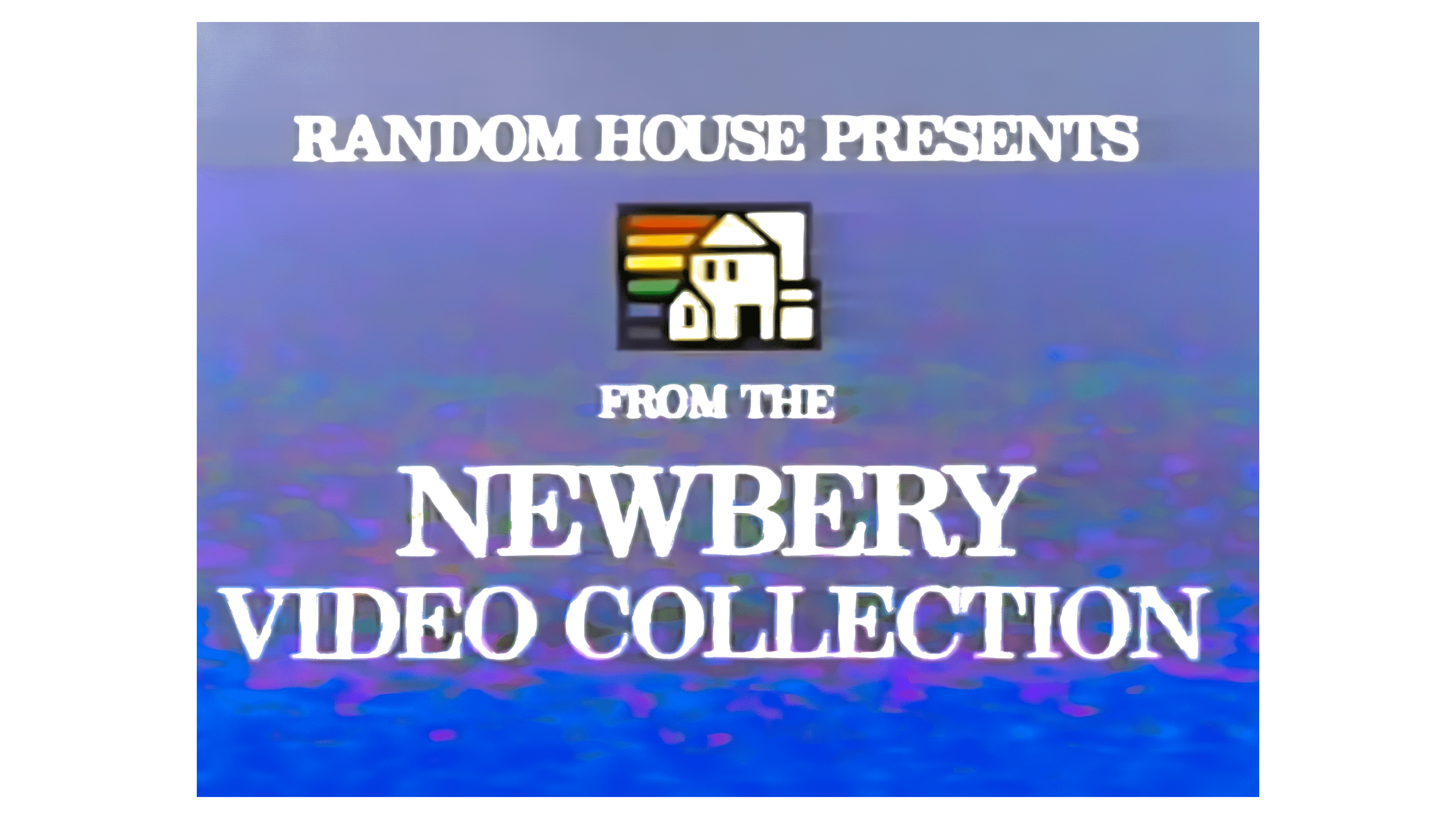
Alongside the previous version, another logo was used briefly. Here, the logo was presented on a light purple background. The emblem occupied the central zone, while inscriptions made in white letters were presented above and below. It said “Random House Presents” at the top. The graphic part hasn’t changed much but looks less elegant.
2008 – 2009
Before the Random House Home Video project was closed, it was decided to return to the 1984-2006 logo. It was an identical variant, with a smooth font, serifs, and two lines of text.
Font and Colors
During the studio’s existence, several font types were used. It originally used a classic, bold sans-serif typeface. From 1984 to 2006, the most requested version used an elegant serif typeface with tall letters.
The logo uses a black-and-white color palette. At the same time, in certain cases, all the colors of the rainbow are used, with the help of which the space between the horizontal lines is painted over. Thus, representatives from Random House Home indicated they were ready to implement stories in video format in various directions.