The Ravn Alaska logo reflects the company’s strength and reliability. It provides comfortable flights for residents of one of the coldest regions in the United States. The emblem symbolizes accessibility and convenience, highlighting the brand’s leading role in connecting different cities.
Ravn Alaska: Brand overview
Ravn Alaska, a notable aviation entity rooted in Anchorage, Alaska, offered air services from 1948 until its closure in 2020. It was primarily dedicated to facilitating travel within Alaska, maintaining Anchorage as its core operational hub.
The airline’s fleet comprised approximately 30 aircraft, including De Havilland Dash 8 turboprops. Ravn Alaska bridged the gap between remote Alaskan locales and significant hubs like Anchorage by providing regular passenger flights and charter services.
In 2019, the airline made impressive strides, carrying north of 300,000 passengers across approximately 400 daily flights traversing Alaska. Ravn Alaska didn’t exist in a vacuum—it emerged from the unification of five preceding Alaskan airlines: Era Aviation, Hageland Aviation, Frontier Flying Service, Corvus Airlines, and PenAir.
An integral part of its services involved codeshare connections with bigger aviation names such as Alaska Airlines, American Airlines, and United Airlines. However, the COVID-19 pandemic dealt a harsh blow to Ravn Alaska, drastically reducing demand. Consequently, it had to halt operations and file for bankruptcy in April 2020.
FLOAT Shuttle, an aviation firm, acquired most of Ravn Alaska’s assets towards the end of 2020, with plans to revive some of the airline’s former services. At its zenith, Ravn Alaska, along with its regional partners, was a significant employer, providing jobs for more than 1,200 people across the state.
Meaning and History
What is Ravn Alaska?
Based in Anchorage, this regional airline is key in providing air transportation in the USA’s largest and least populated state. The company stands out for its unique route network connecting remote communities in Alaska, many accessible only by air. It operates a fleet of De Havilland Dash 8 turboprop aircraft, which are ideal for operating in harsh Arctic conditions and on short runways.
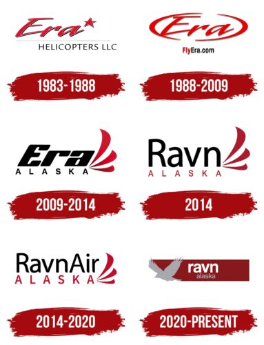
1983 – 1988
Ravn Alaska began as Economic Helicopters and was later renamed Era Helicopters, adopting a new logo with the new name. During this time, its operations expanded to include passenger transportation, so the emblem reflects the brand’s historical connection to helicopters and its continuous drive for progress.
The desire for innovation is expressed through the image of a large five-pointed star rising above the word “Era” and moving forward. This symbolizes leadership, strength, bold decisions, and ambitious plans. In aviation, the star represents the safety and reliability of transportation. It signifies prestige, authority, and high-quality services.
The first word is designed in a unique handwritten italic script. The slanted letters and sharp lines with tapered ends convey the dynamism that helps Ravn Alaska transport residents of one of the coldest states in the USA. The reddish-pink color embodies fiery energy, showing the company’s passion for work and desire to please passengers. The vibrant palette enhances brand recognition and memorability.
The upper part of the logo has a distinctive three-dimensional texture. The five-pointed star and letters are outlined with white and black stripes, resembling uneven shadows, giving the emblem a 3D appearance. This design demonstrates the company’s modernity and commitment to progressive solutions.
The word “Era” is underlined with a long, thin line, creating the illusion of rapid movement. This symbolizes the airline’s adherence to a strict flight schedule and punctuality. Below is a simple black inscription, “HELICOPTERS LLC,” in a thin sans-serif font. The strict style reflects the brand’s seriousness and supports its business image.
1988 – 2009
In 1988, the airline underwent restructuring and changed its name to Era Aviation, resulting in a new logo. The only element retained from the previous version was the first word, which is now inside an open oval. The text and the rounded frame are bright red with a barely noticeable gray shadow. The fact that the red color became more intense indicates the brand’s growing confidence and intention to develop and actively evoke a range of emotions in passengers.
The oval border makes the word “Era” more prominent while symbolizing the clear boundaries the company strives to adhere to. These requirements pertain to punctuality, regular flights, and quality service.
To make it easier for passengers to use the airline’s services, designers placed the inscription “FlyEra.com” at the bottom of the emblem. They highlighted the first word in red and made the rest black for better contrast. Including the website address in the brand logo is a smart marketing move to increase Ravn Alaska’s recognition.
2009 – 2014
In 2009, Era Aviation became part of the newly formed airline group Era Alaska, creating a new logo. Designers reimagined the oval frame, transforming it into three stripes arranged one above the other, resembling the petals of a whimsical flower. Their elongated shape with pointed ends conveys the brand’s active character.
The dynamism is expressed in expressive colors: the maroon-black combination creates an interesting contrast associated with power and authority. This symbolizes the strong emotions passengers experience from fast and comfortable air travel. The gradient texture gives an impression of movement, making it seem like the emblem is about to take off.
The idea of flight is embodied in the image of a bird’s wing, as the three different-length stripes resemble feathers. This shows Ravn Alaska’s connection to passenger transportation. The wing symbolizes aviation and the company’s care for the comfort and safety of its clients.
The name of the airline group is colored black, which is associated with seriousness and professionalism. The same impression is conveyed by the font of the word “ALASKA” – a thin geometric sans-serif. The uppercase letters with wide spacing evoke a sense of space, freedom, and the open sky.
The upper word “Era” has a completely different style, close to a futuristic look. Its modern design highlights the company’s innovative approach to everything it does. The large bold letters don’t appear heavy because their corners are rounded. This font creates a sense of softness, friendliness, and accessibility, fostering trust in Ravn Alaska’s services.
2014
The airline wanted to avoid being confused with other Era brands, so it changed its name to Ravn Alaska and introduced a new logo. Designers removed the gradient, coloring the three “feathers” in a uniform maroon shade. Its velvet texture evokes elegance, luxury, and refined taste. This color emphasizes the airline’s prestige and its attention to passenger comfort.
The idea of care is conveyed in the wing image, formed by three curved stripes with smooth bends. The wing symbolizes flight and the ability to cover long distances by air. The brand name is visually divided into two parts:
- The word “Ravn” dominates in size and position, as designers wanted to emphasize it.
- The word “ALASKA” stands out only due to its maroon color, which harmonizes well with black.
All these elements enhance the airline’s recognizability. Designers unified the text style, using a consistent font for both lines – a thin geometric sans-serif. The even shape of the letters instills confidence in the company’s stability and reliability. The lack of serifs makes the emblem minimalist and modern. This demonstrates Ravn Alaska’s commitment to progress and adopting new technologies in the aviation industry.
2014 – 2020
This logo differs from the previous one in several details that may seem insignificant at first glance.
- “Air” has been added at the top, making the company’s connection to aviation clearer.
- Designers had to reduce the size of the letters in the first line and increase those in the second to balance both parts of the text. The brand name looks unified and is perceived as a symbol of coherence and unity in Ravn Alaska’s operations.
- The simple, strict sans-serif font has been replaced with an original typeface featuring smooth, rounded ends on some letters. Designers visually softened the text to create a sense of comfort and safety. This style complements the shape of the three “feathers.”
- The stylized wing has been reduced in size and moved down, starting next to the last letter “A” in “ALASKA.” This balances the logo, symbolizing the company’s pursuit of harmony and coordination.
- The maroon color has taken on a lighter and brighter shade. It still conveys a sense of luxury, but now it embodies energy and passion.
2020 – today
In 2020, the airline went bankrupt and then resumed operations. Upon relaunch, it completely rebranded and adopted a new logo, entirely different from previous versions.
The brand abandoned its traditional stylized wing symbol. Now, its name is illustrated with a flying bird, resembling a silhouette raven. The sharp beak and jagged feathers evoke a sense of danger, but this doesn’t threaten passengers. Instead, it demonstrates Ravn Alaska’s competitiveness.
The bird flies to the left, leaving behind a wide, long, rectangular trail. This trail contains the company name: ” Ravn” in white and “Alaska” in gray. Designers placed the text on a dark maroon background to make it stand out. The combination of contrasting colors gives the emblem a stylish and modern appearance.
Regarding the font, the wordmark is now in lowercase sans-serif letters. The bold, grotesque typeface closely resembles Camber Semi Bold by Emtype Foundry. Lowercase letters usually suggest an informal style, youth culture, and dynamism. In the context of an airline, it reflects the company’s aim to create a friendly and appealing image.
Font and Colors
The logo features a modern, easy-to-read font that communicates the brand’s identity. The name is displayed across two lines, with “RAVN” and “ALASKA” on the bottom. Both words are written in uppercase letters, which instills a sense of authority and confidence in the logo’s design.
Though the precise name of the font used in the logo remains unknown, it resembles grotesque fonts like Helvetica or Arial. These fonts are known for their simplicity and clean lines, making them suitable for corporate logos seeking clarity and professionalism.
The logo’s color palette consists of three primary colors: red, white, and gray. Red serves as the background color and symbolizes energy and passion, both vital attributes for the brand. White is used for the word “RAVN,” ensuring that the company name stands out prominently against the red background. Gray is utilized for the word “ALASKA,” creating a clear contrast highlighting the airline’s association with the American state of Alaska.
Combining these colors and font styles creates a visually appealing logo that effectively conveys the brand’s core values and geographical identity. Red, white, and gray add a dynamic yet balanced look, with each element playing a crucial role in the overall design, ensuring the logo is memorable and impactful.
