The logo of Raya Airways reflects the company’s connection to aviation and Malaysian culture. The emblem’s graphic elements convey the brand’s authenticity while highlighting its mission in the cargo transportation sector, showcasing the global scale of its operations.
Raya Airways: Brand overview
Raya Airways emerged on the aviation scene in 2005 under the name Transmile Air Services Sdn Bhd, based in Subang, Selangor, Malaysia. The company’s inception aimed to cater to the burgeoning demand for cargo transportation within Southeast Asia, mirroring the region’s swift economic growth, particularly in Malaysia and its neighboring nations.
By 2006, Transmile Air Services commenced operations, launching cargo flights from its hub at Sultan Abdul Aziz Shah Airport in Kuala Lumpur. With a modest fleet, the company initially focused on domestic routes and nearby international destinations.
From 2007 to 2010, the airline’s reach expanded significantly. New routes across Southeast Asia were added, and the fleet grew to accommodate the increasing demand for cargo services in the region.
A pivotal transformation occurred in 2013 when new investors acquired Transmile Air Services, leading to its rebranding as Raya Airways. This marked a fresh chapter for the company, embodying a commitment to growth and operational enhancement.
Following this rebranding, the company undertook fleet modernization in 2014, acquiring Boeing 757-200F aircraft. These additions bolstered cargo capacity and operational efficiency on crucial routes.
2015, the airline extended its international footprint with new routes to China, Vietnam, and Indonesia. This expansion underscored Malaysia’s role as a regional logistics hub and strengthened trade flows between ASEAN countries and China.
Substantial infrastructure investments were made at Subang Airport in 2016. The development of the cargo terminal and upgraded warehousing facilities aimed to optimize operations and enhance service quality.
The company forged strategic partnerships in 2017 with leading logistics and courier companies, broadening its service offerings and providing comprehensive logistics solutions to customers.
In 2018, the airline embraced technological advancements. It implemented a new cargo management system to streamline operations and boost efficiency, and blockchain technology was adopted to enhance transparency and security within the supply chain.
In 2019, the company shifted its focus towards specialized cargo services, catering to transporting perishable goods and pharmaceuticals. Investments in specialized equipment and staff training ensured high service standards.
By 2020, the airline demonstrated adaptability amidst global market shifts. The company played a crucial role in maintaining supply chains within the region, particularly in meeting the heightened demand for medical supplies and e-commerce logistics.
Meaning and History
What is Raya Airways?
This Malaysian cargo airline is based at Sultan Abdul Aziz Shah Airport in Subang and is known for its specialization in express cargo delivery in Southeast Asia. The company operates a fleet of Boeing 767 and Boeing 737 aircraft, transporting cargo between key logistics centers in the region. It is known for its unique real-time tracking system, which allows customers to receive up-to-date information on the location of their shipments.
1993 – 2014
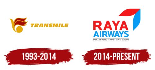
Before the extensive rebranding, Raya Airways was known as Transmile Air and used an optimistic logo that combined strict formality and creative originality. This combination made the company well-known in the cargo transportation market, at least in Malaysia.
The focal point is the mustard-yellow word “TRANSMILE.” Its bright color supports the brand’s optimistic image, while the slanted font creates a sense of movement. This showcases the high level of activity essential for the airline’s operations. The clear form of the bold letters reflects confidence and high professionalism.
The symbol next to it has a completely different look. It resembles a bird taking off with a sharp beak, wide red wings, and, most unusually, a large round tail. Due to this tail, the design looks like a whimsical musical note. The abstract emblem symbolizes flight, as Raya Airways specializes in air transportation. The subconscious reference to music suggests the ease and virtuosity with which the company performs its duties.
2014 – today
The logo of the Malaysian cargo airline exudes a welcoming and approachable vibe through its bright and vibrant colors, soft design, and richness of information. The emblem is a detailed billboard prominently featuring the airline’s name spread across two lines, with additional clarifications at the bottom, separated by distinct lines. The upper text parts are displayed in a large, sans-serif font. “Raya” stands out in vivid red, while “Airways” is highlighted in bold blue. A two-color element resembling a paired leaf is positioned on the right side.
The presence of multiple elements in the logo, including the added clarifications and the two-color leaf, creates a multi-layered corporate identity. The striking contrast between the red and blue text ensures each part of the name is distinctly noticeable, effectively capturing attention. The sans-serif font, which is modern and clean, enhances the friendly and inviting tone the company aims to project.
The detailed design of the logo, with its vivid colors and distinct elements, communicates clarity and warmth. The emblem is an effective marketing tool because it displays the airline’s name and supplementary information. The red and blue colors create a striking visual impact, ensuring the logo is memorable and recognizable.
The paired leaf element adds a touch of nature and freshness to the design, further enhancing the logo’s welcoming feel. The overall composition, with its thoughtful combination of colors, font, and design elements, aligns perfectly with the airline’s brand identity. The logo’s comprehensive and well-thought-out design conveys a sense of reliability and friendliness, making it a strong representation of the airline’s values and goals.


