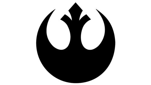
The Rebel Alliance logo is imbued with the spirit of struggle and resistance. It is the embodiment of mental and physical persistence directed against evil and injustice. The emblem demonstrates rebirth, resilience, and determination.
Rebel Alliance: Brand overview
| Founded: | between 19 BBY (Delegation of 2000) and 2 BBY (Declaration of Rebellion) |
| Headquarters: | Alderaan, Atollon, Dantooine, Yavin, Hoth, Tureen VII |
Meaning and History
According to the storyline, Princess Leia chose this sign, believing that her people needed a flag that embodied hope for the better. The presented image fits perfectly into this principle since it is associated with the Phoenix – a mythical bird reborn from the ashes. This symbol is also called Starbird: it is associated with concepts such as faith, resurrection, and constancy. It is used on rebel uniforms and helmets to make them stand out among others.
At the same time, this sign is a manifestation of respect for Galen Marek. After all, the element in the form of a heraldic lily adorned his dynasty’s coat of arms. However, it reminds not only of the legendary flower but also of a double halberd with sharpened ends. Therefore, some suggest that it came to the Rebel Alliance emblem from the seal of the Old Republic, which was in circulation during the Great Galactic War.
What is the Rebel Alliance?
The Rebel Alliance is a rebel coalition from the fictional world of the Star Wars franchise. It was organized by rebels who were against the Galactic Empire. Its tasks include restoring the liberal rule of the republic and uniting like-minded people who disagree with the authoritarian rule of the self-proclaimed emperor.
2000
The Rebel Alliance logo is graphic. It doesn’t have any text – only a rounded emblem with a harmonious balance of sharp and soft lines. Smooth contours are concentrated at the bottom of the symbol of eternity and faith, reminiscent of the edge of an axe, a crescent, and an inverted arc. Many images arise, but not all of them match the author’s original concept, as the semicircle is nothing other than the body of the mythical bird, the Phoenix, with its wings spread wide.
Also clearly visible are the neck and head of the mythical creature. It seems to be crowned, but that’s not the case – there is a wide crest. The outlines of a miniature crown are added as a symbolic decoration because there is a certain similarity between them. Corners, spikes, and rounded edges are perfectly balanced, not creating a sense of danger at all.
The image is designed so that it fits into an imaginary circle, so the bird seems to be in an improvised ring. And in the negative space (at the top, where the background is white), you can clearly see the outlines of two chicks with strong beaks. Their bodies are two ovals, and their heads are inclined towards the center as if they are clinging to their mother.
Font and Colors
There’s no text in the Rebel Alliance logo, so there’s nothing to say about typography. Colors are also not varied: the priority is only two contrasting shades. This is the classic combination of black and white, representing the eternal confrontation between good and evil.
Rebel Alliance color codes
| Black | Hex color: | #000000 |
|---|---|---|
| RGB: | 0 0 0 | |
| CMYK: | 0 0 0 100 | |
| Pantone: | PMS Process Black C |


