After a quarter-century of enchanting the palates of San Francisco with handcrafted chocolates, Recchiuti Confections has unveiled a transformative rebranding to rejuvenate its iconic identity. In collaboration with Manual, a design agency also rooted in the City by the Bay, Recchiuti Confections seeks to encapsulate its “Sublime Balance” ethos through its newly minted branding elements.
Inspired by a collection of customer feedback and testimonials, the phrase “Sublime Balance” emerged as the nucleus of the Recchiuti brand. It’s not just a tagline; it’s a philosophy that encapsulates the chocolatier’s mastery over contrasting elements like Classic+Contemporary and Sweet+Tart. Co-founders Michael and Jacky Recchiuti have prided themselves on their ingenious blends of traditional European craft and avant-garde flavors like tarragon grapefruit or star anise with pink peppercorn.
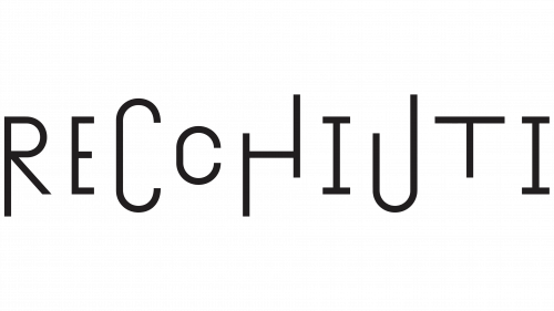
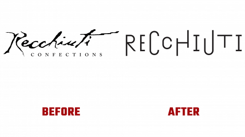
The Recchiuti logo has been reinvented to epitomize this balancing act. The new wordmark, drawn from Tightype’s Exposit, flaunts dynamic, breathing letterforms that seem to ebb and flow, almost like a dance of flavors in their chocolates. This is a radical transformation from the old logo, which, though aiming for authenticity, had faltered in its readability and symmetry.
Resembling musical notations scattered across a staff, the letters in the new wordmark convey an artful rhythm, reflecting Recchiuti’s cocktail of art and science, familiar and novel, and the old and the new. This musicality adds depth to Recchiuti’s branding, portraying it as not just a chocolatier but a curator of sensory experiences.
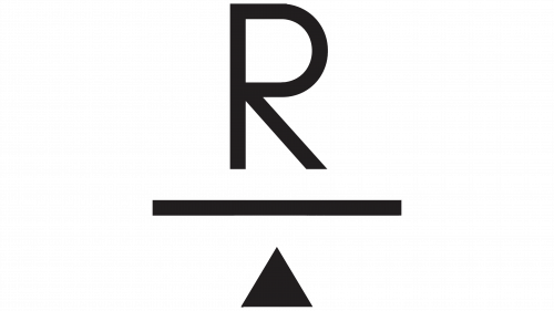
But the ingenuity doesn’t stop at the wordmark. As part of the visual overhaul, Recchiuti introduced a whimsical monogram featuring an abstract balancing board beneath the letter ‘R.’ This monogram is not just ornamental—it performs a functional role. Its location varies on the packaging to indicate whether the chocolate inside is a classic or a culinary experiment. Moreover, this balancing act of the ‘R’ monogram is animated in some of the brand’s materials, lending a sense of playfulness.
All these new visual elements work in concert to offer a more articulate, sophisticated, and harmonious representation of what Recchiuti Confections stands for. By addressing previous design limitations—notably, the legibility and balance issues—the rebrand brings Recchiuti’s visual identity perfectly aligned with its essence of “Sublime Balance.”
Recchiuti Confections has refreshed its 25-year-old brand with a renewed commitment to craft and innovation. As it moves forward with its refined identity, it’s poised to continue expanding its legacy in artisanal chocolates.


