


![]()
Recovery.com, formerly known as RehabPath, has undergone a rebranding to reflect its expanded mission of providing broader recovery support. The updated name and visual identity, created by design studio Denada, mark a shift in focus and reinforce the platform’s role as a reliable resource for individuals seeking recovery solutions.
The transition from RehabPath to Recovery.com is central to the rebranding effort. The new name is simple, universally relatable, and designed to connect with a wider audience. It captures the platform’s purpose as a comprehensive guide for the recovery journey, extending beyond traditional rehabilitation services.
![]()
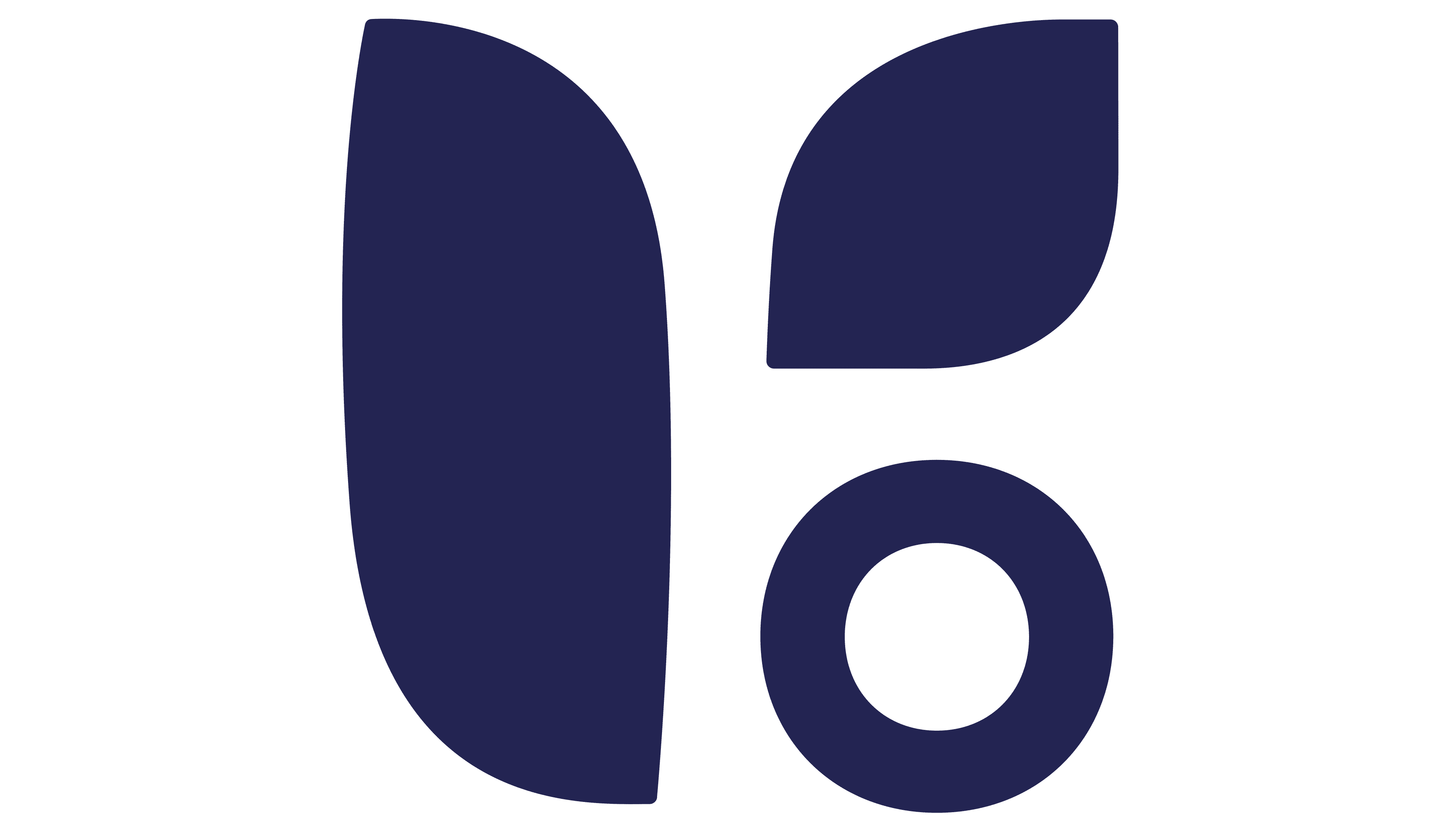
The new logo features a minimalist leaf icon, symbolizing hope, renewal, and growth. This visual metaphor ties directly to the platform’s mission of empowering individuals on their path to healing. The clean, straightforward design enhances recognizability, making the logo effective across various applications.
The typography for the rebrand incorporates a modern serif typeface that blends classic and contemporary elements. This design choice communicates professionalism and trust while remaining approachable. The refined font complements the leaf icon, creating a balanced and elegant look suited to a platform offering essential recovery support.
The color palette has shifted significantly, moving away from the previous bright pink and purple tones. The new black-and-white scheme projects seriousness, reliability, and versatility, aligning with the platform’s goal of being a dependable resource for users at all stages of recovery.
Previously, the RehabPath logo used a graphic element resembling a linear spectrum, symbolizing the diverse pathways to recovery. The new design simplifies this idea, focusing on universal symbols of growth and hope for a cleaner, more impactful visual. Moving from a playful aesthetic to a more polished and professional identity highlights Recovery.com’s evolution and dedication to its mission.
![]()
The rebranding reflects Recovery.com’s values of support, growth, and progress. The leaf icon emphasizes renewal, while the minimalist design simplifies access to resources and fosters empowerment.
This transformation marks an important moment for Recovery.com as it broadens its services and strengthens its connection with a diverse audience. The updated logo and visual identity position the platform as a trusted leader in the recovery space, ready to grow alongside the people it supports.