The Reese’s logo embodies the perfect blend of peanut butter and chocolate, a flavor combination that has become iconic worldwide. This symbol represents the joy and pleasure the company delivers to its consumers through its unique confections. The logo reflects Reese’s passion and creativity in candy-making, emphasizing the rich taste and high quality of its products. Reese’s offers memorable experiences that become part of the enjoyable moments in people’s lives.
Reese’s: Brand overview
Reese’s, known for its signature chocolate and peanut butter blend, began in 1917 with Harry Burnett Reese. He was a former farmer and dairy factory worker who started crafting candies in his basement in Hershey, Pennsylvania. His creation, Penny Cups, were the precursors to what we now know as Reese’s Peanut Butter Cups.
In the 1920s, these candies became popular in Hershey, prompting Reese to open a factory in 1923 and establish the H.B. Reese Candy Company. The Great Depression of the 1930s didn’t slow Reese’s growth; the Peanut Butter Cups were an affordable treat many loved. Reese also added more varieties to his product line during this time.
After Reese passed away in 1956, his company was sold to The Hershey Company in 1957 for $23.5 million, a significant acquisition. Under Hershey’s, Reese’s expanded further, introducing Reese’s Peanut Butter Chips in the 1960s and Reese’s Pieces in the 1970s, which became widely known after their feature in the 1982 movie “E.T. the Extra-Terrestrial.”
The brand kept innovating through the 1980s and 1990s, introducing products like the Nutrageous Bar, Reese’s Puffs Cereal, and Reese’s Sticks while maintaining its distinctive orange and brown packaging.
From the 2000s onward, Reese’s launched new products and flavors, such as Reese’s Big Cup and collaborated with other brands to create unique offerings. Today, Reese’s is a popular brand in the U.S. and sold in over 60 countries, with annual sales surpassing $500 million.
Meaning and History
What is Reese’s?
Reese’s is a renowned global brand of chocolate candies owned by The Hershey Company. Famous for its unique candies filled with peanut butter cream and coated in smooth milk or dark chocolate, Reese’s offers various shapes and sizes, including classic rounds, squares, hearts, and more. As one of the most popular and recognizable chocolate candy brands worldwide, Reese’s enjoys tremendous popularity among chocolate lovers of all ages.
1928 – 1929
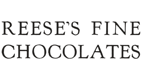
From 1928 to 1929, when Reese started in the confectionery business, the company’s main product was chocolate candies made with Hershey’s chocolate. Reese chose Hershey’s because of its high quality and taste, which helped make Reese’s products popular in the market.
The first logo of Reese’s highlighted these qualities. It featured the phrase “Fine Reese’s Chocolate” in sleek black letters, adding a touch of elegance to the design and underscoring the candies’ smooth flavor. The logo was designed to make a high-quality product appealing to a wide audience.
The logo indicated that Reese’s candies were priced at just one cent. This pricing strategy made the candies attractive and was prominently featured in the brand’s identity, signaling affordability and broad appeal. Despite the premium quality provided by using Hershey’s chocolate, the low price made the candies widely accessible, underlining Reese’s popularity.
1929 – 1932
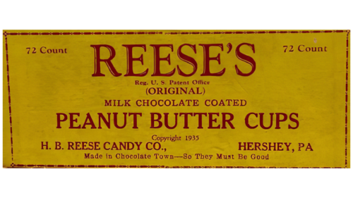
A businessman introduced a new candy to the market the year after its launch, significantly impacting the confectionery industry. The product’s logo was thoughtfully designed to represent its main ingredient and unique taste. Its yellowish background matched the color of peanut butter, hinting at the candy’s primary component and flavor.
The product name, which prominently uses the brand creator’s name in the logo, adds a personal touch and underscores the candy’s exclusivity. The logo clarifies that the product was a collaboration between Reese and Hershey, enhancing its credibility due to both companies’ strong reputations.
The logo described the candy as a “peanut butter cup covered in milk chocolate,” effectively highlighting its unique flavor combination and appealing directly to customers’ tastes. This description helped the candy stand out on store shelves.
Additionally, the logo, which resembled a label, included details like the place of production, the product’s weight, and the year it was created. This provided essential information, though the abundance of details could potentially overwhelm the main message.
1932 – 1934
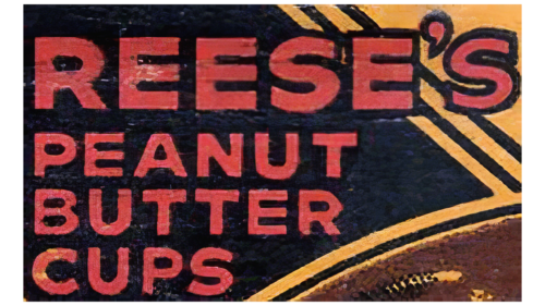
In 1932, the Reese’s Peanut Butter Cups logo was redesigned to be more expressive and effective. The new logo featured bold red letters that read “Reese’s Peanut Butter Cups.” The bright red choice was deliberate because it is linked to energy, passion, and appetite, making it appealing for food products. This color choice helped capture consumer attention and emphasized the pleasant and unique taste of the candy.
The logo’s layout placed each word of the product name on a separate line with strict left alignment. This made the name clear and easy to read, but the arrangement could seem too rigid and formal. This appearance was somewhat at odds with the brand’s image, which is associated with joy and the enjoyment of the candy.
1934 – 1947
In 1934, Reese introduced a new logo key to the brand’s marketing strategy by focusing on a simple yet memorable design. This design featured the brand name in a minimalist style, emphasizing the candy’s small size and affordability. The main ingredients, chocolate and peanut butter were highlighted to attract customers looking for delicious, affordable, and simple products.
The logo featured capital letters designed with care, spelling out the brand name and suggesting the pleasure of eating the candies consecutively. This aimed to increase the desire for more, highlighting the candies’ great taste and appeal.
Additionally, the logo’s text had a greenish tint to match the natural color of the peanut butter, emphasizing the candy’s natural quality. This color choice strengthened the visual link between the brand and its ingredients, enhancing consumer appeal.
1947 – 1972
When the founder’s children took over the company, they updated the Reese’s brand logo. The new logo aims to appeal to more people while keeping its traditional values. It features a playful, bright design that captures the youthful and innovative spirit of the new leadership.
The logo uses rounded, solid letters to make it look appetizing and friendly, which attracts consumers. The thick letters suggest the rich flavors and warm welcome the brand offers. The emblem’s yellow letters with a brown outline represent the peanut butter and chocolate that make up the candy, emphasizing the product’s main ingredients.
The logo’s text points upward, showing growth and renewal. It represents the brand’s dedication to improving and keeping up with current trends, suggesting a positive outlook for its future.
1972 – today
Reese’s introduced a new crunchy version of Peanut Butter Cups and updated its logo to make it brighter and more appealing. The new logo features an orange background with a brown outline and the brand name in yellow letters. These colors highlight the key ingredients: orange for the peanut butter’s bright flavor, brown for the chocolate, and yellow for peanuts.
The text on the logo is bolder, resembling the texture of peanut butter wrapping around the crunchy peanuts in the candy. The addition of peanut pieces makes each bite enjoyable and crunchy.
The orange also adds a symbolic touch, representing warmth, festivity, and sociability. It positions Reese’s as a perfect treat for sharing during joyful events or as a gift for celebrations. The logo’s multilayered colors reflect the candy’s complex flavor and texture, enhancing its unique appeal.
2015 – today
In 2015, Reese’s updated its logo to showcase its signature chocolate with various fillings, capturing the brand’s essence. The new logo uses a brown background, suggesting a rich layer of melted chocolate covering each piece. This change aims to highlight the delicious, full flavors that Reese’s fans love.
The logo features yellow, which connects to peanut butter, a key ingredient in many Reese’s candies. This color highlights peanut butter and signals the special place Reese holds for many of its fans.
Moreover, the yellow brings out excitement and curiosity about what flavor might be inside each candy—mint, caramel, or truffle. Each flavor tells its own story, adding to the enjoyable experience of eating Reese’s.
Font and Colors
The Reese’s logo uses a bold, rounded font that gives it a playful and accessible look. This handwritten style is similar to fonts like Atomic Wedgie or Halley Shadow Italic, but it has been significantly customized with unique character outlines to fit Reese’s brand style.
The logo’s large and easy-to-read text makes it suitable for various uses, from product packaging to advertising. Its bold and italic style suggests movement and a casual tone, enhancing the logo’s dynamic appearance.
The font in Reese’s logo is designed to create a sense of fun and informality while remaining distinctive and easily recognizable as part of the brand. The fluid, handwritten letters are clear, but their unique style may require a closer look to fully appreciate them, especially in smaller or more condensed forms.
Yellow and brown (and sometimes orange) reflect the product—peanut butter in chocolate. These warm and vibrant colors evoke feelings of happiness and indulgence, matching the sweet and rich taste of the treat. The brown suggests chocolate, while yellow and orange represent peanut butter and the brand’s energy.
Reese’s logo is recognizable, and its color palette perfectly conveys the brand’s identity as a purveyor of high-quality and flavorful treats.
FAQ
What does Reese’s stand for?
Reese’s Peanut Butter Cups story begins with a simple idea by Harry Burnett Reese. Unlike Milton Hershey, who was well-known for his chocolate, Reese wasn’t famous. In 1928, he introduced Peanut Butter Cups as part of a mix of candies sold by weight, not knowing they would become so loved.
These candies, named after Reese himself, proved his skill in turning simple ingredients into something special. His journey from making candies on a small scale to creating one of the most popular treats shows that big successes can come from small starts. Reese was all about trying new things and ensuring everything he made was top quality. This led to a candy that people of all ages enjoy, combining chocolate and peanut butter in a new and exciting way.
What is Reese’s mascot?
Reese’s mascot, created by The Hershey Company, is a character shaped like a Reese’s Peanut Butter Cup with human features, like arms, legs, and a face. This mascot brings the snack to life and connects with people by representing the fun and enjoyment of eating Reese’s. It’s a smart way to market the candy, appealing to everyone from kids to adults by making the peanut butter cup look like it can talk and move.
This character is selling chocolate; he wants to show the happiness and pleasure that Reese’s Peanut Butter Cups bring. By making the mascot look like the actual product, Hershey communicates directly what’s special about Reese’s—the chocolate and peanut butter mix. This fun and memorable mascot helps keep Reese’s in the minds of people who love chocolate and peanut butter, reminding them why they enjoy it.
When did Hershey buy Reese’s?
In 1963, The Hershey Company bought Reese’s, known for creating peanut butter cups. Before this, Hershey supplied the chocolate used in Reese’s candies. This deal was big news for both companies and candy lovers everywhere. By then, Reese’s Peanut Butter Cups had become a favorite in America, famous for mixing chocolate and peanut butter in a way no one else did.
These two companies had a strong relationship because of the ingredients they shared and how they both contributed to making candies in the US. Hershey saw how much people loved Reese’s Peanut Butter Cups and decided to make Reese’s part of its family. This move ensured Reese’s treats would be around for a long time, keeping the brand strong and making candy fans happy with their great chocolate and peanut butter mix.
What is Reese’s famous for?
Reese’s Peanut Butter Cups sell well, bringing in over $2 billion annually. People love them for the mix of sweet and salty tastes. The peanut butter is smooth and covered in Hershey’s chocolate. This mix is why so many different kinds of people enjoy them. Reese’s hasn’t stopped at just the original Peanut Butter Cups. They’ve made new types, like Reese’s Pieces, cups filled with Reese’s Pieces, and white and dark chocolate versions. They even have special shapes for holidays like Halloween and Christmas. These new ideas keep Reese excited and loved by people everywhere.
Reese knows how to get attention with its ads and social media. It works with famous people and gets its candy into movies and TV shows, making its brand well-known. You can find Reese’s products in many places, like supermarkets, convenience stores, gas stations, and vending machines, making it easy for people worldwide to buy them.
