The Refinery29 logo stands out against the emblems of similar resources and is quite recognizable.The main reason lies in the refined and, at the same time, veiled design. The logo features a text mark, numbers, and a decorative graphic symbol consisting of several components. It emphasizes the uniqueness of the brand and its importance in the modern media space. In addition, the creative icon makes the logo incredibly stylish, which helps to attract the attention of the potential audience.
Refinery29: Brand overview
| Founded: | November 2005 |
| Founder: | Philippe von Borries, Justin Stefano, Piera Gelardi, Christene Barberich |
| Headquarters: | New York, U.S. |
| Website: | refinery29.com |
Refinery29 is a global feminist online platform that offers entertainment content and online shopping. Despite its American origins (headquartered in New York City), the website is multinational and accessible to users in many countries.
Refinery29 is such a diverse resource that it can be called a true guide to fashion, style, and culture. There are periodic video programs, targeted articles, editorials, social types of content, and various selections. In addition, the website offers fascinating shows hosted by the renowned Lucy Fink. At various times, the multinational platform has also won seven Webby Awards and several Clio Awards.
Meaning and History
Despite the active development of the web resource, it retained the original visual concept for a long time. A new logo appeared eight years after its official launch. The absence of the need for rebranding, on the one hand, was due to a rather stylish design of the early version of the logo. It was an example of timeless classics, which was based on a confident text mark complemented by original numbers. But, the brand still decided on a more stylish format after a while.
What is Refinery29?
Refinery29 is a popular multinational online resource providing access to entertainment content. The main target audience is young people who seek development and self-improvement. For them, the online resource offers various video programs, series, articles, social content, and even live broadcasting. A large company, Vice Media Group, currently owns the website.
2005 – 2013
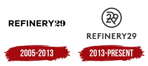
The website was created in the format of a city guide, which also included content describing fashion in New York City. It was founded by Kristen Barberich, Philippe von Borris, Justin Stefano, and Pierre Gelardi in 2005. At the time of its official launch, the online resource already had a unique brand identity. It was displayed through a concise, stylish logo that consisted of two parts: text and numbers.
Designers used a different design for them, which positively affected the overall aesthetics. The inscription Refinery consisted of massive capital letters. Straight lines, minimal rounded shapes, straight cuts, and equal thickness characterized the font chosen. It manifested principle, credibility, authority, and usefulness. This was how the platform was positioned by its creators.
They wanted to give people only verified information that would help them with certain requests. In addition, they tried to fill it with entertaining content to dilute the “dry” tourist themes. This nuance designers reflected in a special design of the second part of the logo – the number 29.
The signs were designed in a capital style with irregular lines, smooth transitions, and decorative dots at the ends of the numbers. This style resembled the design of license plates on houses. Both elements had strict black coloring, which demonstrated prestige and high status. Complementing the characteristic was a white background, symbolizing responsibility and honesty.
2013 – today
By 2013, the Refinery29 platform had already become a true guide to personal growth and style enhancement. The focus from the guide had drastically shifted to fashion and entertainment. The final change of direction was a prerequisite for a renewed logo. Thus appeared the corporate icon, which is still in use today. To some extent, it is similar to its predecessor. This refers to the central element in the form of the brand name.
But, otherwise, it is a more modern and stylish version, which fully characterizes the evolving platform. The new emblem includes not only the name but also a decorative sign. It consists of several signs that overlap each other. The basis was a frame in the form of a circle, and inside it were the number 29 and the first letter of the name of the web resource.
An unusual design solution was aimed at increasing recognition. The remaining elements of the logo acquired a simpler design. Massive shapes and decorative effects were replaced by a simple font with thinner lines. This style combined perfectly with the graphic sign’s design, symbolizing harmony in the information space of Refinery29.
Font and Colors
The corporate style of Refinery29 looks rather strict, but simultaneously, it demonstrates openness and striving for perfection. The modern concise font and the classic achromatic coloring provide a versatile brand description. The font is highlighted by neat, thin lines that are slightly elongated in some places and shortened in others. These features and the absence of serifs characterize the style as one of the Sans Serif variants.
Fonts from this category are often used to create logos for progressive brands. Refinery29 is no exception. It is actively developing and improving its resource. In addition, the management shows respect for the origins of the platform. This is emphasized at the level of coloring. Black is used as the main color – a symbol of authority, prestige, and excellent reputation. The background is designed in traditional white to signify openness to new solutions. These are the main principles that Refinery29 adheres to.
Refinery29 color codes
| Dark Charcoal | Hex color: | #333333 |
|---|---|---|
| RGB: | 51 51 51 | |
| CMYK: | 0 0 0 80 | |
| Pantone: | PMS Black C |
