


![]() REI Logo PNG
REI Logo PNG
The REI logo represents what the company does: outdoor and sporting goods. It inspires new achievements and victories, and motivates them to go to the forest or conquer a mountain peak. This emblem shows the spirit of a pioneer who can not sit still.
In 1938, Seattle climbers Lloyd and Mary Anderson founded Recreational Equipment, Inc., known as REI, after struggling to find reliable mountaineering gear in the United States at a fair price. Lloyd located an ice axe in an Austrian catalog and organized a direct group purchase with 22 other outdoor enthusiasts.
REI began as a consumer cooperative run by volunteers. Members paid an entry fee and later received annual dividends based on their purchases. In its early years, orders were handled from a home office, while gear was stored and distributed through informal locations.
After World War II, REI opened its first retail store in Seattle, selling climbing gear, tents, backpacks, and equipment for the growing outdoor community of the Pacific Northwest. A major turning point came on May 1, 1963, when REI employee Jim Whittaker became the first American to reach the summit of Mount Everest.
During the 1960s and 1970s, REI expanded beyond Seattle as hiking, cycling, and kayaking gained popularity in the United States. The company competed with L.L. Bean and Eastern Mountain Sports. At the same time, its cooperative structure helped distinguish it from regular sporting goods retailers.
In 1987, REI launched REI Adventures, adding organized outdoor trips to its business. In 1996, “rei.com” became an early full online store for outdoor equipment. Under Sally Jewell, CEO from 2005 to 2013, REI accelerated regional growth. By the late 2010s, the cooperative had more than 20 million members and about 180 stores across the United States.
Meaning and History
![]()
The name REI stands for Recreational Equipment. This phrase reveals the essence of the company, which produces and sells sporting goods. Its logo is also associated with the theme of active pastime. For many years, it has featured an image of a mountain landscape against a Christmas tree. The fact that the drawing is far from realistic makes it easier to use the emblem on tags and promotional materials.
What is REI?
REI is an abbreviation of Recreational Equipment, Inc. This is an American corporation specializing in goods for active recreation. It operates as a consumer cooperative; that is, it belongs to its customers, who, after paying the membership fee, can buy products at reduced prices.
1960s – 1975
![]()
The original version of the REI logo stood out for its simplicity and bold expression. At the composition’s core is a stylized mountain range, its peaks defined by broken lines. A graphic representation of a spruce tree with angular contours, filled in solid black and resembling a hand-drawn sketch, is also present.
The company name is placed directly within the image, set in uppercase letters with a slight slant, creating a sense of movement.
All elements are arranged within an oval shape that visually unifies and completes the composition. Despite the simplicity of the graphics and the limited color palette, the logo appears fresh and modern, conveying the brand’s connection to nature and an active lifestyle.
1975 – 1982
![]()
The updated REI logo, introduced in 1975, brought a new stylistic approach that reflected the brand’s energy and momentum. The mountain graphic became more structured, with sharp geometric lines, while the spruce silhouette grew larger and more defined, enhancing the overall composition.
The brand name is set in a bold custom sans-serif typeface, with large characters featuring softened corners while retaining a strong, solid presence. The word “co-op” appears below in larger lettering, positioned compactly beneath the main name, reinforcing the cooperative spirit at the company’s core.
Overall, the logo conveys a sense of activity, strength, and connection to nature, presenting a cohesive and impactful visual identity.
1983 – 2015
![]()
From 1983 to 2015, the Recreational Equipment Company avoided advertising itself as a cooperative. Information about this was excluded from advertising materials and from the logo, which contained three capital letters: “R,” “E,” and “I.” To the left of the abbreviation was the silhouette of a Christmas tree, consisting of four triangles of different sizes superimposed on each other. A zigzag strip was drawn from above, imitating the outlines of mountain peaks on the horizon. The designers made all the elements black and used a white background to achieve contrast.
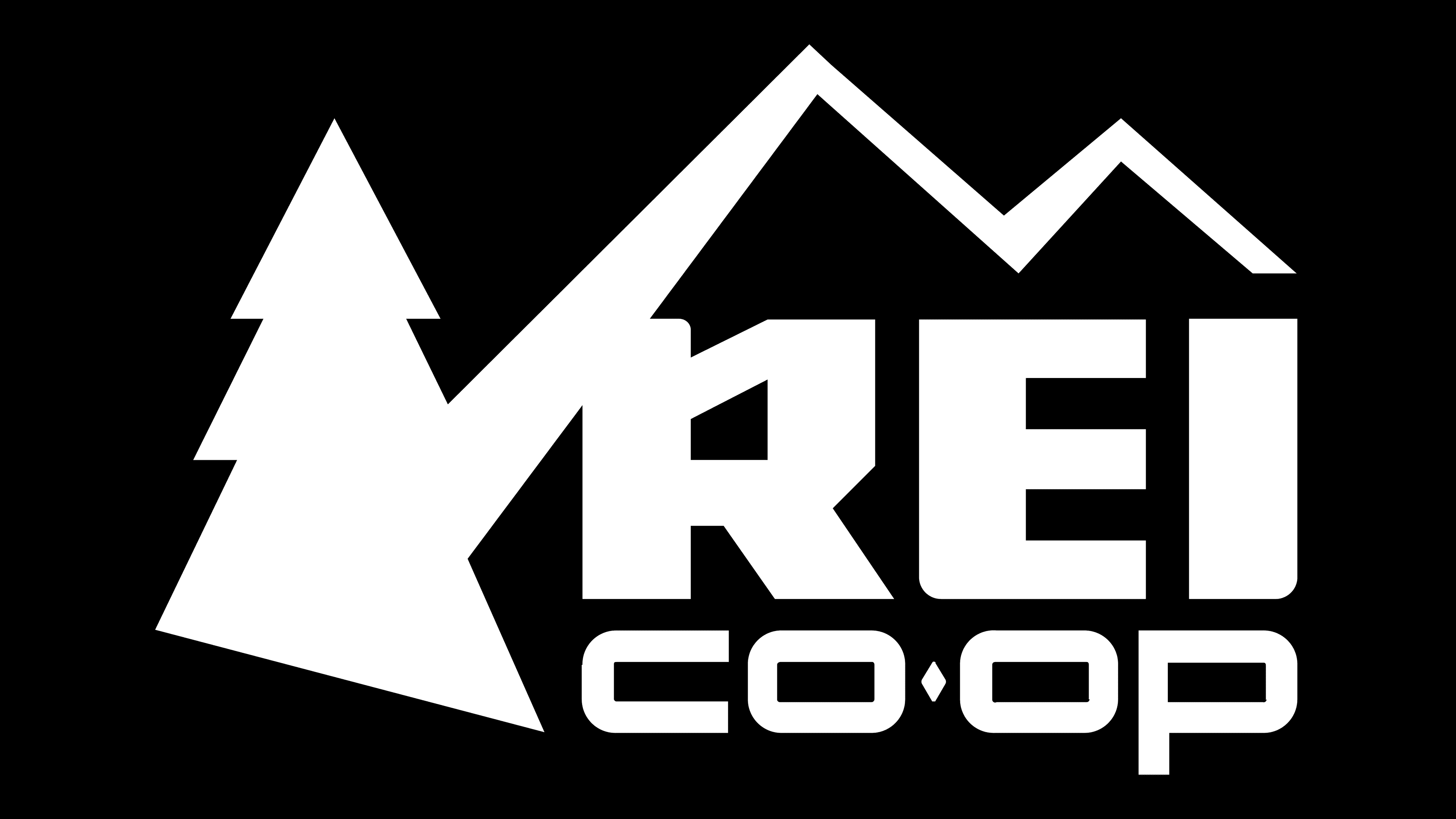
2015 – today
![]()
After a redesign in October 2015, the REI logo featured the word “co-op.” That is, the company, for the first time in a long time, decided to remind people that it is a consumer cooperative. The new word is placed directly under the changed abbreviation: the developers have increased the internal clearance of the letter “R” and rounded some corners. They also corrected the zigzag and made the ascending lines narrow from the bottom. The Christmas tree has also become asymmetrical: the lower part is cut off on the left side.
Font and Colors
The abstract image of the forest and mountains hints at REI’s main field of activity: the sale of goods for active recreation. Since the company’s founding, mountain peaks have been an important part of its identity. Even the expansion of the assortment to attract new customers in the form of surfers, kayakers, runners, and other athletes did not affect the symbolism.

A custom geometric sans-serif typeface was created for the company name, featuring bold, substantial characters with slightly softened forms. The letters have pronounced outlines and a solid structure, while the rounded elements lend the inscription a friendly and approachable appearance.
The “co-op” line is styled differently: the letters are wider and lower, with a small diamond replacing the hyphen to visually separate the syllables. The characters are geometrically stretched, approaching square proportions, which gives the text a sense of stability and visual balance. A similar aesthetic is evident in typefaces like Radio Space Bold and DBXLNightfever UltraWide, though the letterforms in the REI logo are more distinctive.
The brand’s color scheme is classic and subdued: black lettering and graphics create a strong contrast, reinforcing the minimalist design. This restrained palette has remained consistent since the earliest versions of the emblem.