


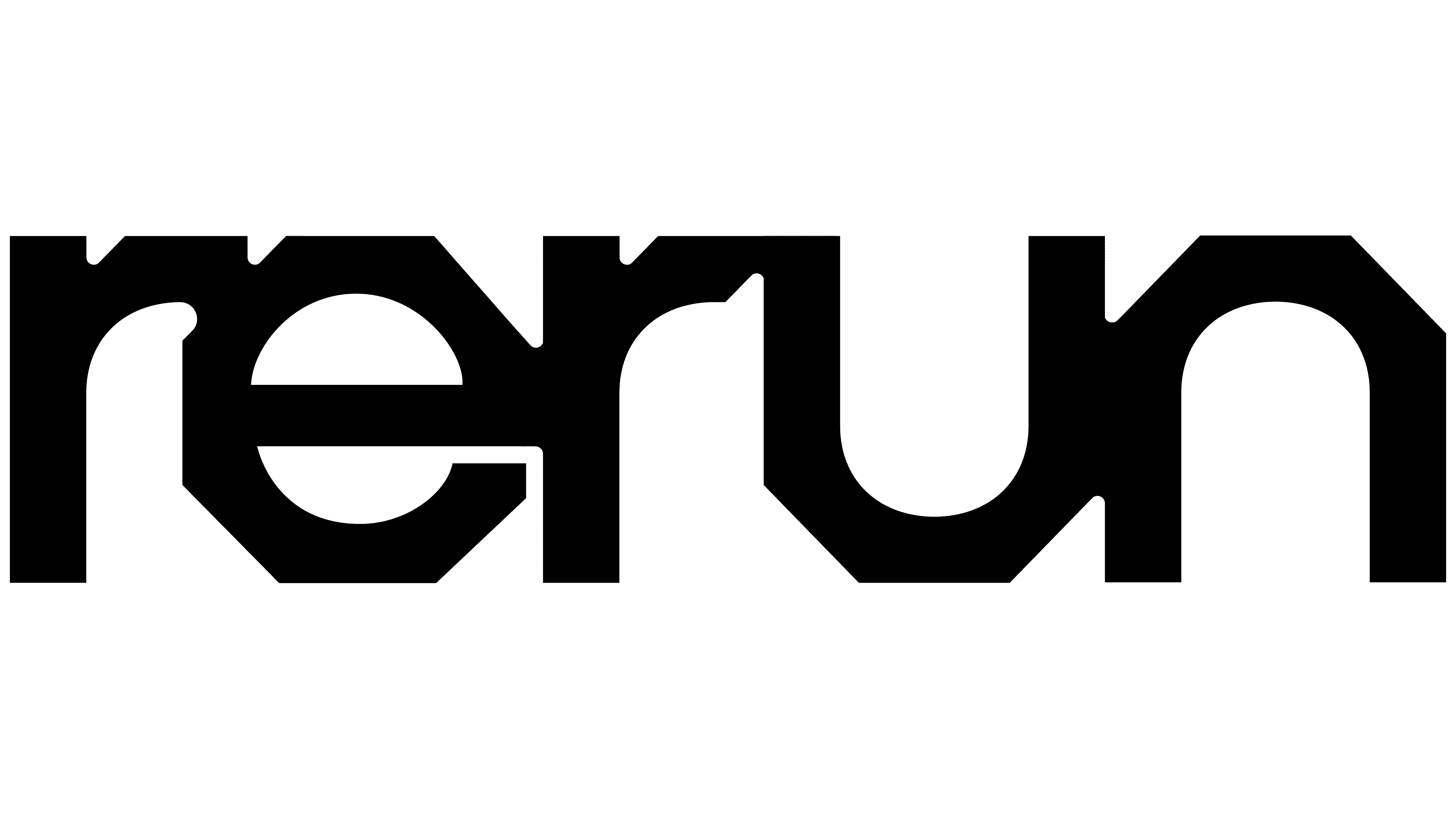
Robotics software developer Rerun introduced a new logo with the release of Rerun 0.32.0 on May 13, 2026. Berlin-based Studio Gruhl replaced the line-based symbol and domain name with a tightly packed wordmark featuring faceted letters. A bolt head inspired its shape, connecting the software to engineering workshops and hardware assembly through a familiar fastener.
Founded in Stockholm in 2022, Rerun is an open-source platform for viewing sensor recordings, video streams, and three-dimensional scenes to troubleshoot robots, drones, and autonomous vehicles. The collected data trains and improves models. Teams at Meta, Google, and NVIDIA use the company’s tools. In March 2025, Rerun raised $17 million in a seed round led by Point Nine.
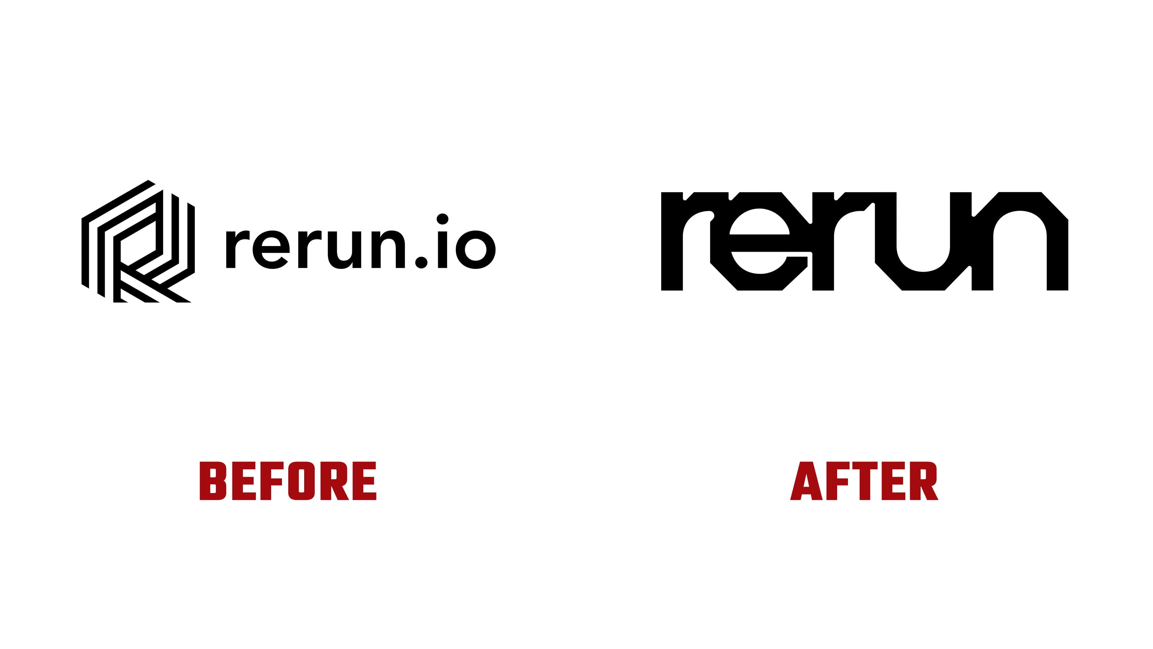
As the business grew, it needed to reconsider its previous identity, which featured a domain name and gradients. Studio Gruhl proposed focusing on robotics’ physical side. Bolts, soldering irons, and device testing inspired the project. Through familiar workshop objects, the studio aimed to explain a complex product and convey the culture of the people behind it. Malte Gruhl led creative direction, and Emma Damiani served as lead designer.
The wordmark began with the lowercase “e.” Its outer contour was given facets resembling a bolt head. Horizontal and vertical sections meet at diagonal cuts, creating an octagonal outline. Inside the letter, smooth curves remain. The designer then applied this combination of angular exteriors and rounded interiors to the other letters.
The designer tightened the spacing until the strokes touched. The five letters of “rerun” form an almost continuous structure, resembling soldered components. In the “u” and “n,” chamfered outer corners meet softly curved interiors. Both “r” letters retain a rounded gap between the shoulder and stem. Small notches along the top and subtle curves at the joins help distinguish the letters. The lowercase wordmark uses sans-serif forms, with a hardware reference built into the lettering.
The previous logo featured a dimensional “R” on the left, constructed from parallel lines with angular bends. Slanted sections created depth. To its right, “rerun.io” appeared in rounded, loosely spaced lettering. The update replaces the full domain name with the shorter brand name. The primary logo appears in black or white.
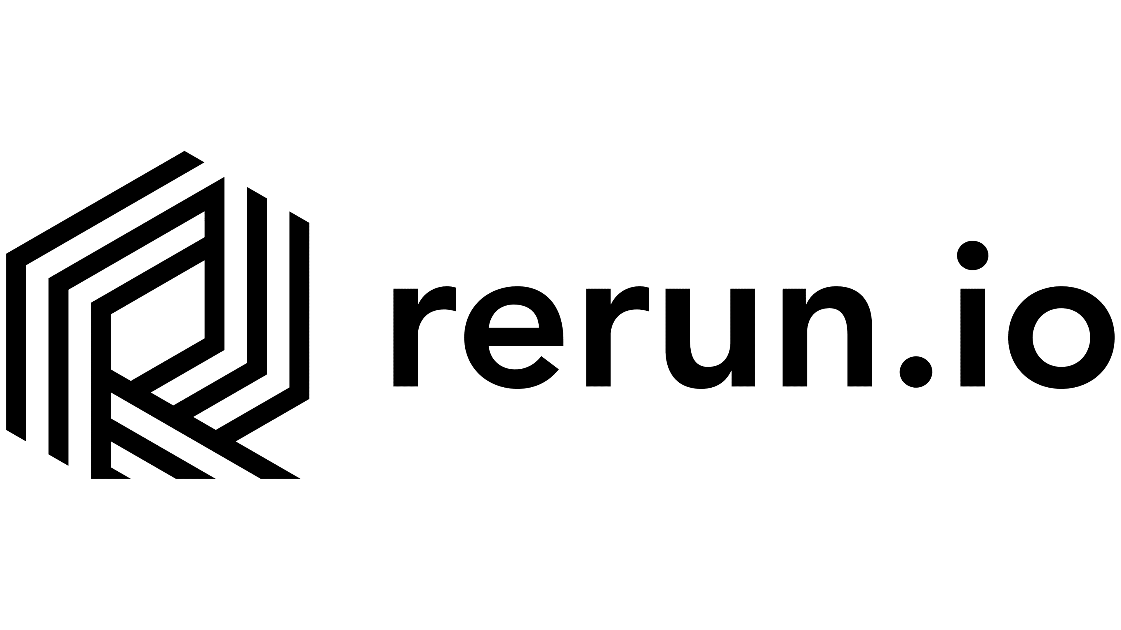
A shortened version using “re” was created for smaller applications. It retains the joined strokes and faceted outline. The app icon places the white monogram inside a rounded square, with colored bands radiating behind it and echoing the letterforms. In the project presentation, “re” was applied to a metal bolt head to show the logo’s original inspiration.
The colors relate to the theme “See What Robots See.” Studio Gruhl drew on the Jet and Turbo colormaps used in data visualization. Transitions from blue and cyan to green, yellow, and red reference the ways machine data is displayed. Black, white, and a light shade called Sandpaper complement these colors. In the animation, mechanical forms emerge from fields of color before dissolving back into them.
Yuriy Starikov worked on design and three-dimensional imagery, while Joma Frenzel created the artwork. Matthias Schulz handled development, and Duncan Brazzil produced the animated presentation.