



The updated HarleyMeds logo puts Harley at the forefront, with Meds tucked inside a small capsule-shaped outline. Brazilian studio LOTIPA developed the identity to connect the telehealth service with patients’ everyday lives. The difference in scale between the two parts of the name aligns the company with health and active lifestyle brands. At the same time, the capsule retains a medical reference.
Founded in 2024, HarleyMeds operates in the United States and offers remote consultations, hormone therapy programs, and weight management services. LOTIPA described the previous identity as cold and typical of the telehealth category. The studio wanted to show how the services fit into people’s lives beyond a consultation and give patient communications a friendlier tone. A detailed presentation of the project was published on October 27, 2025.
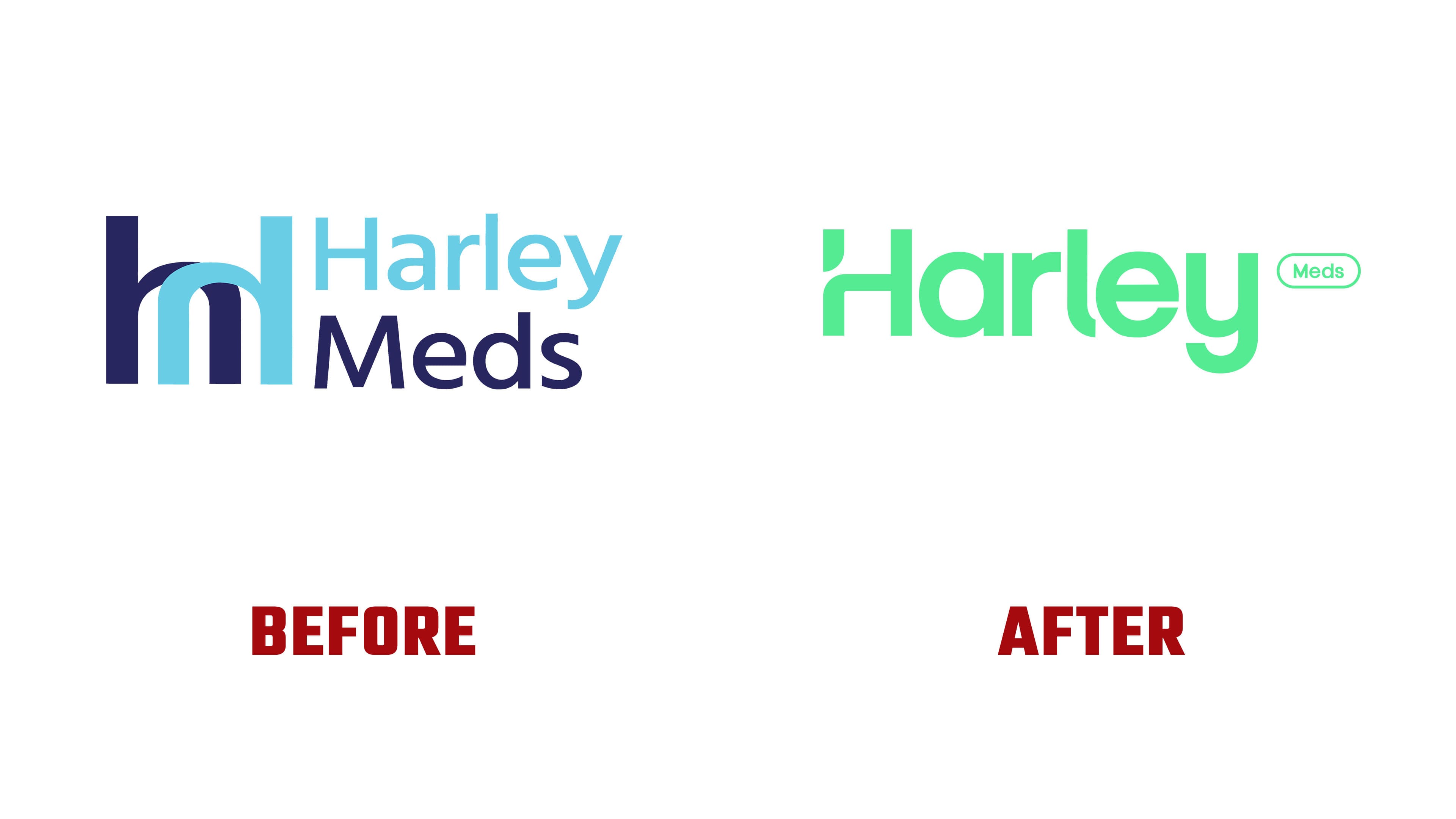
A pill provided the starting point for the new logo variations. In the primary version, an elongated outline with semicircular ends surrounds Meds. This reference to medicine becomes a compact part of the wordmark, while Harley sets its overall scale and shape. The combined name and capsule replace the large standalone symbol.
The previous logo featured a monogram on the left, formed from mirrored arches. Their interlocking shapes combined the outlines of an “h” and an “m.” To the right, the name appeared on two lines. Harley was light blue, and Meds was dark blue-violet. Both colors also appeared in the monogram. The updated name uses a single color, with the visual distinctions now concentrated in the letterforms.
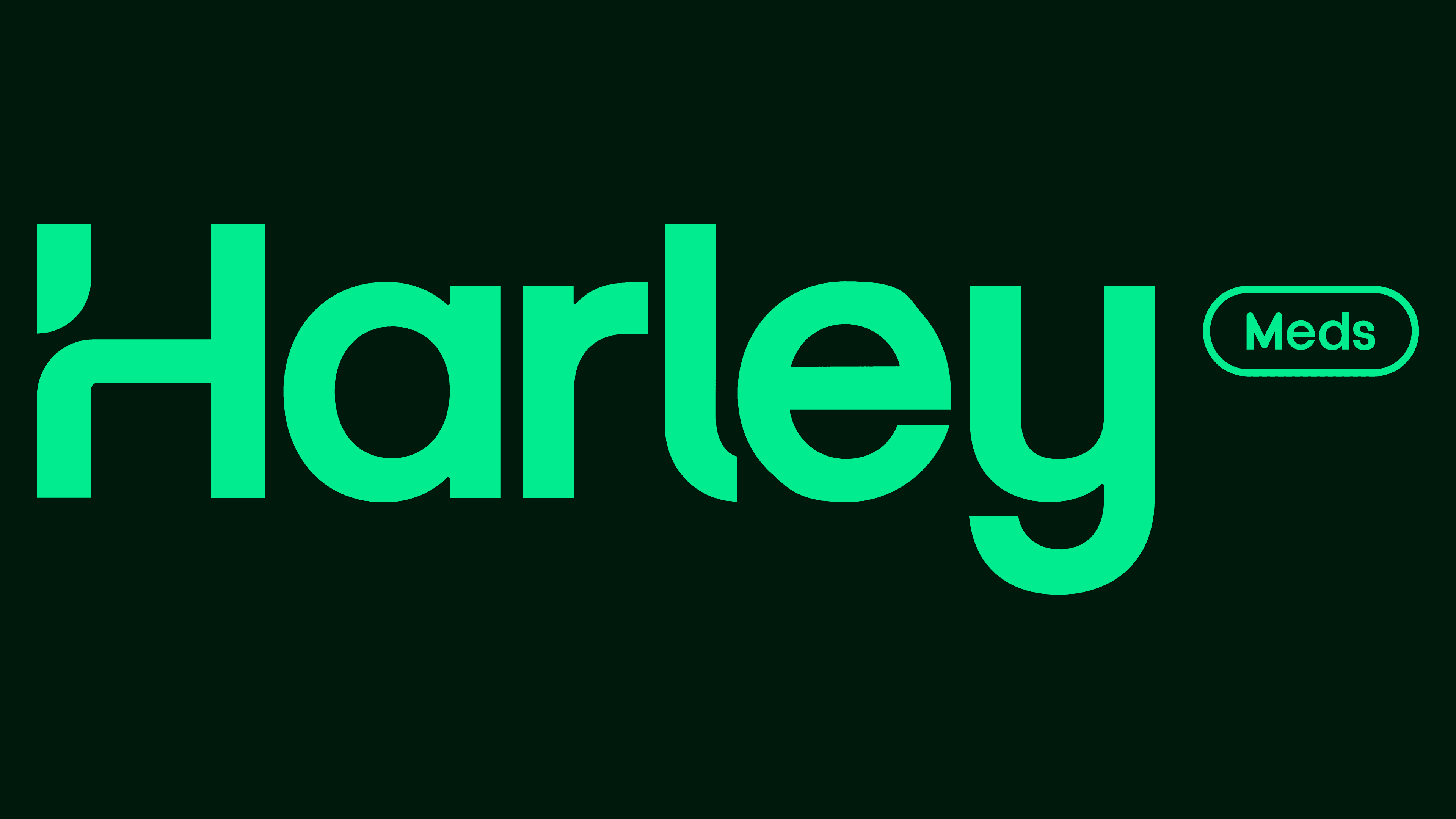
Harley uses bold sans-serif lettering with rounded contours. A small gap separates the upper section of the capital “H” from the rest of its left stem, creating a shape that resembles a short comma. Below it, the stem curves into the crossbar. The single-story “a” has a circular counter, the “l” terminal curves to the right, and the “y” descender forms a broad arc. These curves echo the rounded outline around Meds.
A shortened version was developed for smaller applications. The letters “H” and “M” sit within a shared elongated outline that narrows in the middle, creating two connected compartments. Another version places the letters of Harley inside individual circular enclosures, some linked by connecting bars. Their arrangement resembles a molecular structure. These layouts let the logo adapt to available space by varying its width and compactness.

Shades of green replace the former light blue and blue-violet. The primary version shown in the presentation features bright light-green lettering against a dark green background. The tonal contrast helps define the curves, counters, and gap in the “H.” The capsule shape extends into frames for short phrases and animations in which rounded forms join and morph into one another.
Antoniel Felainne and Alex Monteiro handled design and digital design, while Kim Dale developed the brand positioning. Lukas Martins created the animation, and Daniela Noriega produced the three-dimensional imagery. Lucas Aranha and Marco Cuel worked on the website. In 2026, the project was shortlisted in the professional category of the Latin American Design Awards.