


![]()
MSN, Microsoft’s long-established web platform, has unveiled a new logo as part of its reinvention for the modern digital era. Originally launched in 1995 alongside Windows 95, it was one of the first web portals offering news, entertainment, and essential online services. The refreshed logo reflects the platform’s transformation while honoring its rich history.
The updated design features a vibrant, dynamic multicolor palette with blue, green, pink, and yellow gradients. These lively tones create a sense of movement and energy, modernizing the logo and symbolizing the wide variety of content provided, from news to entertainment and lifestyle topics.
![]()
A standout element of the redesign is the reimagined butterfly emblem, a classic symbol associated with the platform since its early days. The butterfly now features smoother, more fluid shapes that recall the original design from the early 2000s, evoking nostalgia while presenting a fresh, contemporary look. As a symbol of transformation and renewal, the butterfly perfectly aligns with the ongoing evolution to meet the changing needs of digital users.
The typography has been updated to a minimalist yet approachable style. Rounded edges soften the logo’s appearance, creating a friendly and accessible vibe. While simple, the modern typeface pairs well with the vibrant colors and butterfly icon, delivering a cohesive and engaging visual identity.
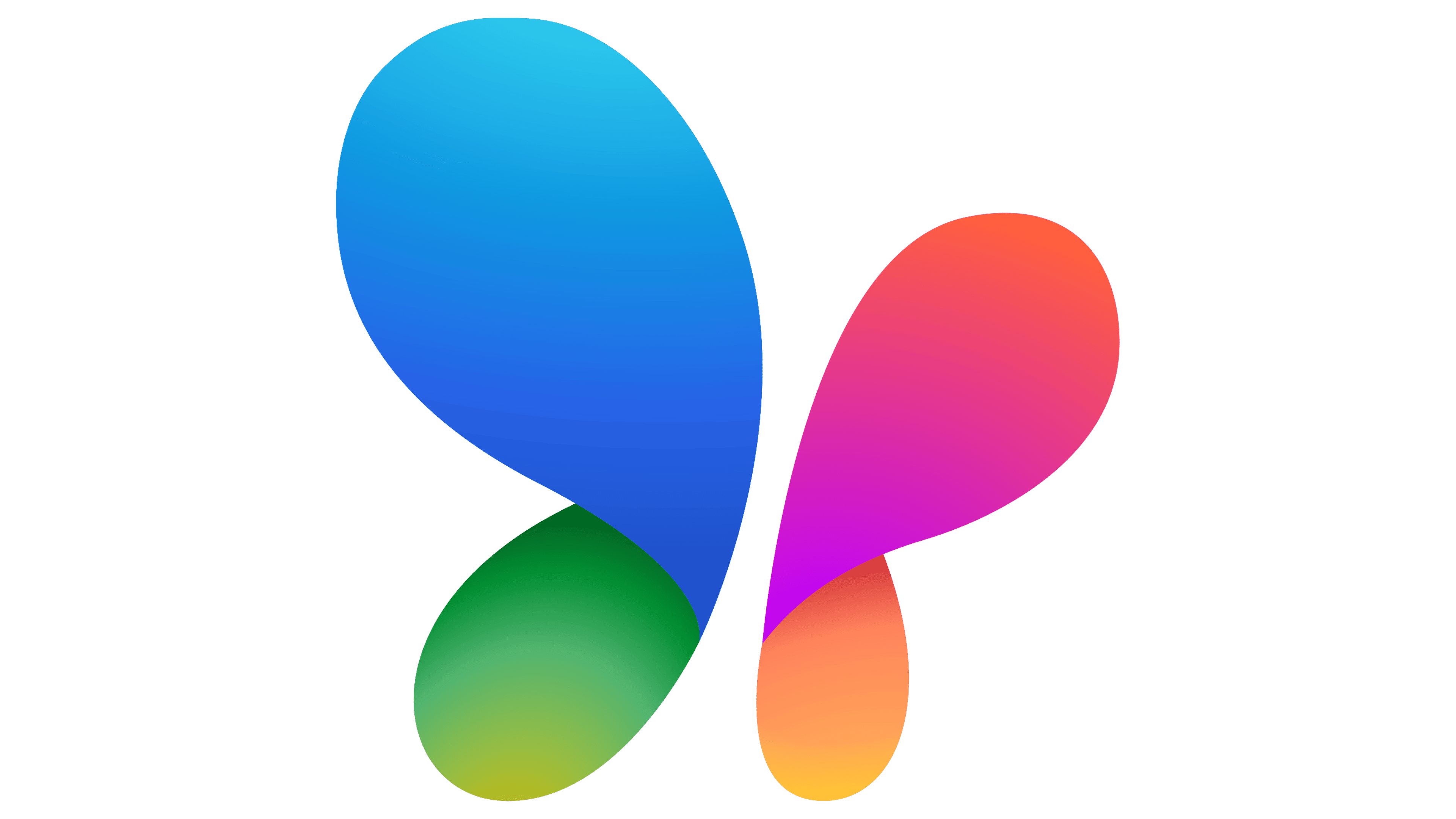
The shift from the previous black-and-white logo to this colorful design marks a clear change in brand identity. Where the old logo projected a more formal and reserved tone, the new design is bright and engaging, appealing to a diverse and contemporary audience. Gradients enhance the sense of movement and interactivity, qualities that resonate strongly in today’s digital environment.
The butterfly’s return as the logo’s centerpiece is a visual metaphor for adaptability and continuous growth. Each color in the gradient palette reflects the variety of services offered, reinforcing the platform’s role as a hub for personalized and comprehensive content.
![]()
This refreshed logo positions the platform for the future while celebrating its legacy as a trusted digital space. The thoughtful balance of modern design elements with nods to its history ensures the brand remains relevant to users of all ages. With its renewed identity, the platform reaffirms its commitment to providing engaging, versatile, and accessible content for the next generation of digital users.