


![]() MSN Logo PNG
MSN Logo PNG
The MSN logo represents how easily users can find online content across different categories. After all, this website contains a huge collection of Windows applications that make it easier to interact with the Internet.
Microsoft launched MSN on August 24, 1995, the same day Windows 95 launched. At first, it was a closed online service created to compete with AOL and CompuServe, offering news, chat, email, and other content through special software. In 1996, the company began shifting MSN toward the open web, adding a portal with news, sports scores, and weather available through any browser.
In 1997, Microsoft bought Hotmail for $400 million, giving MSN one of the largest free email services at the time. Messenger followed in 1999 and became a major part of the platform, especially among younger users. In 2000, Explorer was introduced as a way to combine web browsing, email, and messaging in a single internet environment.
During the early 2000s, MSN added new services and became more closely tied to Windows XP. Microsoft tested a music service to compete with Apple’s iTunes, then reorganized the platform in 2003-2004 as Hotmail and Messenger grew into stronger separate brands. In 2005, the company introduced a mapping tool later known as Bing Maps, and in 2009, its search service was replaced by Bing.
From 2010 to 2014, MSN was rebuilt around content, mobile access, and personalization. Sharing tools connected it with Twitter and Facebook, while partnerships with publishers turned the portal into a broader news and entertainment aggregator. Integration with Office and OneDrive increased, and later, Microsoft improved MSN apps for iOS and Android. By 2023, MSN remained a global web portal for news, services, video, and entertainment content.
Meaning and History
![]()
First, there was the online service Microsoft Network, which provided access to the Internet. It had its own Microsoft Internet Start portal. It served as the start page in Internet Explorer and contained useful content. In 1998, it was moved to a new domain and, at the same time, renamed, reducing the long two-word name to the short abbreviation MSN. The range of services united under this brand has been actively expanding. This is where the Bing search engine, the Bing Maps mapping service, and many Windows applications come from.
The branding guide states that the current MSN logo combines a wordmark with a graphic image (a butterfly) and that they cannot be separated. Moreover, this is the only place where the portal’s name is written in lowercase; in all other cases, the letters must be capitalized. The copyright holder also notes that he is not obliged to use a registered trademark except in certain cases. This is not the first MSN logo: the web service has had many other identifying symbols in various configurations.
What is MSN?
MSN is a shorthand for “Microsoft Network.” This is the name of a website that hosts a collection of Windows software. There is also online content in the categories “News,” “Sports,” “Health,” “Entertainment,” “Cars,” “Travel,” “Weather,” and so on.
1995 – 1996
![]()
The debut wordmark consisted of the letters “m,” “s,” and “n” in lowercase. A big round dot was at the end of the abbreviation as if it were part of the domain name. The “n” before her stood out noticeably in shape and color. First, it was red, while the remaining elements were black. Secondly, the designers made it bolder than the “m” and “s,” so the logo used two different fonts. The “m” and “s” typeface resembles Wiescher-Design’s Franklin Gothic Raw Book, Manfred Klein’s Nonserif Regular, or Suomi Type Foundry’s TeeFranklin Medium. The lowercase “n” style is reminiscent of Sky Sans Bold by Aviation Partners, Acumin Pro Semi Condensed Black by Adobe, or Mr. Eaves XL Modern Narrow Ultra by Émigré.
1996 – 1998
![]()
After the redesign, the logo took on a more complex configuration. The base was a black vertical rectangle. Most of the space was occupied by the letters “M,” “s,” and “n,” lined up in columns one below the other, with the “M” being capitalized. In the lower-left corner was a yellow ball with a gradient, likely symbolizing the service’s global nature. On the right (on the very edge) was the phrase “The Microsoft Network,” inverted so that the beginning was at the top and the end was at the bottom.
1998 – 2000
![]()
In 1998, the portal was moved to the .com domain and officially became known as MSN. Naturally, this was reflected in its logo. The designers converted the acronym to lowercase and used bold italics, roughly similar to CheapProFonts’ Familiar Pro Black Oblique. The white letters were set against an orange ellipse at about a 45-degree angle. Because the “n” didn’t fit entirely inside the shape, it had its orange base. “Microsoft” was written in a sans-serif typeface from the Segoe UI subfamily in the lower right corner.
2000 – 2010
![]()
In 2000, MSN launched a logo created by the joint efforts of McCann Erickson, FutureBrand, and Everbrand. It was launched at the beginning of the year (in February); the main developments occurred in 1999. The designers removed the orange background and made the abbreviation dark blue. They used the grotesque Franklin Gothic Bold Italic to decorate the letters. The word “Microsoft” was removed because it interfered with the new element: a flying butterfly with multicolored wings in green, blue, red, and yellow. The insect was in the upper right corner. Its wings were translucent, so mixed shades formed at their points of contact: green plus blue and red plus yellow. The butterfly seemed voluminous due to the gradient and light highlights, casting a light gray shadow.
2010 – 2014
![]()
A decade later, MSN decided on another redesign, which was recognized as one of the worst (according to Brand New). The portal began implementing the new logo on December 29, 2009, and completed the process in March 2010, although the website was originally scheduled for a redesign in autumn 2009. As a result of the changes, the butterfly has become much simpler. Both wings on the left side were scaled down and repainted in a gradient orange, while blue and green were used on the right side. The difference in size was supposed to reflect the butterfly’s tilted flight.
The designers changed the font, making the letters straight, thin, and light gray. It was similar to Artegra Sans Extended Regular by Artegra or Chinger Regular by Bud White, except that the tops of the vertical strokes in “m” and “n” were cut off.
2014 – 2024
![]()
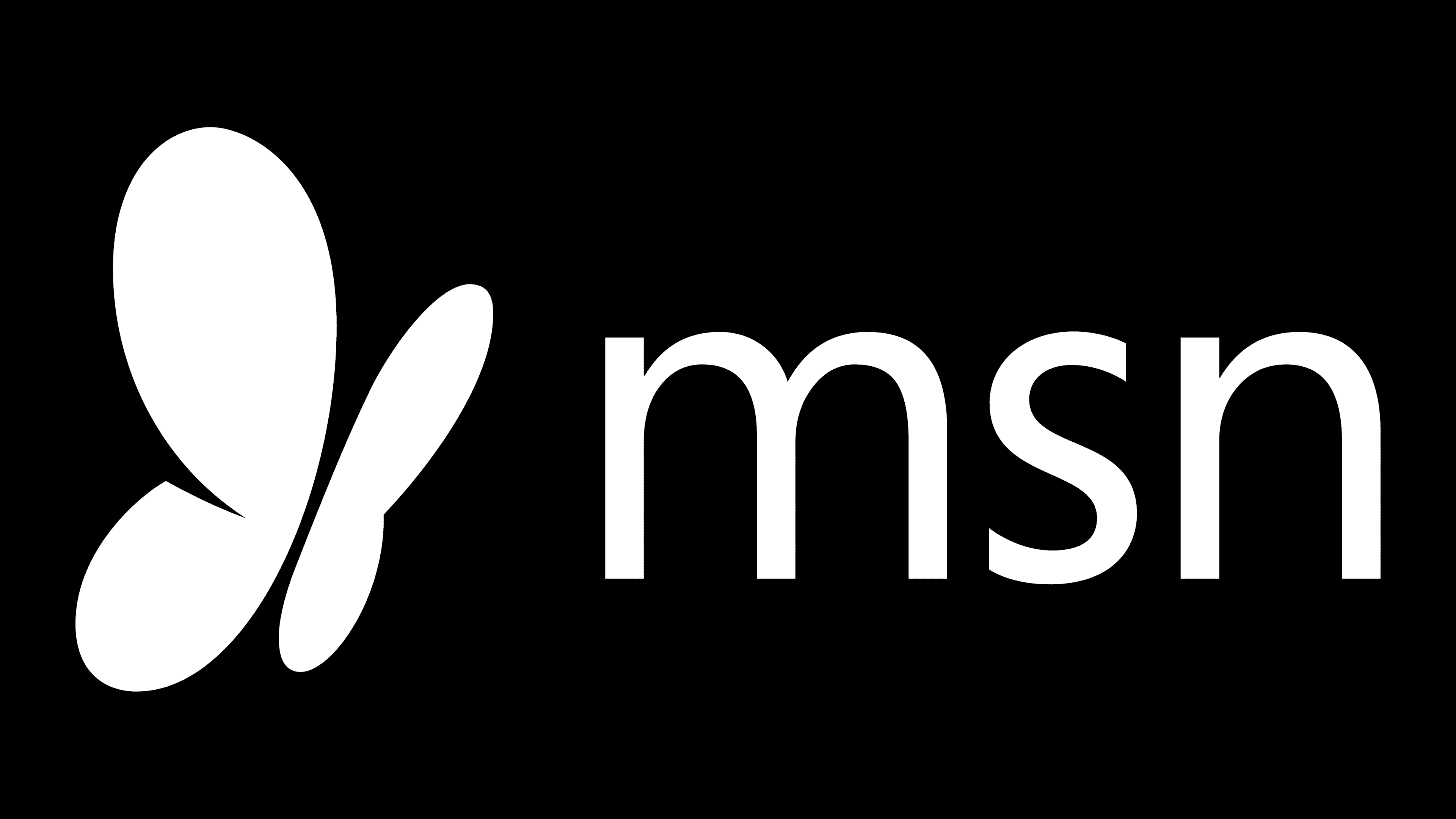
The 2014 MSN logo was significantly simplified compared to previous versions. The most distinctive feature of the new design is the black butterfly, now positioned in the upper left corner. This symbolism emphasizes lightness and a connection to the internet and technology, as butterflies are often associated with movement and freedom.
The shape of the wings has changed slightly, with one wing now having a sharp angle, giving the emblem a modern, even technological appearance. The butterfly’s black color adds a sense of seriousness, making it neutral and versatile. Here, black symbolizes professionalism and stability, which is crucial for a brand that delivers news and services.
Along with the butterfly, the “MSN” text is now black. The font used is Segoe UI, a typeface associated with Microsoft, which owns MSN. With its smooth and clean lines, this font conveys modernity and accessibility. It’s the same font used in other Microsoft products, adding consistency and reinforcing the connection with the parent company.
The logo features no complex elements or bold colors; its composition is minimalist. This was reflected when many major brands transitioned to simpler, more streamlined designs, aiming for functionality and modernity in their visual identity.
2022 – 2024
![]()
The new MSN logo stands out for its simplicity and conciseness. It’s an example of how minimalism can preserve a brand’s identity while modernizing it.
The black butterfly remains unchanged, symbolizing lightness, mobility, and speed, perfectly reflecting MSN’s concept as a news and service portal.
However, the “msn” font has undergone the most change in the new version; it is bolder, making the text more prominent and easier to read. This font looks stronger and more substantial compared to the previous version, where the text was thinner. This adds more confidence to the logo, which is important for a brand with a long-standing history.
2024 – today
![]()
The new MSN logo appeared in 2024, and its design is a prime example of how modernity can be blended with respect for heritage. This step reflects the return of the MSN brand, which once again unites its news and informational services under a well-recognized name. Previous changes related to the rebranding as “Microsoft Start” have now taken a back seat. The decision to return to this brand highlights how strongly the name is associated with delivering high-quality information to millions of users.
The new logo features a colorful abstract figure reminiscent of a butterfly. The symbol evokes associations with lightness, freedom, and the flow of information, perfectly capturing the brand’s essence as a news and content portal. Gradient transitions between blue, green, orange, and pink create a sense of fluidity while adding vibrancy and appeal. The shades and their gradients emphasize the diversity of topics and directions.
Comparing the new symbol to the MSN emblem from the early 2000s, it is evident that the company used a similar idea but reimagined it in a more modern way. While the earlier butterfly looked like a flat symbol, the new version has gained depth through gradients. Each color doesn’t just fill the shape but almost brings it to life, adding dimension.
The font is simple, concise, easily readable, and most importantly, remains unchanged. Nothing about it was altered. The same black “msn” letters are set in a sans-serif style, and the minimalism keeps attention focused on the emblem itself.
The choice of colors and form aligns with MSN’s return to its roots, where news was presented, emphasizing accessibility and a broad range of topics. The new visual mark does not chase the trend toward black-and-white or simplified symbols; it showcases the brand’s individuality and confidence in its uniqueness. The butterfly element is a metaphor for the free flow of information among users.
The new MSN symbol doesn’t simply look like a modernized version of the old one. It creates an entirely new impression of the brand. These changes prove that the company can move forward while respecting its traditions and creating something truly appealing for today’s audience. And for this new symbol, Microsoft deserves a thank you. Bravo to the company for not following the trend toward simplification. Perhaps Microsoft will inspire a new era of vibrant logos.
Font and Colors

The butterfly is MSN’s signature symbol, but how does it relate to the website’s history? This is likely a beautiful element that symbolizes beauty, rebirth, and immortality. In Native American culture, it represents positive change, joy, beauty, and transformation. There is no hidden connection with the functions or heritage of the web portal here. The butterfly was originally a joint fantasy between McCann Erickson, FutureBrand, and Everbrand. This image was so memorable and vividly represented MSN that it was retained in all subsequent versions of the emblem. By the way, the Illuminati has one little-known symbol – the monarch butterfly. It represents mind control.
The current MSN logo is set in the humanistic grotesque Segoe UI. It belongs to a family of fonts created by typographer Steve Mattson in 1994, specifically for Microsoft. This typeface is used in all American company products for a uniform text display. Remarkably, all letters are lowercase in the MSN wordmark, while in other cases, they must be uppercase. Previously, the abbreviation was painted in the portal’s corporate color, Pantone 3005 blue. After the redesign, both the butterfly and the brand name became black.
![]()