


New York Lottery launched a campaign spanning its games under the tagline “Can You Imagine?” alongside its first major identity update in 28 years. Unveiled on May 18, 2026, the new look by McCann Design and McCann New York retains the blue ball while refining the logo’s lettering, colors, and outlines.
New York’s state lottery has operated since 1967, with proceeds supporting public education. Its contribution totaled $3.6 billion in fiscal year 2024-2025. The update brings scratch-off tickets and draw games under one identity after several years of separate campaigns. McCann’s task was to unite the products under a shared look and reach younger adults.
The campaign centers on the dreams that take shape between buying a ticket and learning the outcome. The creative team focused on the life changes people imagine a win could bring. The circular logo, named Globe, reinforces a world of possibilities. It resembles a lottery ball, with curved lines of text suggesting a rounded surface.
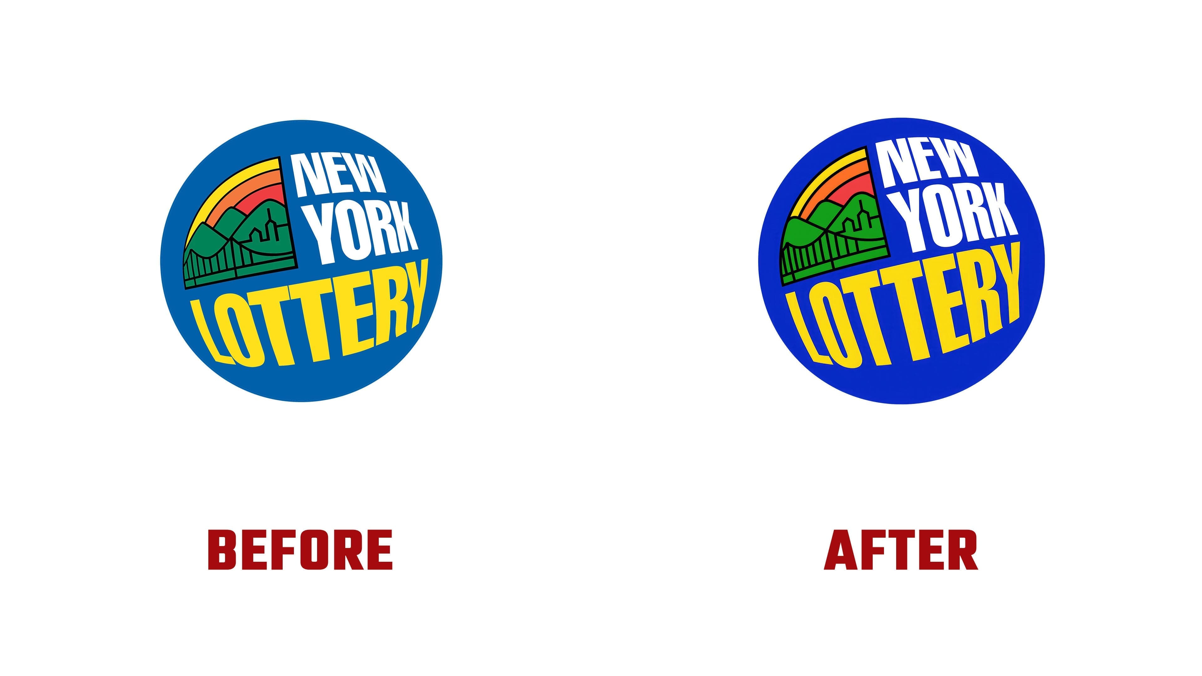
Inside the circle, the name still occupies three levels. The white words “NEW” and “YORK” sit above the yellow “LOTTERY.” An illustration of a bridge, hills, and buildings adjoins the ball on the left, with yellow, orange, and red arcs above it. The tilted arrangement and distorted lettering add depth. Because residents recognize the logo from signs at stores and gas stations, McCann retained its main components.
The refinements focused on proportions and individual contours. The designers tightened the letter spacing, adjusted the text’s curvature, and elongated “LOTTERY.” They also reshaped the bridge, hills, and buildings. The blue became more saturated, while the green shifted to a bright grass green. A white outline around the circle separates the logo from its background. According to McCann Design, these adjustments enhance its three-dimensional appearance and give it a more optimistic feel.
Globe received its first animated logo sequence, incorporated into the broader identity system. Matt van Leeuwen led the design team, with Emely Perez serving as design director. Senior designers Dewen Yang and Eva Vidan also contributed.
The logo’s components became the basis for other materials. The three colored arcs evolved into Sunstripes, used in static layouts and animation. The bridge, hills, and buildings inspired a treatment called Lottoscape. Rotating the image 90 degrees shifts the familiar perspective. The designers connect this transformation to imagination’s ability to change how people see their everyday surroundings.
The identity reintroduces ITC Avant Garde Gothic, which appeared in the lottery’s 1974 logo. The typeface is used for supporting text. The lettering inside Globe retains its own design, with curves that follow the surface of the ball.
The campaign rolled out across outdoor advertising, the subway, digital platforms, and retail locations throughout the state. Cuanan Cronwright and Leo Barbosa led creative direction. Photographer Todd Antony created 9 staged scenes, while directing duo Los Pérez shot two 30-second commercials in New York with local performers and production crews. The stories explore fantasies of unusual purchases and hobbies made possible by a lottery win.