The Residence Inn logo stands out for its dynamic and pronounced emphasis on a businesslike, formal style aimed at attracting its target audience—people frequently on business trips. The emblem symbolizes reliability and professionalism, reflecting the hotel’s philosophy. It is designed for those constantly moving and, after completing their tasks, are ready to head back on the road. The quality and high level of service are highlighted not by bright colors but by reputable names recognized in the business world.
Residence Inn: Brand overview
Residence Inn’s story began in 1975 when businessman Jack DeBoer from Wichita, Kansas, created a new kind of hotel tailored for guests needing long-term stays. DeBoer noticed a lack of comfortable accommodations for families and business travelers who had to stay for several weeks or months.
The first property opened in Wichita in 1975. It offered spacious apartments and studios with full kitchens, work areas, and separate bedrooms. Travelers appreciated the “home away from home” concept, which gave them more space and the flexibility to cook their meals.
Over the next few years, DeBoer launched more locations in various U.S. cities. Each new hotel helped establish the brand as a pioneer in the extended-stay market, proving the concept’s success.
A major milestone occurred in 1982 when the Marriott Corporation, known for its full-service hotels, noticed the rapidly growing brand. Marriott acquired a stake in the business, allowing it to retain its focus on longer stays while benefiting from Marriott’s resources and expertise.
By 1987, Marriott had fully acquired the chain, integrating it into its growing portfolio. This acquisition marked a new chapter, providing the resources for faster expansion and improved service quality.
The 1990s were a period of rapid growth. The brand expanded not only across the U.S. but also internationally. 1991, the first international location opened in Ontario, Canada, demonstrating the extended-stay concept’s worldwide potential.
The chain continued refining its offerings throughout the late 1990s and early 2000s. New features like enhanced public spaces encouraged guest interaction, and introducing free breakfasts and evening receptions helped reinforce its reputation as a “home away from home.”
By 2005, the brand had opened its 500th hotel, further cementing its success. Around this time, interior design updates were introduced to align with changing traveler preferences.
In 2009, the “Gen 9” concept was introduced. It featured improved workspaces, recreational areas, and more flexible public spaces. The new design catered to extended-stay families and business travelers.
The 2010s saw further international growth. The brand adapted its model to suit local markets by opening hotels in Europe, the Middle East, and Latin America. For example, the first European hotel opened in Munich, Germany, in 2011.
2016, the chain celebrated its 40th anniversary, solidifying its place as a leader in the extended-stay industry. By this time, it had more than 700 hotels.
In 2018, the company launched the “It’s Not a Room. It’s a Residence.” advertising campaign, highlighting the unique features that set the brand apart, such as full kitchens and spacious, home-like accommodations.
Despite the global challenges faced by the hotel industry in 2020–2022, the brand continued to adapt to guests’ changing needs. The business enhanced its health and safety protocols and expanded its long-stay options, which became especially popular during that period.
By 2023, the chain operated over 860 hotels across 17 countries and territories, firmly establishing itself as a top brand in the extended-stay market. The brand continues to evolve with travelers’ changing demands while staying true to its core mission of providing a comfortable, home-like experience for long-term guests.
This hotel brand has shown a remarkable ability to adapt to changing travel and accommodation trends while maintaining its original “home away from home” concept. With ongoing service improvements and global expansion, it has grown from a small hotel chain into a household name.
Meaning and History
What is Residence Inn?
This brand reimagines the concept of extended-stay hotels, creating a “home away from home” atmosphere for its guests. The luxury hotels offer spacious rooms with fully equipped kitchens, separate living areas, and workspaces to accommodate those who need more than just a place to sleep. The brand stands out from competitors by fostering community among guests, organizing evening events, and offering amenities such as food delivery and on-site laundry facilities. The hotels conveniently located in suburban and urban areas attract families, business travelers, and people renovating their homes. It’s a unique solution for those seeking a personalized and comfortable experience during long stays or relocations, combining the comforts of home with hotel conveniences.
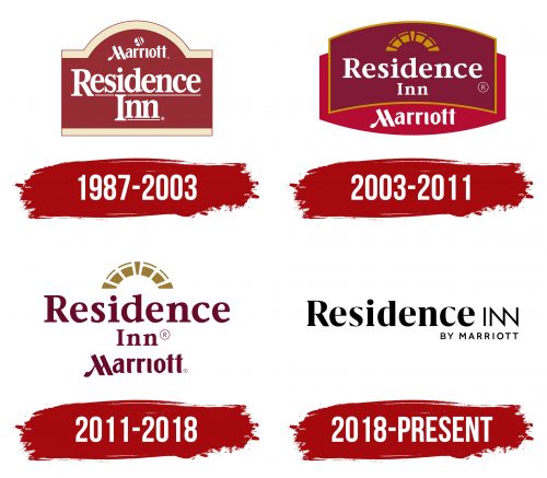
1987 – 2003
The chain’s emblem is designed as a symbolic representation of a house, reflecting the brand’s offering, which combines elements of rental housing and hotel services. Residence Inn provides rooms for extended stays and functions as a hotel. Notably, before renovations, the network’s buildings were ordinary apartment complexes, maintaining a connection to home comfort.
The Marriott logo is placed in the semicircle of the roof’s upper arch, emphasizing the focus on travel and journeys. In 1987, Marriott acquired the brand and changed its logo, reflecting its vision. The primary clientele consists of business travelers staying more than a week, explaining Marriott International’s decision to lead business development.
The brand name is divided into two levels. White letters with fine serifs symbolize the cleanliness and upkeep of the buildings where guests reside. The thin lines underlining the name hint at the professionalism of the staff and impeccable service, guaranteeing high standards of hospitality.
The emblem’s color scheme, featuring maroon and beige, highlights the luxury and design style of the apartments. These colors emphasize the prestige and comfort of staying at Residence Inn, making the experience convenient and stylish.
2003 – 2011
The two arched signs on the emblem merge to form the image of a crown, creating a sense of grandeur and status. The brand name is set against a maroon background with white letters on the first sign. This background is framed with gold lines, emphasizing the prestige and exclusivity of the establishments. This design symbolizes that guests are staying in conditions worthy of royal standards.
A stained-glass arch stands out at the top of the emblem, taken from the previous logo but now rendered more realistic and detailed. This element hints at the hotel’s vintage design, maintaining a connection to tradition. Such arched windows were often found in the attics of mansions, reinforcing the association with historical architecture.
As a foundation and support, inside the structure is a second sign bearing the parent brand’s name. The red color of this part symbolizes the visionary inspiration and influence the owners have on the company’s development. Overall, the emblem reflects the guidance and support from the parent brand, highlighting the importance and prestige of the hotels in the chain.
2011 – 2018
The updated logo features more open space due to removing the dark background, giving it a sense of lightness and visual freedom. One key element remains the arch, a symbol representing the hotels in the chain. The brand name and the parent company’s name are rendered in maroon, with the font of each part remaining unchanged. Despite this, the differences in the slant and style of the fonts prevent the overall symbol from achieving complete harmony.
The emblem consists of three levels, with the addition of a design that creates a rather complex and substantial structure. However, this layering reflects the various hotel rooms with different comfort levels. The logo also symbolizes buildings typically consisting of four to six stories, aligning with the architectural style of most hotels in the chain. This design balances tradition and modernity, emphasizing the brand’s unique characteristics and history.
2018 – today
The Residence Inn by Marriott emblem reflects the brand’s evolution and new priorities. The logo is designed in a minimalist and formal style, emphasizing a move away from excess and focusing on practicality and convenience. The name “Residence” in large black letters appears understated but confident. The brand shifts from a luxury concept to one targeting business travelers and guests needing reliable and comfortable long-term accommodations. This approach demonstrates attention to the details important for guests who stay at the hotel for extended periods, whether for business trips or medical stays.
The small “BY MARRIOTT” inscription is added in the lower right corner, subtly indicating its affiliation with the global Marriott network, one of the leaders in the hotel industry. The small yet clear letters convey the idea of high-quality service, assurance, and trust that clients can expect when choosing this brand. The mention of Marriott in the logo helps clients understand that their expectations of service and comfort will be met, even without excessive luxury.
The word “Inn” is designed with a dynamic slant, adding a sense of individuality to the brand. This element highlights that the hotel offers a unique stay experience created for those who appreciate a balance between home and work, simplicity, and comfort. The style and design of the text suggest that the brand aims to provide hotel services that offer a space where guests can live and work comfortably.
The Residence Inn logo symbolizes the brand’s commitment to creating convenient environments for those seeking a balance between work and relaxation in their daily lives.


