


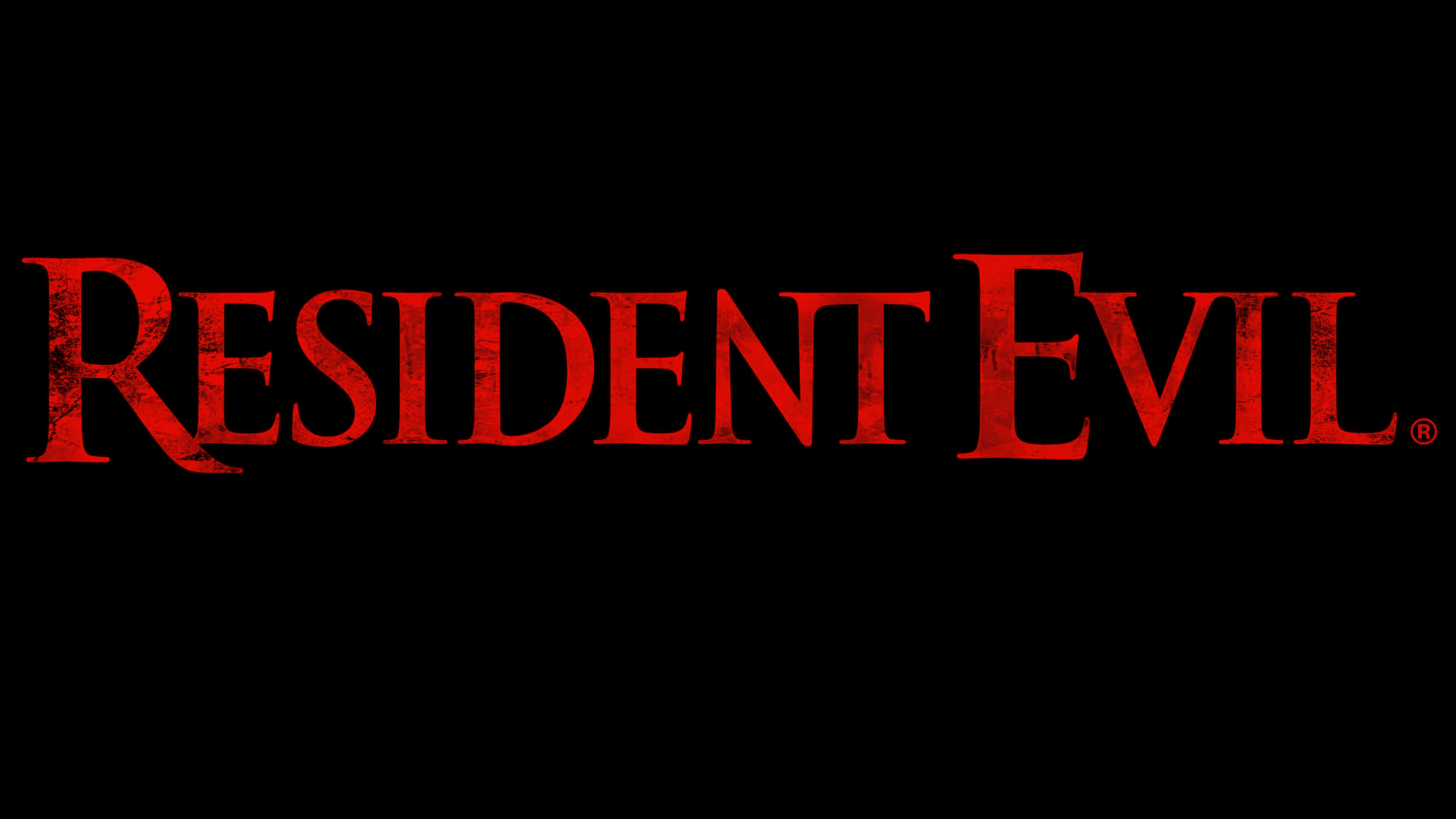
![]() Resident Evil Logo PNG
Resident Evil Logo PNG
No one knows what lies behind the veil of the Resident Evil logo. The emblem encourages you to develop your survival strategy. Rise above the plot and, watching everyone, remain invisible. Only this will help you survive the dangers and earn a reward.
Resident Evil began from an unfinished idea. In the early 1990s, Capcom producer Tokuro Fujiwara planned a 3D remake of Sweet Home for PlayStation and brought in young designer Shinji Mikami. Mikami reworked the concept into a tense survival game inspired by George Romero’s Night of the Living Dead and Infogrames’ Alone in the Dark.
Biohazard launched in Japan on March 22, 1996. In the US and Europe, Capcom renamed it Resident Evil because Biohazard was already registered there. Players controlled Chris Redfield or Jill Valentine inside a zombie-filled mansion, with limited ammo and fixed camera angles.
Resident Evil 2 followed in 1998, moving the outbreak to Raccoon City and selling over 5 million copies. Konami answered the same year with Silent Hill, creating a major horror rivalry. Resident Evil 3: Nemesis arrived in 1999, and Code: Veronica brought full 3D environments in 2000.
Capcom remade the first game for GameCube in 2002, then released Resident Evil 0 in 2003. The major shift came in 2005 with Resident Evil 4, which replaced fixed-camera controls with over-the-shoulder gameplay and sold over 10 million copies. Resident Evil 5, released in 2009, sold well but moved toward co-op action. Resident Evil 6 in 2012 drew a colder reception, prompting Capcom to rethink the series.
“Resident Evil 7: Biohazard” relaunched the tone in 2017 with first-person horror. Remakes followed, led by Resident Evil 2 in 2019, Resident Evil 3 in 2020, and Resident Evil 4 in 2023. Resident Evil Village arrived in 2021 and sold over 5 million copies in its first month. By 2023, the series had passed 150 million sales.
Meaning and History
![]()
The game received individual symbols right at the start to identify itself and stand out from its counterparts. After all, Resident Evil is about the most common plot: the confrontation between people and zombies. It currently exists in eight full editions and three remakes. Each of them has its logo.
What is Resident Evil?
Resident Evil is a line of media products derived from the computer game of the same name. This is the highest-grossing media franchise in the horror genre. The shooter on which it is based first appeared in 1996. The next parts of the series were released almost every year, and several films and cartoons were released simultaneously. The owner of the game franchise is the Japanese corporation Capcom Co., Ltd.
1996
![]()
The base of the debut logo was the video game’s name. The creators sought to emphasize the ominous atmosphere with minimalism, so they concentrated on the type. The letters in the phrase “Resident Evil” turned out to be narrow, elongated, bright scarlet, and closely spaced. In their shape and color, they more resemble bloody wounds than printed signs. All characters are in uppercase and cast in pitch-black shadows on a white background on the right side. This technique makes the inscription appear voluminous and eerie, as if frozen in midair. The edges of the letters are uneven – as if gnawed or torn.
1998
![]()
The emblem retains the same style, eerie, bloody, and fatal, since the combination of red and black remains a priority. The only change is the number “2”, which denotes the next issue’s number. But unlike letters, it is smooth and even, without ragged edges.
1999
![]()
The logo of the third issue is radically different from the first two. It is larger and contains more detail. On a dark background dotted with chaotic dots, stripes, and textures are the inscriptions “Resident Evil Nemesis.” It spans three lines, one for each word. The visual emphasis is on the central part, “Evil,” highlighted in large print. Like the top inscription, it looks like it’s made of broken glass. “Nemesis,” in contrast to them, is made in the form of a stream of blood. The video game number is shown in large, two-line text.
2005
![]()
This option contains not only text but also a graphic element. It sits in front of the franchise title and looks like body parts falling off or chunks of torn flesh. The color neutralizes the picture’s expression; black is paired with white, not with red. But in reality, it is not an icon, but the number “4”, decorated with sharp fangs and claws. The phrase “resident evil” has been moved to lowercase. The letters are completed with a torn edge.
2009
![]()
In the center of the emblem, there is burnt-out fabric, on which the outlines of “5” can be guessed. The number is scorched white, with yellow edges and an upward-extending stroke. In the background, the phrase “Resident Evil” is in capital letters in dark red. Fiery reflections and a vascular network filled with red blood are visible around them. Symbols now have classic serifs.
2012
![]()
For the sixth version of the logo, the developers chose a strict, cold, metallic font with light highlights in the center of the letters. The series number is large and is located above the title. It is made in the form of decaying purple-pink flesh.
2017
![]()
This time, the designers did not use a separate number for numbering. They played the last three letters in the word “Evil” in an interesting way: the role of 7 is played by the syllable “VIL.” And to get a perfect resemblance to the Roman seven, the developers cut off the last character’s bottom stroke, depicting it as a square dot. They did this in color, since the phrase “Resident Evil” is black, except for the three indicated letters (dark orange). They added “biohazard” lettering at the bottom, which is smooth, thin, and easy to read.
2021
![]()
This franchise logo uses the same graphic technique as the previous one, where the numbers are made from the text. As a result, the word “VILLAGE” denotes both the issue title and its number. The two Ls have the protruding parts cut off at the bottom, so the VILL looks like a Roman figure of a light swamp color. The full name of the franchise is at the bottom in small print. In all words, the font is smooth, sans serif.
Font and Colors
Each video game release has its label. The name “Resident Evil” is the same across all variants, presented in a distinct style. The exceptions were the first and second versions, when the designers kept the inscription unchanged by using it twice.
The typeface in the emblems is not unified thematically and varies across cases. But the predominant ones are flat and wide letters that resemble geometric shapes. In the seventh and eighth parts of the game, the designers added Roman numerals.
Colors also differ in variety. If the first issues are supplemented with an emblem in the blood-and-flesh theme, then the later ones feature a cold palette: shiny metallic, muted khaki, charcoal black, powdered orange, etc.
FAQ
Where is the bar in Resident Evil?
The bar in the game is located on the ground floor of the west wing of the Spencer Mansion. This area is central to the game, filled with rooms, puzzles, and secrets. The bar is important for finding clues and items that help players progress. Its detailed and eerie design adds to the suspenseful atmosphere of the mansion. Exploring the bar is crucial for uncovering mysteries and advancing the game’s storyline.
What does the Resident Evil logo mean?
The 2021 Resident Evil logo cleverly incorporates the Roman numeral VIII to represent the eighth installment in the series. This is embedded within the word “VILLAGE,” where the letters V, I, and the vertical lines of the two Ls form the numeral VIII. This design highlights the game’s place in the series while keeping the logo cohesive and visually appealing. Using typography adds depth to the logo, making it functional and symbolic.
What is the emblem for in Resident Evil?
In Resident Evil, the emblem is crucial for solving puzzles and advancing the game. A large wooden shield with the family crest is found in the Spencer Mansion’s dining room. Players must replace the gold emblem with this wooden emblem to open the exit from a secret passage accessed by playing the piano.
To proceed, players must place the golden emblem in the dining room, which unlocks a key needed for further progress. This puzzle is one of many that players must solve, showcasing the game’s mix of action, exploration, and problem-solving.
What is the font of the Resident Evil logo?
The 2021 Resident Evil logo uses two similar fonts: a bold, geometric sans-serif. The “VILLAGE” lettering can be recreated using the RE 7 Font, similar to Press Gothic Biform by Patrick Griffin and Aldo Novarese, and resembles Paul Renner’s Plak Black Extra Condensed.
Press Gothic Biform is known for its strong, structured appearance, which adds to the logo’s impact. The geometric shapes and clean lines give the logo a modern, intense look, which fits the game’s dark, atmospheric themes. The bold, condensed fonts in the logo highlight the game’s dramatic, suspenseful nature, enhancing its visual identity. The sharp, angular lines and bold typography emphasize the game’s focus on horror and action, making the logo instantly recognizable and memorable for fans.