Serres Toundra, a key player in Quebec’s agricultural landscape and a top supplier of cucumbers, has embarked on an exhilarating rebranding journey. Since its inception in 2016, the company’s dedication to delivering premium local vegetables through its state-of-the-art greenhouses in Saint-Félicien has earned it a reputation for providing fresh, quality produce.
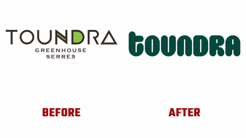
Crafting a brand identity that would match the freshness of Serres Toundra’s offerings fell to LG2, who designed a visual identity brimming with charm and warmth. The newly minted logo is a proud emblem of Serres Toundra’s ethos, utilizing a rounded font that reflects the greenhouses’ ceaseless bounty. Neat, linear features underline the company’s stringent farming protocols. At the same time, the selected color scheme, influenced by hues seen inside the greenhouses, paired with lively illustrations, articulates Toundra’s approachable nature and dedication to perennial production.
This rebranding marks a striking departure from the former logo, which seemed more befitting a tech firm, exhibiting an unapproachable, frigid appearance. It failed to evoke any warmth or correlation with the actual products. In stark contrast, the new logo Toundra bursts with a welcoming, lighthearted custom wordmark, proudly boasting a cucumber-shaped touch, thereby forging a palpable link with the main product line. The uniform, unicase lettering adds to an integrated and visually pleasing design, harmonizing with the brand’s persona.
The transformation extends to the packaging, moving from a bland, nondescript design to one pulsing with life, mirroring the brand’s character. The once-drab olive green backdrop has been replaced with fresh and lively contrasts, utilizing bright colors and a straightforward design that feels active and engaging.
Though not without some minor challenges, such as certain illustrations that may seem slightly disjointed from the overarching theme, these are trivial in the context of a largely successful rebranding.
An unforeseen triumph in the new branding comes in photography, which enriches the overall aesthetic by weaving the color scheme into various elements, such as clothing and accessories, generating a unified branding experience.


