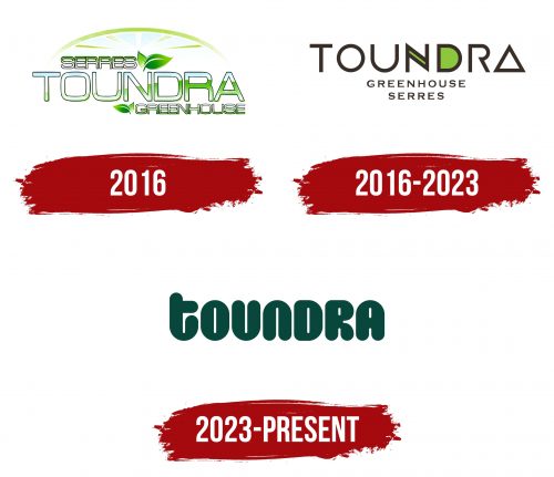
The Toundra logo stands as a hallmark of ingenious design, reflecting the core values and offerings of the brand. Delving deeper into its design elements reveals a story beautifully narrated through typography, color, and shape.
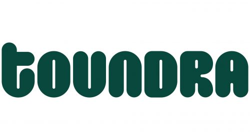
Stretched Vertical Typeface: The letters in the brand’s name are strikingly elongated. This isn’t just a stylistic choice but one that seamlessly integrates the brand’s essence into its visual identity. The stretched vertical lines don’t just grab attention; they subtly mimic the slender form of cucumbers.
Softened Edges for Organic Appeal: The rounded edges of the letters further strengthen the cucumber resemblance. In a world where sharp, edgy designs often dominate, opting for a gentler curvature speaks of approachability and resonates with the natural, organic nature of the product.
Dark Green: More than Just a Color: The color palette is purposefully restricted to a dominant dark green. This shade isn’t random—it signifies the freshness of verdant gardens and lush fields. It’s the color of nature’s glory, representing purity, health, and sustainability.
Echoing Product Centrality: By designing the letters to reflect the shape and feel of cucumbers, the brand emphasizes its primary product without explicitly saying it. Such smart integration makes the brand synonymous with its offering.
A Symbol of Trust: Beyond design aesthetics, the logo is a badge of assurance. It communicates a commitment to ecological responsibility, safety in consumption, and a promise of genuine, unadulterated vegetable products.
Versatility in Application: Given its distinct design and clear message, the emblem effortlessly translates across various mediums. Whether it’s product packaging, digital platforms, or promotional material, the logo stands tall, echoing its brand promise.
Reinforcing Brand Philosophy: Every logo has a philosophy, a raison d’être. Here, it’s about championing the cause of natural, fresh produce. Each design choice, be it the font, curvature, or color, aligns with this ethos, making it a visual and a brand statement.
The Toundra logo beautifully encapsulates the brand’s dedication to providing fresh and natural products. It’s not just a name but a narrative, a visual testament to the brand’s commitment to quality, nature, and health.
Toundra: Brand overview
| Founded: | 2016 |
| Headquarters: | Saint-Félicien, Quebec |
| Website: | serrestoundra.com |
2016 Max Tremblay and Sophie Lavertu, childhood friends from the Saguenay-Lac-Saint-Jean area in Quebec, launched Toundra. Both shared a fervent interest in farming and harbored ambitions of spearheading a cutting-edge greenhouse initiative within their native territory.
Fuelled by their enthusiasm, they embarked on a European tour to absorb advanced greenhouse farming techniques. Drawing inspiration from their travels, they erected a 15-acre modern greenhouse in Saint-Félicien, Quebec. Their primary crop was tomatoes, cultivated sustainably by harnessing renewable energy solutions, including geothermal warmth and rain-fed irrigation.
Within a year, Toundra’s tomatoes, renowned for their vibrant taste and resilience, graced local supermarkets. The distinctive blend of precise light, moisture, and nourishment rendered these tomatoes an instant hit, and soon they were available throughout Quebec.
Navigating the landscape of 2021, Toundra broadened its offerings, adding cucumbers and assorted greens to its repertoire in response to escalating consumer demand. Concurrently, as the COVID-19 pandemic reshaped shopping behaviors, the company ventured online, rolling out an e-commerce site and facilitating home deliveries.
Currently, Toundra’s operations span over 25 greenhouse acres, employing a workforce exceeding 100 individuals. The brand is synonymous with freshness, superior quality, and eco-conscious practices. As they gaze into the future, Tremblay and Lavertu remain committed to spearheading sustainable farming advancements and bolstering the region’s economic fabric.
Meaning and History
What is Toundra?
Toundra is a Canadian company established in 2016 that specializes in cucumber cultivation. They own modern greenhouses in Quebec, designed to provide the perfect conditions for producing fresh vegetables. They use rainwater for irrigation and compostable cardboard for packaging to reduce their environmental impact.


