


 Revolut Logo PNG
The Revolut logo represents a modern, high-tech service. The emblem reflects the platform’s openness and readiness to implement new developments. The platform’s wide range of features and operations, spanning Europe and the U.S., attracts active users. The symbol forecasts the brand’s growth and expansion.
Revolut was founded in London on 1 July 2015 by Nikolay Storonsky and Vlad Yatsenko. Storonsky, a former trader at Credit Suisse and Lehman Brothers, had faced high fees on currency exchange and international transfers. Yatsenko brought development experience from Deutsche Bank and UBS. Their first product focused on low-cost transfers and currency exchange at interbank rates through a mobile app.
By the end of 2015, Revolut had raised £2.3 million in its first major funding round, using the money to grow its team and technology base. In 2016, it added virtual cards for online payments and received permission to process electronic-money transactions across the European Union.
In 2017, Revolut added cryptocurrency trading and launched a premium plan with services such as priority support and travel insurance. By year-end, the platform had more than one million users. In 2018, it received a specialized banking license from the European Central Bank, allowing it to offer broader banking services in the EU, and launched business accounts for entrepreneurs and companies.
In 2019, a Visa partnership supported expansion into new markets, including Japan and the United States, while Revolut added a metal card and stock trading. In 2020, it launched in the United States and Australia, introducing Revolut Junior for children and teenagers. In 2021, the company raised $800 million and reached a $33 billion valuation. From 2022 to 2024, Revolut improved payments, international transfers, business tools, personal finance features, and investment services while expanding in Asia and Latin America and pursuing additional banking licenses.
Meaning and History
What is Revolut?
This fintech company and mobile banking app provide a range of services accessible through a sleek smartphone interface, including stock trading, cryptocurrency exchange, multi-currency accounts, and international money transfers. The app allows users to manage their finances quickly and conveniently, including expense tracking, budgeting, and access to different currencies. The company also offers premium accounts with enhanced features and additional benefits, such as insurance and access to airport lounges.
2015 – 2016

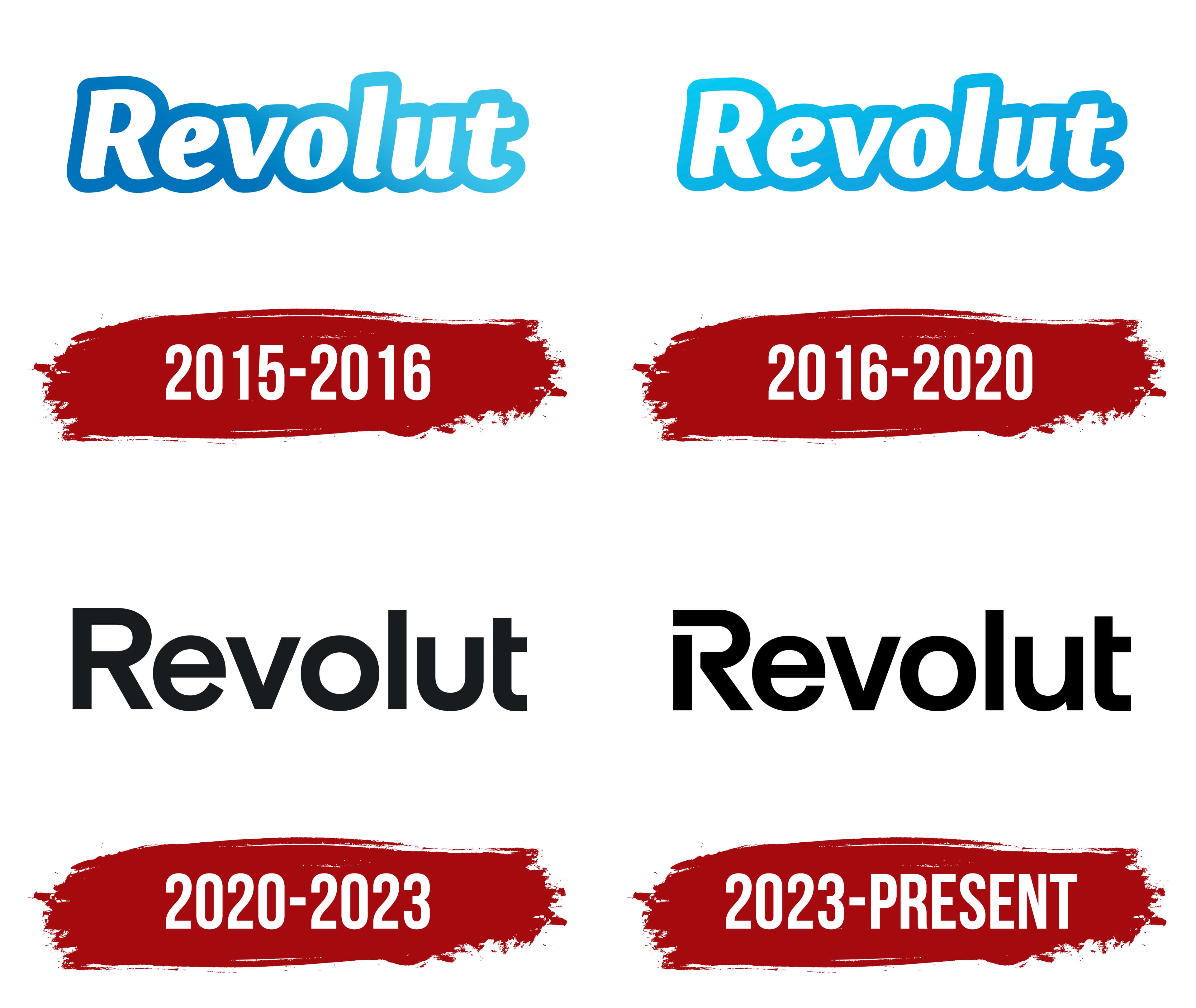
The company’s logo appears modern and tech-oriented. The white letters of the name, outlined with a wide border, are set against a gradient background that transitions from deep blue to light blue. The visual effect creates a glowing impression, adding dynamism and highlighting the company’s growth. The logo resembles a burst of light, emphasizing the brand’s significance.
The company name combines “volute” and “revolution,” highlighting the uniqueness of its service. It focuses on providing international banking services, including currency exchange and payment processing, with minimal fees. The company has made a breakthrough in the financial sector by offering customers a neo-bank model that operates entirely online, without a physical presence.
2016 – 2020

In 2016, after surpassing 300,000 users, the company updated its logo to highlight its growth. The main change involved the lettering outline, which adopted a lighter gradient. The new design creates a sense of freshness and novelty, with shimmering effects resembling mother-of-pearl. The airy blue tones enhance the image of lightness and perfection. The logo reflects the company’s commitment to providing high-quality online financial management services, giving it a modern, celebratory appearance.
2020 – 2023

In 2020, the company updated its visual identity by creating a new logo. The black lettering symbolized stability and reliability, reflecting the brand’s maturity. This update coincided with a significant market expansion: the platform launched in the U.S. and simultaneously entered 24 additional countries.
The updated design reflected a new stage in the company’s development, showcasing its ambitions and confidence in its capabilities. It emphasized the readiness to compete internationally and secure a position among the leading players in the global financial market.
2023 – today
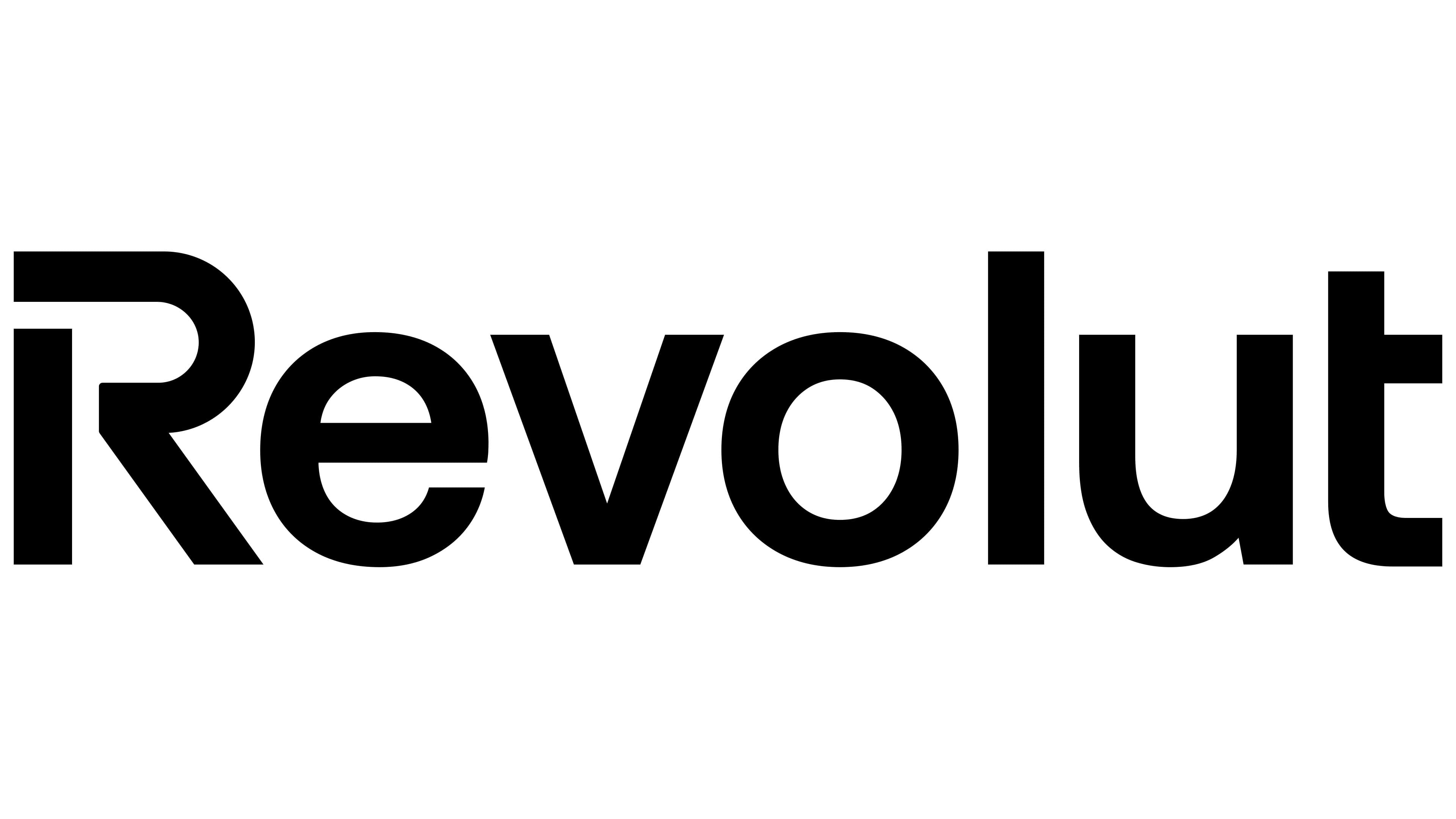
The letter “R” is designed with an open glyph, emphasizing the company’s readiness for growth and exploration of new directions. Obtaining official banking licenses in several European countries and the U.S. allowed the company to offer additional services to its users. These include cryptocurrency operations and the ability to trade stocks commission-free in euros. This expansion of capabilities is reflected in the modification of the emblem’s first letter, conveying the company’s openness to new technologies and its commitment to implementing modern solutions.