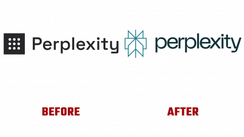
Last week marked a significant milestone for Perplexity, an AI-powered search engine that has rapidly become a major player in the tech industry. The company has refreshed its image to align more closely with its innovative technology by introducing a rebranded identity, including the new Perplexity logo. The new logo, designed by Philadelphia, PA-based Smith & Diction, is a minimalist icon filled with deep meaning and elegant design, encapsulating the essence of Perplexity’s services.
The Perplexity logo is more than a simple icon; it’s an embodiment of the company’s commitment to providing transparent and verifiable insights through accessible footnoting of results. Unlike its old logo, which was well-executed but somewhat enigmatic, resembling a sifting tool, the new design is a thoughtful representation of information scouring. With imagery that can be interpreted as flipping through pages of a book, symbolizing cursors or windows, the icon conveys a rich metaphorical landscape that connects with the company’s vision.
Animating this complex icon, Justin Lawes has added life and movement, transforming a simple cursor into a spinning world of possibilities. Meticulous attention to details such as stroke thickness, proportion, and depth helps create an engaging design that avoids unnecessary embellishments. Accompanied by the wordmark in FK Display, which harmonizes with the design, the new logo presents a cohesive and well-balanced image.
Smith & Diction’s refreshing approach extends beyond the logo into the broader visual identity. Their sophisticated color palette transforms the traditional hyperlink blue into something more refined, enhanced by darker blue tones and earthy hues. While mostly minimalist, some elements, such as patterns with gradients and Art Deco vibes, might feel out of place in an otherwise sleek and modern design.
Among the most notable pieces in this rebranding effort is a poster embodying the new icon’s minimalism. Depicting various objects in a single color, it creatively explores converging multiple sources into a single place. Paired with the playful wordmark, it adds complexity and interest to the brand, resonating well with Perplexity’s mission.
Established in 2022, Perplexity quickly distinguished itself with a unique natural language processing and machine learning blend. Within four months, it has attracted 2 million monthly active users, a success celebrated with a $25.6 million series A funding round. The end-user experience promises to be engaging and distinctive, reflecting a company that has successfully addressed the needs of modern information seekers.
The Perplexity logo, along with the updated brand identity, is a vibrant embodiment of elegance and functionality. It aligns perfectly with Perplexity’s innovative technology, fortifying its position in the industry. Whether for tech enthusiasts or everyday users, Perplexity’s rebranded identity symbolizes a company in tune with the current digital age, committed to delivering solutions with style and substance.


