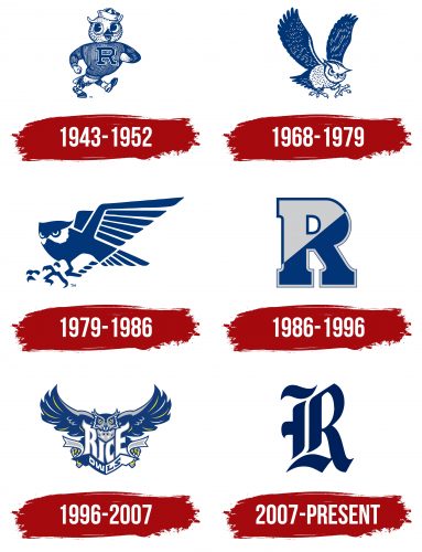
The Rice Owls logo exudes a powerful energy. Determination, drive, intelligence, resourcefulness, and unwillingness to yield to opponents are concentrated in simple forms and unusual images. The lines, harmoniously transitioning from wide zones to narrow ones, clearly convey dynamics; therefore, the emblem fits well into the sports theme.
Rice Owls: Brand overview
| Founded: | 1914 |
| Headquarters: | Houston, Texas, United States |
| Website: | riceowls.com |
Meaning and History
After the university was launched in 1912, a sporting spirit gradually emerged as student teams, which received the nickname Owls. Although the owl has nothing to do with active physical loads or competitions, it not only became their mascot but was also included in the name.
Moreover, it is not just an abstract character but an Athenian owl from the coats of arms of the Rice dynasties living in Houston. It is associated with the family heraldry of the founder of the educational institution – businessman William Marsh Rice. Three-night predators are used at once in the university logo and the academic seal, and the sport’s emblem – one. But it is colorful, authentic, and anthropomorphic.
What is Rice Owls?
Rice Owls is a sports department from the city of Houston, Texas. It belongs to Rice University and has 14 teams: 7 men’s and seven women’s. Students compete in the NCAA at the Division I level and have been members of the American Athletic Conference since 2013. The program’s crown colors are gray and blue. The mascot is an owl named Sammy. She has been depicted on the logo for a long time.
1943 – 1952
The logo features a brave owl in a striped sweater and a sailor’s cap on its head. It smiles warmly, slightly opening its beak, and walks enthusiastically to the right. The lively, athletic, muscular bird looks like a successful athlete who can easily overcome any difficulty. This is what it demonstrates with its appearance. Instead of wings, it has hands clenched into fists. This gesture manifests determination and unwillingness to give up the victory, for which the owl is ready to fight. It has a print in the form of a large “R” from the word “Rice” drawn on its chest. This is how the designers conveyed the name of the teams.
1968 – 1979
During this period, the student-athletes from the Rice Owls organization wore helmets with the image not of an anthropomorphic owl but a realistic one. It’s depicted flying to the right with its wings highly raised. The powerful beak is open as if the predator is making an intimidating sound. The eyes strictly look downward, as if the bird has spotted prey: claws with sharp talons are ready to grasp the victim. The drawing is done in blue and white, but in the original version, gray was used instead of white at first.
1979 – 1986
The athletes adopted a form with an abstract owl in a futuristic style, where mechanicalness, abstraction, smooth lines, sharp features, and modernism dominate. The bird doesn’t have a beak: it has merged with the other details. However, the eyes are highlighted – large, impressive, and white. They resemble a ghost mask, appearing in negative space. It’s a classic element of intimidation in competitions, intended to suppress the competitors’ spirit.
The owl’s wings are raised upwards. Each feather is well drawn in them. In particular, the artists made them resemble knife blades. The top part of the head with sharp ears, a powerful body, and talons with hook-like claws ready to grab potential prey are also clearly visible.
1986 – 1996
The owl era seems to have ended because the Rice Owls logo now features a block “R.” This is the most common design technique among sports emblems, as many contain or contain the first letter from the team’s name. With this step, the leadership aimed to demonstrate a focus on modernity, current sports trends, and branding. The large glyph is colored blue and gray with reverse edging. This symbol is known as the Split R or Divided R.
1996 – 2007
The athletic department once again returned the menacing owl to the logo. This time, it is placed in full face and flies forward, spreading its wings. The similarity of feathers to stabbing-cutting weapons remained, but the features became softer. The word “Rice” adorns the front of the bird’s body. Tall letters with elongated ends harmoniously complement the sharp ears (“R” and “E”), and the central “I” and “C” are combined in such a way that they resemble a beak. Beneath them, the word “Owls” is placed on a curved ribbon. Interestingly, during this period, the palette of visual identity expanded. In addition to blue and gray, two equally significant colors, yellow and white, were introduced.
2007 – today
Initially, this logo was secondary, but later it transitioned into the category of main symbols. It was introduced in 1992 and was used solely by university baseball players. In 2007, the management decided to make it the main one because it uniquely represents the letter “R” in an exquisite Old English style. The glyph resonates well with the plumage of an owl, perfectly echoing the shape of the feathers – soft, wide, with narrow edges and sharp ends. It also includes details that distinctly convey the sharpness of the claws and the bulk of the beak. The emblem encapsulates a stylized owl harmoniously combined with the letter. The color palette is now limited to blue.
Font and Colors
The Rice Owls logo was rarely accompanied by inscriptions – only in 1996-2007 when designers proposed two custom fonts. The symbols were maximally adapted to the image of the owl; hence they were complemented with sharp elements and prickly serifs, reminiscent of the beak and claws of a predatory bird. But most often, it was a single glyph – the first letter of the name of the athletic department. It was large, blocky, monolithic.
The official palette of Houston athletes consists of blue and gray – the colors from Rice University’s identity, to which the teams belong. They are complemented by neutral white and accent yellow to provide a favorable background and focus attention on the owl’s wings, eyes, and claws.

