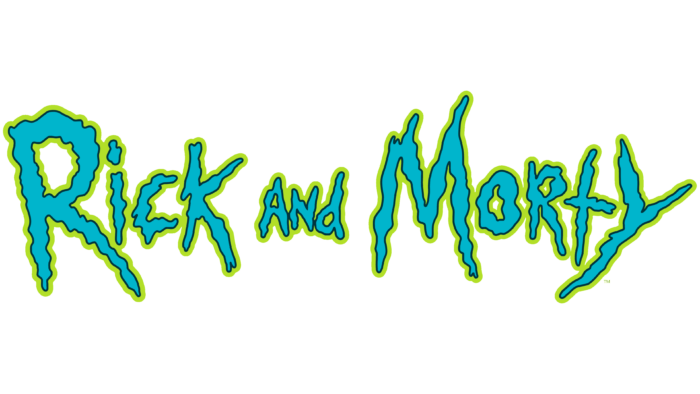
The Rick And Morty logo is shaking in fear and horror, just like viewers of the late-night comedy adult cartoon series. The emblem, like a protruding inscription on a dark background drawn by a trembling hand, both frightens and attracts the viewer.
Rick And Morty: Brand overview
| Founded: | December 2, 2013 – present |
| Founder: | Justin Roiland and Dan Harmon |
| Headquarters: | United States |
Meaning and History
Daniel James Harmon and Mark Justin Roiland are the creators of a series of colorful characters with a philosophy of nihilism. They met in the early 2000s at the Channel 101 Short Film Festival, where Mark was a member and Daniel was the organizer. Harmon immediately appreciated Roiland’s work, calling it “sick and perverted.”
Their paths briefly parted ways until Adult Swim started a new project. The channel decided to involve Harmon in work, and he, not understanding anything in animation, called Roiland for help. They wrote the first script literally in 6 hours, without leaving an empty office with no table or chairs. This is how the cult animated series Rick And Morty appeared with the simplest concept: the genius, sociopath, and alcoholic Rick Sanchez, together with his grandson Morty Smith, travel to the most distant corners of the world using a flying car and portals.
Both characters in the original voice actors speak in the voice of Roiland. In addition to them, other members of the dysfunctional Smith family appear in the episodes, who have a cynical outlook on life. Depicting a strange postmodern universe, the sitcom’s authors made many references to science fiction, horror films, pop music, politics, and real people. The comedy show is filled with scenes of monstrous absurdity and ironic, sad mood.
The show’s logo looks as crazy as the plot scenes. It debuted with the first episode in early December 2013. The authors stylized the show’s title using squiggly letters. The wobbling of the lettering, combined with the vibrant colors, is reminiscent of the narcotic effect of hallucinogens. And this allusion is not accidental, given the shocking humor of Rick And Morty and the dependence of the genius scientist Rick on psychoactive substances.
Font and Colors
The animated series has no graphic symbols other than a text mark. But this is not required because the inscription looks self-sufficient and, to some extent, conveys the essence of Rick And Morty. It is made in the same style that is used to depict the animated universe. Because of the wavy lines, it seems that this is something temporary, impermanent, like a mirage.
All text elements are drawn by hand, and the creators of the logo combined upper and lower case letters, not observing the rules of grammar. For example, both “R” s are in uppercase, although one of them is in the middle of the word “Morty.” The “N” in “and” also looks more like an uppercase than a lowercase. At the same time, the symbols have different sizes and seem to hang in space: they are not aligned either horizontally or vertically.
The inside of the lettering is colored blue, and the outside is outlined in green. To prevent the two bright shades from merging, thin black lines separate them. This color scheme has been in use since the debut of Season 1.
Rick And Morty color codes
| June Bud | Hex color: | #bfde42 |
|---|---|---|
| RGB: | 191 222 66 | |
| CMYK: | 14 0 70 13 | |
| Pantone: | PMS 375 C |
| Maximum Blue | Hex color: | #41b4c9 |
|---|---|---|
| RGB: | 65 180 201 | |
| CMYK: | 68 10 0 21 | |
| Pantone: | PMS 3125 C |
| Squid Ink | Hex color: | #203745 |
|---|---|---|
| RGB: | 32 55 69 | |
| CMYK: | 54 20 0 73 | |
| Pantone: | PMS 303 C |


