The Ripple logo represents the connection between platform participants located in different parts of the world. The system works smoothly and continuously, and the cash flow flows from one wallet to another according to specially designed rules.
Ripple: Brand overview
| Founded: | 2012 |
| Founder: | Ripple Labs Inc. |
| Headquarters: | United States |
| Website: | ripple.com |
Meaning and History
For ten years of work in the cryptocurrency market, the company has changed its logo only once. Moreover, we are talking about a minimal redesign that most platform users did not notice. The logo consists of the name “Ripple” and the emblem. Visual brand recognition is high, thanks to the fact that today the decentralized system is one of the ten largest in the market.
What is Ripple?
First of all, this is a modern resource relevant for users who own digital assets or want to purchase them using such platforms.
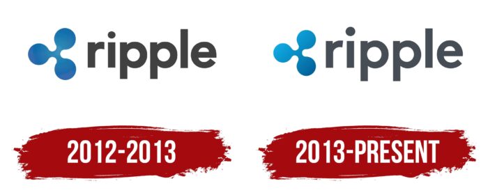
2012 – 2013
Interestingly, the first version of the Ripple logo was presented at the stage when the future market leader was at the startup stage. The logo consisted of the name “ripple” in lowercase black letters using a classic bold sans-serif.
The ancient sign triskelion was used as an emblem, which depicted three legs that come out of one point. However, in the case of “ripple,” we are talking about three circles. This geometric figure is more associated with the digital world and cryptocurrency in particular. The emblem is made in blue with a barely noticeable gradient.
Despite the contrast between the two elements of the logo, the result is a solid and modern look, thus attracting users worldwide.
2013 – today
A year after the project’s launch, it was decided to redesign the logo. The changes were minimal. The blue color gradient in the emblem has been changed. Thus, there was a feeling of movement in the emblem, visually resembling a spinner. The association with the popular toy also appeared among users, but the company did not comment on this moment. One thing is for sure: brighter shades of blue made the logo more friendly and customer-oriented.
Also, minimal changes were made to the verbal name of the brand. Now it is better displayed in small sizes. In addition, the distance between the emblem and the inscription has decreased.
Font and Colors
The brand name on the logo is made using lowercase black letters. The bold font used to create the logo is called LL Brown. He was chosen in 2013 to improve the quality of the inscription.
The triskelion, which forms the basis of the Ripple emblem, was made using blue and its shades. This choice is not accidental. Through the sense of movement created by the gradient, the company indicated the constant movement it was in. Thus, users had a feeling of reliability and timelessness of the platform.
Ripple color codes
| Rich Electric Blue | Hex color: | #0b9cd4 |
|---|---|---|
| RGB: | 11 156 212 | |
| CMYK: | 95 26 0 17 | |
| Pantone: | PMS 801 C |
| Star Command Blue | Hex color: | #0575ab |
|---|---|---|
| RGB: | 5 117 171 | |
| CMYK: | 97 32 0 33 | |
| Pantone: | PMS 7461 C |
| Marengo | Hex color: | #474d55 |
|---|---|---|
| RGB: | 71 77 85 | |
| CMYK: | 16 9 0 67 | |
| Pantone: | PMS 7540 C |
