The emblem elements’ practical meaning is unifying subscribers using a stretched cable. On a more elevated level, Rogers’ logo symbolizes unity, a circle of people connected by a love of communication and technology.
Rogers: Brand overview
Rogers Communications was founded by Ted Rogers, who inherited his father’s love of radio technology and experimental television broadcasting. He decided to continue the family business and 1960 created Aldred-Rogers Broadcasting with TV presenter Joel Aldred. Their joint radio business began with the purchase of CHFI, Toronto’s only FM station.
In 1967, the corporation acquired the Rogers Cable TV division. This was followed by several strategic deals that allowed the company to gain wide access to the cable TV and wireless market. Thus, a small broadcaster became a leading provider of services in communication and media. After Ted Rogers died in 2008, management was transferred to the board of directors.
Meaning and History
Restructuring and mergers with other firms have impacted Rogers Communications’ identity. Thus, the company often changed its logos with only one goal: to show individuality and earn Canadians’ trust. Her iconography contained many abstract symbols that were used at different times. It is a complex circular pattern that has received the unofficial name “Mobius.”
What is Rogers?
It is a large Canadian media and communications company. She specializes in IT, wireless communications, cable TV, telephony and Internet services, and media. The company has existed since 1959.
1965 – 1967
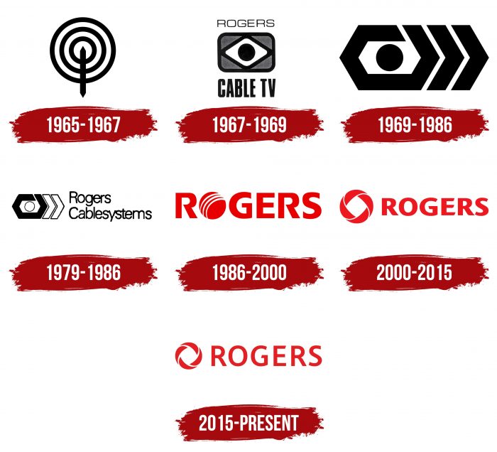
One of Rogers Communications’ predecessors was the Rogers Broadcasting division. Its logo contained three concentric circles representing radio waves and a vertical strip with pointed ends, symbolizing a radio broadcasting point.
1967 – 1969
1967, the telecommunications corporation founded Rogers Cable TV, later renamed Rogers Communications. Until 1969, he used the “eye” emblem. The drawing consisted of several geometric shapes. The base was a gray rectangle with rounded edges, and inside it was a white rhombus with a black circle in the middle.
The brand name was split into two parts. The first word was written at the top, the second and third at the bottom. For ROGERS, the designers chose a thin sans-serif font. For “CABLE TV,” the font was also grotesque but bold.
1969 – 1986
Rogers Cable TV’s second emblem was significantly different from the first. There were no inscriptions, and the “eye” became even more abstract. The circle representing the pupil remains. It was in the center of a white hexagon placed in the same black hexagonal frame. A new element has appeared on the right—two-angle brackets. They resembled a fast-forward button, which, like the eye, corresponds to the television theme.
1979 – 1986
When Rogers Cable TV took over Canadian Cablesystems, the division became Rogers Cablesystems. After the restructuring, the logo has hardly changed. The designers only recolored the white circle and two angle brackets, leaving thin black outlines.
1986 – 2000
In 1986, executives renamed Rogers Cable to Rogers Communications. The design reflected the global rebranding: the corporation ditched its original symbols to favor a wordmark with large red lettering “ROGERS.” The second letter’s place was taken by a circle, divided into parts by three white lines. The geometric figure symbolized the planet, and the arched stripes symbolized the telecommunications network.
2000 – 2015
In January 2000, the company unveiled a new logo with the word “ROGERS” and a multi-piece ring nicknamed “Mobius” because of its similarity to the Mobius strip. The letter “O” has acquired a familiar look, and the font has become more laconic overall.
2015 – today
The work on the current corporate identity lasted about eight months. Lippincott and Publicis, CEO Guy Laurence, Brand Director Dale Hooper, and Rogers’ design team actively participated in rebranding. Viewers saw the first hints of the company’s identity in an advertising video released in the fall of 2014. The official presentation of the logo took place the following year.
At first glance, nothing has changed: on the left, as before, there is a figured ring, and on the right – an inscription. But looking closely, you can see that the developers made the letters more elongated and thinner. The so-called “Mobius” has also become more compact.
Rogers: Interesting Facts
Rogers Communications Inc., a big name in Canada’s telecom and media world, has existed for over 50 years. Started by Ted Rogers, it grew from a small radio station into a giant that deals with wireless, cable TV, high-speed internet, and media.
- Starting with a Bang: Ted Rogers launched Canada’s first FM radio station, CHFI-FM, in 1960, which is still running.
- Cable TV Trailblazer: In the 1960s, Rogers was one of the first in Canada to bring cable TV, changing how Canadians watched TV.
- Into Telecom: In the 1980s, Rogers entered the telecom market with Rogers Cantel (now Rogers Wireless), eventually becoming Canada’s biggest wireless carrier.
- First with BlackBerry: In 1999, Rogers was the first to offer BlackBerry services, changing how business was done with email on the move.
- High-Speed Internet Pioneer: Rogers pioneered the introduction of high-speed internet to Canadian homes in the late 1990s, transforming internet use.
- Sports and Media: Rogers is a major player in sports and media, owning the Toronto Blue Jays, holding a big part of Maple Leaf Sports & Entertainment (which owns teams like the Toronto Maple Leafs and Raptors), and having a stake in various media.
- Rogers Centre: They own the Rogers Centre in Toronto, which has been famous for its retractable roof since 1989 when it was a big deal.
- Leading in 5G: Rogers launched its 5G network in early 2020, leading the charge for faster and more reliable connections across Canada.
- Giving Back: The Rogers family and company focus on philanthropy, supporting healthcare, education, and community development.
- Eco-Friendly Goals: Rogers is working on being more sustainable, reducing its carbon footprint, and minimizing waste.
From humble beginnings to becoming a leader in Canada’s digital landscape, Rogers Communications has always been about innovation and connecting people. It plays a key role in shaping Canada’s digital future as it grows.
Font and Colors
The Rogers graphic sign resembles the Mobius strip—a convoluted ring with one closed curved line. This symbol was previously used in graphic art and inspired sculptors. It is classified as a topological object because its surface remains unchanged under infinite deformation.
The last two company logos contain the “Mobius” badge and red lettering. The first case presents a grotesque resembling a Prenton RP Pro Bold (published by Wiescher-Design). The second font has a lot in common with Vanarchiv’s Lisboa Bold, aside from the lack of a hook on the diagonal “R” stem and the presence of slices at the ends of the horizontal lines of the “E.”
The red color was also changed after the rebranding. At first, it was bright (# E90000), but then it got slightly darker (# EF111A). The current version of the logo uses a shade of red (# E41B1F), close to the color of the Canadian flag.
FAQ
Is Rogers Canadian or American?
This is a Canadian company founded by Ted Rogers. He started by purchasing his first radio station, CHFI, in Toronto. This began the emergence of a major telecommunications and media brand in Canada.
The brand now offers various services, including wireless, cable, internet, and media broadcasting. It is based in Toronto, Ontario, and serves millions of Canadians. Rogers helped shape telecommunications in Canada by continually innovating and expanding services to meet customer needs.
What does Rogers sell?
The company offers a wide range of services to meet customer needs. The brand provides mobile services, including voice, text, and data plans, with a robust network across Canada. It sells high-speed internet to homes and businesses, offering plans for basic web browsing and high-bandwidth activities such as streaming and gaming.
The brand offers home monitoring solutions, including security systems with video surveillance, motion detection, and smart home integration. Home phone services offer reliable, affordable landline options with clear voice communications and various calling features.
What is the Rogers symbol?
The symbol is a ring consisting of four elements in a crescent shape. It resembles a Möbius loop, a shape named after the scientist who discovered it. The symbol represents a twisted cable, a key part of utility networks.
The logo represents the brand’s core business in telecommunications and media. The twisted cable in the symbol emphasizes the flow of information necessary for the brand’s services.
Is Rogers Communications in the US?
The company does not reside in the United States. It has agreements with US carriers to support its subscribers traveling to the US. Canadian travelers using the service can continue to use their mobile services, such as voice, text, and data, without interruption while in the US.
It is a Canadian company based in Toronto, Ontario. The brand offers various services in Canada, including wireless, cable, internet, and broadcast media. The focus is on serving Canadian customers and meeting their communication needs.
What is Rogers’ slogan?
The slogan “We bring the best to Canadians” demonstrates the brand’s commitment to offering the highest quality services. This slogan is aimed at the domestic market and focuses on Canadian customers.
The slogan reflects the brand’s mission to provide the best in wireless communications, internet services, cable television, and media broadcasting. Using this slogan, the brand emphasizes its role in improving the daily lives of Canadians through reliable and innovative services.
Is Rogers the biggest company?
It is Canada’s largest telecommunications company and the largest domestic wireless operator. As of the third quarter of 2020, the brand had over 10.8 million subscribers. This large number demonstrates its wide reach and influence in Canada.
The brand’s success in the wireless sector proves its ability to provide reliable services to various customers. Its position allows it to continue to innovate and expand its offerings to meet user needs.
Its extensive infrastructure and variety of services make it the largest company in the Canadian telecommunications industry. The company’s focus on quality and customer satisfaction strengthens its position as a market leader.


