


![]() Roma Logo PNG
Roma Logo PNG
The Roma logo reflects the club’s connection to Italy’s history and culture. The heraldic shield and the image of the she-wolf with the twins recall the legend of Rome’s founding. The emblem conveys the pride, strength, and character of a team that grew from the very heart of the Eternal City.
AS Roma was founded on June 7, 1927, after the merger of Fortitudo-Pro Roma, Roman FC, and Alba-Audace, under the leadership of Italo Foschi. The aim was to challenge northern clubs such as Juventus, Milan, and Inter, while SS Lazio stayed independent. The club adopted yellow and dark red, with the she-wolf and Romulus and Remus as its symbol.
Early games took place at Motovelodromo Appio, then moved in November 1929 to Campo Testaccio. In 1930–1931, Roma finished second behind Juventus. The first Scudetto came in 1941–1942 during the war, driven by Amedeo Amadei’s 18 goals. After the war, results declined, and in 1951 the club dropped to Serie B but returned the next season.
Roma won the Inter-Cities Fairs Cup in 1960–1961 against Birmingham City. A rebuild in the early 1980s under Dino Viola and coach Nils Liedholm, with Carlo Ancelotti and Bruno Conti, led to the 1982–1983 title. In 1984, Roma lost the European Cup final to Liverpool on penalties. Another final defeat came in 1991 against Inter.
In the 1990s, Francesco Totti became the key figure, despite interest from Real Madrid, and finished with 786 games and 307 goals. In 2000, Franco Sensi signed Gabriel Batistuta and Hidetoshi Nakata. Roma won the 2000–2001 title after beating Parma and finishing ahead of Juventus. In 2022, under José Mourinho, the club won the UEFA Europa Conference League against Feyenoord, and in 2023, it lost the Europa League final to Sevilla on penalties.
Meaning and History
![]()
The history of the logo’s creation is nearly identical. The managers of the new club adopted the logo of the existing Fortitude club. However, the emblem seemed most suitable for the club.
The “Roma” emblem consists of two parts: the top features the Capitoline wolf, and the bottom displays the ASR logo (Associazione Sportiva Roma – Sport Association of Rome). The Capitoline she-wolf is one of the main symbols of the Eternal City. According to legend, Romulus and Remus, the founders of Rome, were raised by a she-wolf, which became the city’s symbol of purity and protection.
The colors of the emblem were taken from the Roman flag: gold symbolized the gods, and red-brown symbolized the emperors. Roman legionnaires also wore yellow and red.
Over the years, “Roma” earned the nickname “wolves,” prompting the club to change its emblem in the 80s.
What is Roma?
It is an Italian sports association that unites professional footballers. It has existed since 1927, when a historic merger of four teams occurred. The club has won the Coppa Italia and Supercoppa Italiana repeatedly and has topped Serie A three times. Italo Foschi founded it. The club’s headquarters is in Rome. Its home stadium is “Stadio Olimpico”.
1927 – 1930
![]()
The emblem of the Roman football club originated in myth rather than in the sporting environment. From the first years of Roma’s existence, the visual symbol became the she-wolf nursing the twins Romulus and Remus. The motif was placed on a classic heraldic shield in a light tone with a thin dark outline. The connection to the city’s heritage was evident. However, the municipal authorities of Rome never granted formal permission to use the famous statue. Even so, the mark appeared freely on printed materials and season tickets, while it was absent from the players’ match jerseys.
The crest had a restrained and strict structure. The shield’s outline was elongated vertically, and the field was divided by a clean horizontal line into two parts. In the upper segment, the she wolf is shown in profile. Dark areas create the sense of a living figure, though the fur is rendered in a generalized, low-detail manner. Beneath the body, the silhouettes of the twin brothers can be seen in the nursing scene. The designers limited themselves to a concise depiction of the legend.
The lower section featured the ASR monogram, which stands for Associazione Sportiva Roma. The three letters are combined into a single linked form, intertwined with one another and executed in an Art Deco aesthetic.
1930 – 1934
![]()
Roma’s football kit gained its own symbol in the early 1930s. During that period, a maroon circle with a yellow ASR monogram appeared on the team’s shirts. The three letters, representing the abbreviated name Associazione Sportiva Roma, became the first mark to accompany the players on the field. Previously, symbols were used outside the kit, on club documents or tickets. With the emblem appearing on the uniform, the team’s visual identity entered match play.
The composition followed a minimalist principle. At its base was a dark red circle with a thin yellow line along the inner edge. Inside was the ASR letter group. The vertically elongated characters were rendered in the same warm yellow color as the outline.
The letter A was placed on the left. Its outer side followed the circle’s curve. On the right was the R, built from a straight stem and a rounded upper element that transitions into a diagonal stroke. Between them, closer to the center, the S was fitted in, softly closing the monogram’s overall shape.
Over time, the combination of maroon and yellow became established within the club system. It became a permanent part of Roma’s image, linking the early mark to the team’s later history.
1934 – 1945
![]()
For decades, the Roma football club tied its visual identity to the city’s history, and the next version of the emblem continued this tradition. The familiar shield shape was divided horizontally into two zones. The upper part was rendered in a soft ochre tone, while the lower part was colored maroon.
In the upper field, the Capitoline she-wolf appears. The figure is shown in profile, with the head facing left. Beneath it are two infants in the nursing scene. Their forms are depicted schematically.
The lower part of the shield is devoted to the monogram composed of the letters A, S, and R, which stand for Associazione Sportiva Roma. The light ochre letters sit on a maroon background and stand out for their clean shapes and a thin black shadow that creates the impression of a slight separation from the surface.
1945 – 1949
![]()
In 1945, the AS Roma football club emblem received an updated look and a different color treatment. The shield base was retained, but the outline became softer with more rounded lines. The inner field was divided horizontally into two equal color zones. The top is rendered in a red-orange tone, while the bottom is rendered in yellow.
Over the colored fields appears a monogram composed of the letters A, S, and R, arranged in a single vertical grouping. The large, smooth curves fill the shield’s space. The upper parts of the letters are colored orange, while the lower parts are rendered in a red-orange tone. The letters’ color mirrors the background’s division.
1949 – 1950s
![]()
In 1949, AS Roma introduced a mark that differed from earlier versions. Instead of the familiar shield, a thickly outlined circle appeared in a rich yellow color. The interior of the circle is filled with a red-orange tone.
At the center is a large grouping of the letters A, S, and R. The monogram looks heavy, with wide strokes, and the color matches the border’s tone. The letters A and R are joined by a shared vertical stroke, where the right edge of A simultaneously forms the left side of R. Below, between them, the S is inserted, closing the composition and linking all elements into a single mark. This interweaving creates associations with a lock mechanism or interlocked links.
1950s – 1960s
![]()
In the AS Roma chronicle, some marks differ from the club’s familiar visual range. Among the most unconventional is a circular emblem with a thin outline in a saturated orange tone. The inner field is filled with dark brown.
In the top line, the letters A and S are separated by dots. Below, set in a larger font, is the word ROMA. The typeface is extremely restrained, sans-serif, and, in spirit, close to Futura or Franklin Gothic. The lettering color matches the outline and stands out against the dark background. This version became one of the club’s most minimalist.
1960s
![]()
AS Roma once again revised the visual mark, returning to a shield shape with a horizontal color division into two parts. The upper field is colored in a warm yellow-orange tone, while the lower field is rendered in a rich red. A clean black line runs along the edge, setting strict boundaries for the shape.
In the upper area is the classic scene of the she-wolf nursing two infants. The she-wolf faces left, with the infants beneath her, referring to the myth of Romulus and Remus, the future founders of Rome.
For the first time, the lower red field displays the text ROMA. White uppercase letters are centered and rendered in an even typeface close to News Gothic or DIN. Below the inscription, near the bottom edge of the shield, is a black ARS monogram, standing for Associazione Sportiva Roma. The letters are connected originally and introduce a new hierarchy. The letters A and S are positioned above, while R is lowered, forming a different internal structure of the mark.
1960s – 1970s
![]()
The AS Roma football club logo continued to evolve. The outline of the shield changed, and the proportions became heavier. The horizontal division was retained, but the color treatment shifted. The upper section took on a muted orange tone, while the lower part was colored a subdued red leaning toward burgundy.
The image of the she-wolf with the infants was interpreted in different ways. The figure became larger, with emphasis on monumentality. Changes also affected the monogram in the lower field. The letter R returned to the top row and took position to the right of A. The letter S was placed below, between them. The lettering became lighter than in previous versions and shifted toward a golden beige.
The successive updates of the Roma symbol continue to rely on city mythology, with varying outlines, colors, and internal structures, while preserving visual continuity and a connection to the club’s heritage.
1970s – 1979
![]()
The Roma football club’s emblem changed again, and the updated image moved even further away from the ancient source. The most noticeable change affected the she-wolf. The connection to the ancient Roman sculpture weakened, and the image itself became more symbolic and generalized. The animal faces left, the body is elongated, and a mottled pattern in several shades of brown creates a sense of fur texture. Beneath it, as before, are two infants kneeling with their arms raised. Their figures are outlined in thin black lines, with no detailed rendering.
The shield shape was retained with a pointed lower edge and a defined upper section, but the outline became heavier and took on a light brown tone. The inner field is divided into two color zones. The upper part is rendered in a rich yellow-orange, while the lower section is scarlet.
In the lower segment is a monogram associated with the name Associazione Sportiva Roma. The order of the letters changed again. A and S are placed side by side at the top, with R centered below them. Visually, this forms the ARS combination, which differs from the full club name, though the exact letter order is no longer of primary importance. All characters are rendered in white.
Despite the artistic freedom, the key elements of Roma identity remained in place. The shield, the color palette, the she-wolf, and the founding children continue to shape the club image.
1979 – 1997
![]()
In 1978, Roma found itself in an unusual situation. The club’s historic logo, the Capitoline she-wolf, was unavailable for official registration for legal reasons. Municipal authorities denied the right to use the image associated with the capital’s coat of arms. In response, the club turned to designer Piero Gratton, tasking him with creating a new symbol that could replace the lost one without sacrificing visual strength.
Gratton proposed a design that went down in history as Lupetto, or Little Wolf. The concept was based on a stylized animal profile rendered in black. The mark was minimal and contained no text. All emphasis rested on the shape of the animal’s head with an open mouth and a dark red, almond-shaped eye. The drawing suggests features of both a wolf and a dog, giving the image sharpness and an unusual character.
A double border surrounds the silhouette. The inner line is burgundy, and the outer line is golden yellow.
Lupetto became a full replacement for the Capitoline she-wolf and came to symbolize an entire era. To this day, Roma supporters regard it as one of the most successful and memorable images in the history of Italian football branding.
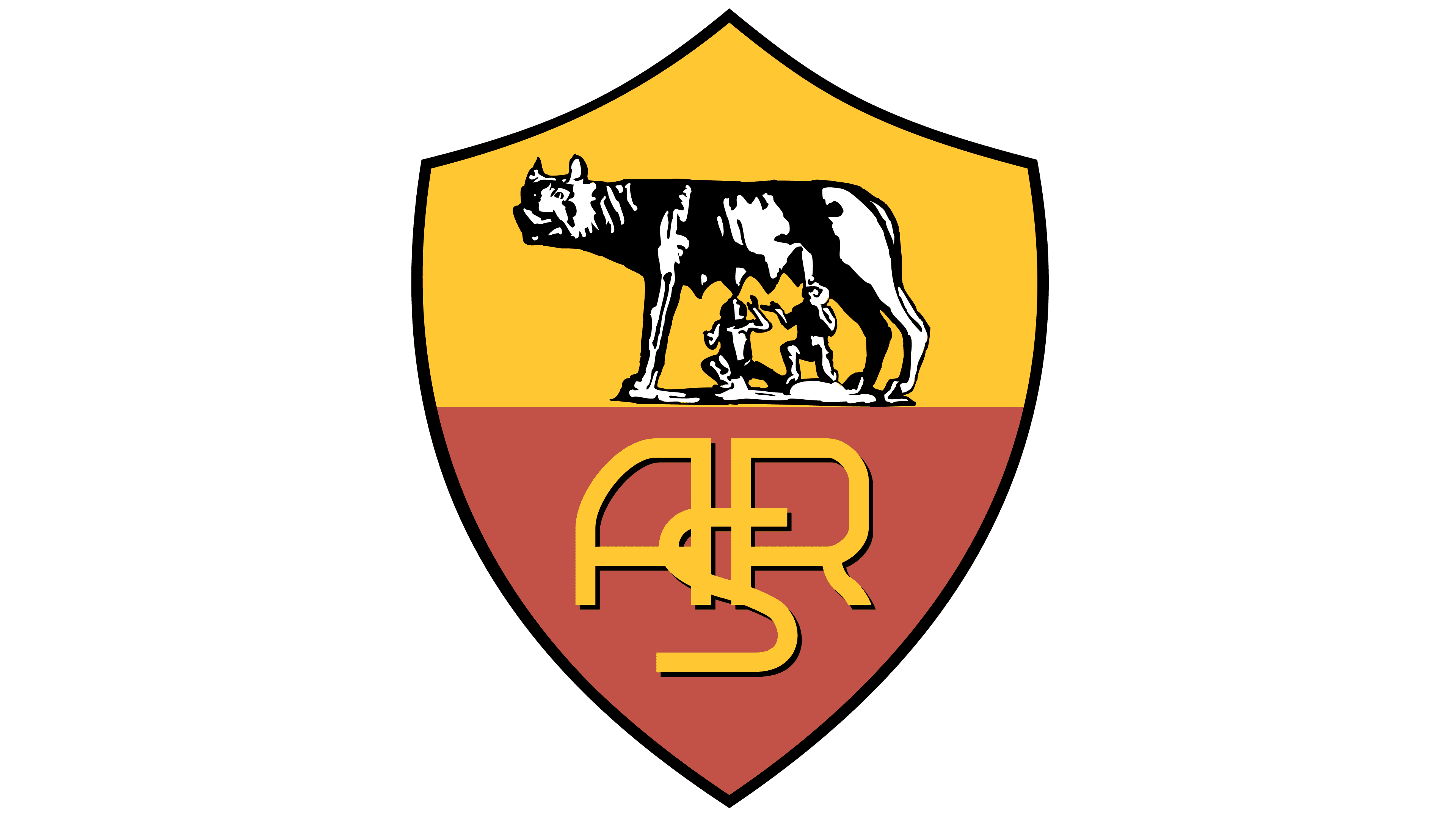
1997 – 2000
![]()
In 1997, the Roma football club reintroduced the Capitoline she-wolf into its emblem, marking another stage in the club’s symbolic development. Attempts to return to the legendary Roman symbol had been made before, but the lack of an agreement with the city prevented securing the rights to its use. After signing an official agreement with the municipality, the club gained the legal ability to place the ancient motif on the crest.
The shield returned. The shape is vertically elongated, with smooth upper lines and a sharp point at the bottom. The inner field is divided horizontally into two color layers. The upper section is rendered in a muted yellow tone, while the lower section is burgundy.
In the upper field is the silhouette of the she-wolf, beneath whose body are the figures of the twins Romulus and Remus. The image is rendered in black using dense hatching. This technique creates a sense of volume and texture even in a flat execution. Lighter areas on the figures help separate details from the golden background.
The lower part of the shield is occupied by a monogram of the letters A, S, and R combined into a single form. A black shadow complements the characters’ orange color.
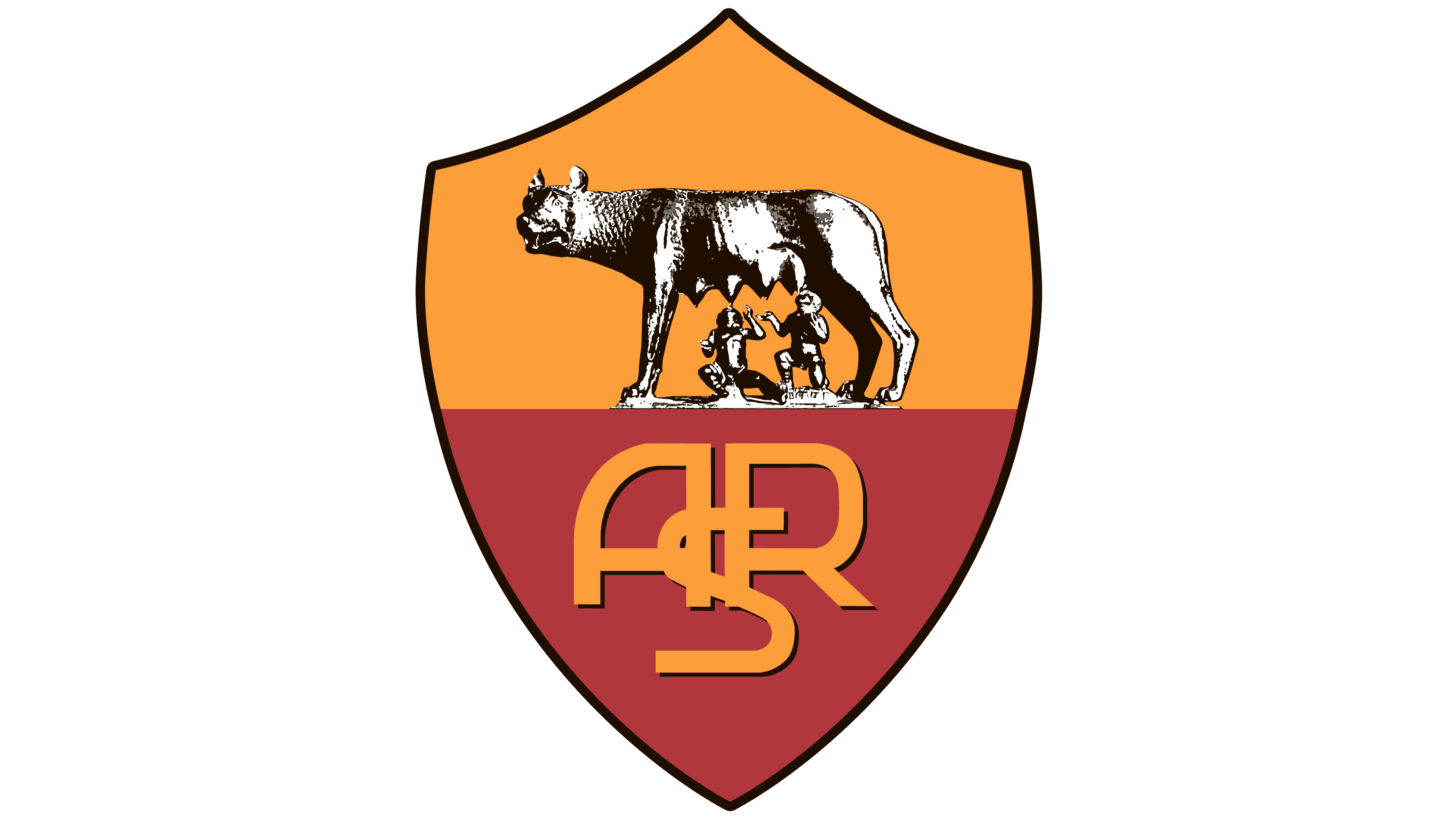
2000 – 2013
![]()
At the turn of the millennium, the Roma logo received a light update, introducing new visual accents. The shield retained its familiar structure, but the color treatment became more saturated. The upper field shifted to a brighter yellow, while the lower section moved toward a denser, more contrasting shade. A thin black outline appeared around the perimeter, strengthening the mark’s contours and making it appear cohesive across different applications.
The scene with the she-wolf, Romulus, and Remus remained unchanged. The ASR monogram in the lower part of the shield kept its orange color and black shadow.
The club enhanced color and detail while preserving the key image of the Capitoline she-wolf, which continues to serve as the foundation of Rome’s Roman symbolism.
2013 – 2016
![]()
In 2013, Roma came under new ownership from the United States, and the first step was updating the club’s emblem. The reworking of the legendary she-wolf image caused a strong reaction among supporters. Many fans perceived the changes as a harsh intervention into tradition and openly expressed dissatisfaction.
The shield shape changed very little in the redesign. The black outline was retained, and the proportions remained elongated with a sharp lower point. The inner field is still divided into two color zones, with a rich orange in the upper section and a dark burgundy in the lower section.
The most radical changes affected the image of the she-wolf. The illustration moved away from associations with ancient sculpture. The animal was depicted in gray, with alternating dark and light planes, defined musculature, and emphasized rib lines. Fur accents on the neck reinforced a sense of physical presence. Beneath the she-wolf are the figures of the children. Their bodies gained clear volume, and their poses became more active. One twin, with arms raised, kneels, while the other sits.
In the lower part of the shield, the familiar ASR monogram was replaced by the word ROMA. A serif typeface was used for the letters. The color matches the upper field’s orange tone and features a soft shadow. Below the name, the club’s founding year, 1927, is shown in gray.
The update sparked debate and polarized opinions, yet it gave Roma’s symbolism a more contemporary sound while preserving a connection to the team’s history and its urban roots.
2016 – today
![]()
The emblem that caused a wave of dissatisfaction among Roma supporters did not disappear under criticism. In 2016, the club carried out another light update of the mark. The designers limited themselves to minor adjustments and left the controversial she-wolf image unchanged. For many fans who expected a return to the classic symbol, this option was disappointing, as the changes affected only the shield’s color treatment.
The shield shape remained the same, with horizontal division and a black outline along the edge. The lower burgundy section remained unchanged, retaining its rich tone. The revision affected the fill of the upper field. In place of a more restrained orange, a bright yellow emerged, altering the emblem’s overall perception.
The image of the she-wolf with the infants retained its gray-black palette. The word ROMA remained in the lower part of the shield. The letter color changed and now also matches the yellow tone of the upper field.
Font and Colors
The main element of Roma’s visual identification is the she-wolf nursing Romulus and Remus. According to legend, one of these twins grew up and founded the city that later became Italy’s capital. Moreover, the logo features mythical characters and the famous statue of Lupa Capitolina. Its original is kept in the Capitoline Museum, and numerous copies are scattered throughout the world.
Thus, the football team’s emblem is directly linked to its homeland’s cultural and historical heritage. This is the most “Roman” thing the designers could come up with.
The modern emblem uses the same font as the one used from 2013 to 2016. The letters in the word “Roma” and the numbers in the club’s founding year have long, thin serifs. This is one of the versions of the Roman capital font.
The football team remains true to its traditions regarding color choice. Like many others, the current logo contains two primary colors: red and yellow.
Now, they are complemented by black and gray, which were needed to highlight certain elements.