The Rossiya logo does not align well with the company’s field of activity. Although the designers connected some symbols with the aviation industry, the graphical incompleteness and visual aggressiveness create a negative brand perception.
Rossiya: Brand overview
Rossiya Airlines has been a trusted brand in the aviation industry for over 85 years and has established itself as a leading carrier in Russia and beyond. Since its founding in 1934, the airline has earned a reputation as a reliable and top-class carrier, making it one of the most respected airlines in the Russian Federation. Russia Airlines, a member of the Aeroflot Group, is committed to providing passengers with smooth and enjoyable flights.
In the early years of its existence, Rossiya Airlines played a crucial role in providing connections to remote regions of Russia, serving as a “lifeline” for residents of remote areas. By flying to remote regions, the airline contributed to economic growth and development, bridging the gap between these regions and the rest of the country. With its fleet of reliable Soviet-made airplanes, Rossiya Airlines has successfully overcome extreme weather conditions, ensuring the safety and comfort of its passengers.
Throughout its almost century-long history, Rossiya Airlines has been constantly expanding the boundaries of air transportation. The airline improves flight efficiency and safety by utilizing modern aircraft and prioritizing passenger comfort.
In recent years, Rossiya Airlines merged with Aeroflot Group, a strategic move further strengthening its presence in the aviation market.
Russia Airlines is prominent at Pulkovo Airport (St. Petersburg), the largest carrier in this major transportation hub. With an extensive network of domestic and international flights, the airline offers convenient travel options for both business and leisure travelers.
Utilizing its extensive network and the combined strength of the Aeroflot Group, the airline plays an important role in connecting people, businesses, and regions in Russia and around the world.
Meaning and History
What is Rossiya?
Rossiya Airlines is one of the most stable and largest air carriers in the Russian Federation. Its creation dates back to May 7, 1934, making it one of the oldest airlines in the region. The airline, a member of the reputable Aeroflot group, demonstrates stable growth and sustainability in its operations.
1934 – 2006
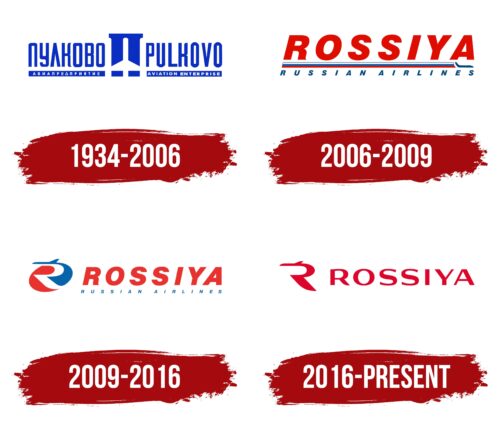
Rossiya’s predecessor was the Pulkovo Federal State Unified Aviation Service Company, making its logo a historic symbol for the airline. The emblem has a primitive design: a white silhouette of an airplane against a blue shape resembling an ancient column. It looks like a stylized letter “P” from the Cyrillic alphabet. The airplane represents the aviation industry, while the column could symbolize an airport building or a runway.
The brand name is written on both sides: on the left, “ПУЛКОВО АВИАПРЕДПРИЯТИЕ” and on the right, “PULKOVO AVIATION ENTERPRISE.” Due to the massive font and visually heavy letters, the logo appears bulky. It has more groundedness than airiness, which spoils the overall impression of the airline. Even the blue color, intended to evoke the sky, does not improve the situation.
2006 – 2009
In 2006, the Pulkovo Federal State Unified Aviation Service Company was transformed into Rossiya Airlines and began using a logo with the new name. The first word is written at the top in large red letters. It’s italic font and bright color make it look very aggressive, as if the brand wants to showcase its high competitiveness.
Below is a small airplane followed by a long ribbon with three stripes: white, blue, and red. The layered stripe gives the impression that the emblem belongs to a toothpaste manufacturer. The text “RUSSIAN AIRLINES” is written in small blue letters. It looks very faint and gets lost among the other elements.
2009 – 2016
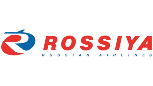
The logo was changed in 2009. The red word “ROSSIYA” still looks aggressive and looms over the small and insignificant text “RUSSIAN AIRLINES.” This poor design choice does not connect the company to the aviation industry and evokes negative emotions.
The icon on the left does not create the right associations either. The designers tried to play with the stylized letter “R” by depicting it in the negative space between a red spot and a blue airplane. However, they turned the airplane into a blue whale-like figure, and the lower part of the design looked like fiery flames. Both of these elements do not align with the concept of air transportation.
2016 – today
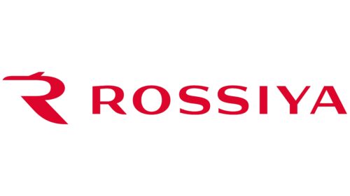
Rossiya Airlines, officially registered under this name in 2006, introduced a bold logo that reflects its brand identity. The logo features the word “Rossiya” in an intense shade of red, designed to capture attention and evoke strong emotions. The red color suggests energy, determination, and confidence, aligning with the airline’s character.
The letters are capitalized and flattened, creating a robust and solid appearance. This design emphasizes stability and reliability, key attributes the airline aims to convey to its passengers. The uppercase font lends a sense of authority and professionalism, reinforcing the airline’s commitment to providing dependable services.
On the left side of the logo is a unique symbol, a stylized fragment of the letter “R.” This design, lacking its vertical stroke, resembles an airplane. The thick stripe forming the symbol gives it a grounded look, contrasting with the light and airy qualities typically associated with aviation.
The combination of these elements creates a multifaceted logo. The red color demands attention and exudes urgency and importance. The fragmented “R” symbol introduces a sense of weight and groundedness while evoking flight. This mix communicates stability and dynamic energy, reflecting the airline’s balance of reliability with the excitement of air travel.
