Rotermann Quarter, a lively area in Tallinn, has introduced a new logo and identity designed by Bond. This update aligns with the quarter’s vision of creating an enjoyable urban environment that blends work, leisure, and social life.
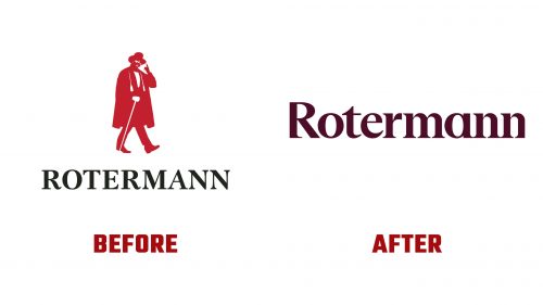
The area is named after Christian Barthold Rotermann, a 19th-century industrialist who expanded his father’s market into a commercial hub with stores and factories. The previous logo showed Rotermann in a top hat, cape, and cane but lacked sophistication. The new design modernizes this image while retaining its historical essence.
The new wordmark uses a sturdy serif font with tightly spaced letters. Unique to this design is the removal of serifs on the left of the “R” and the right of the final “n.” This symbolizes the blend of old and new within the quarter. This subtle touch adds a contemporary twist to the classic typeface, visually representing Rotermann’s mix of historical and modern influences.
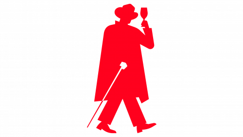
The new icon keeps Mr. Rotermann’s figure but makes it more mysterious and glamorous. The facial features are obscured, allowing the figure to play various playful roles, such as walking a dog, carrying a shopping bag, or raising a glass of wine. This change transforms the icon from a static figure into a dynamic character, reflecting the lively spirit of the quarter.
The color scheme uses shades of red with white accents, creating a bold and vibrant look. This choice complements the quarter’s dynamic atmosphere and makes the branding visually striking. Dinamo’s Arizona typeface family, combining serif and sans serif styles, adds versatility to the design. Although the sans serif weight is a bit heavy, it does not detract from the overall elegance and energy of the identity.
The rebranding reflects Rotermann Quarter’s architectural philosophy of building boldly on top of old structures. This approach is mirrored in the visual identity, which combines historical elements with contemporary design to create a unique and recognizable brand. This blend celebrates the quarter’s distinct architecture, emphasizing its nearly 200-year-old heritage while projecting a modern image.
Rotermann Quarter enhances the urban experience by providing a blend of amenities. If something isn’t available within Rotermann, it can be found in the surrounding areas, whether it’s a theater, shopping center, medieval fortification, or lounge. This interconnectedness emphasizes Rotermann’s role in contributing to the vibrancy of Tallinn, making the city a better place for residents and visitors.


