 Royal Brunei Airlines Logo PNG
The Royal Brunei Airlines logo has become an icon of quality and reliability in aviation. Its simple yet stylish design gives the company the image of a prestigious carrier. Additionally, the emblem symbolizes the high service and comfort passengers receive.
Royal Brunei Airlines: Brand overview
Royal Brunei Airlines began its journey on November 18, 1974, established by a decree from Sultan Hassanal Bolkiah. Launching a national airline was a strategic move for the oil-rich sultanate to strengthen its international ties and boost tourism. The airline started with a modest fleet of two Boeing 737-200 aircraft.
The airline’s inaugural commercial flight took off on April 6, 1975, connecting Bandar Seri Begawan to Singapore. This historic flight began a new chapter in Brunei’s aviation history, paving the way for future international connections.
During the initial years, the company expanded its network across Southeast Asia, adding destinations such as Hong Kong, Kuala Lumpur, and Manila. These additions solidified its presence as a key regional player.
In 1984, the company took a significant step by launching flights beyond Southeast Asia, with Dubai becoming its first long-haul destination. This move opened new avenues for connecting Brunei with the Middle East and Europe.
The introduction of the Boeing 767-300ER in 1990 marked its entry into the wide-body aircraft era. This addition enabled more efficient and comfortable long-haul flights, enhancing passengers’ travel experiences.
By 1991, the airline had established a direct link to London, a major milestone that connected Brunei with one of the world’s financial hubs and underscored its global ambitions.
The company continued modernizing its fleet, adding Fokker 100 aircraft in 1993 to better serve regional routes. This update improved operational efficiency on shorter and medium-distance flights.
In the early 2000s, the company underwent a major rebranding, unveiling a new logo and aircraft livery. This fresh look symbolized its commitment to modernization and innovation.
In 2007, the company ordered five Boeing 787 Dreamliners, becoming one of the first Southeast Asian airlines to invest in this advanced aircraft. This decision highlighted its dedication to staying at the forefront of aviation technology.
The arrival of the first Boeing 787 Dreamliner in 2013 marked the beginning of a new era, offering enhanced comfort for passengers on long-haul journeys.
2015, the airline updated its regional fleet with new Airbus A320neo aircraft. This move improved operational efficiency on shorter and medium routes, reflecting its ongoing commitment to modernization.
By 2018, the airline operated non-stop flights from Bandar Seri Begawan to London using the Boeing 787 Dreamliner. This route became one of the world’s longest commercial flights, showcasing its technical capabilities.
Throughout 2019, the company continued to grow its fleet and expand its route network, adding new destinations and increasing flight frequencies on existing routes.
In 2020, the airline, like many in the aviation industry, had to adjust its operations in response to the changing market conditions, demonstrating resilience and adaptability in the face of global challenges.
Meaning and History
What is Royal Brunei Airlines?
This is Brunei’s national carrier, based in Bandar Seri Begawan. It is known for connecting the small sultanate with key global destinations. The company operates a modern fleet, including Boeing 787 Dreamliners and Airbus A320neo aircraft, serving routes to Asia, the Middle East, Australia, and the United Kingdom. The airline’s Royal Skies loyalty program offers privileges tailored to regional characteristics.
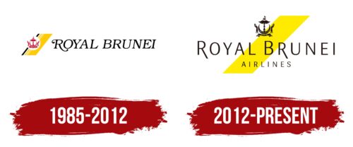
1985 – 2012
Since Royal Brunei Airlines is Brunei’s flagship carrier, its logo features key national symbols. Culturally, this emphasizes the airline’s importance to the nation and plays a significant role in promoting a positive image of the country abroad. It also demonstrates authenticity and national pride, instilling a sense of trust in passengers.
The design of diagonal yellow and white stripes, complemented by a single black line, evokes the Brunei flag. On this background, the state emblem is depicted in a white circle. Traditionally maroon in color, it consists of several elements forming a symmetrical design:
- The center features a crescent moon with its tips pointed upwards. This Islamic symbol honors Brunei’s religion. The Arabic script reads, “Always in service with God’s guidance.”
- Above the crescent are bird wings with smoothly curved feathers, conveying a sense of safety, calmness, and protection.
- The top of the emblem is crowned with a small flag featuring a V-shaped cut attached to an umbrella known as “payung ubor-ubor,” traditional attributes of the Sultan of Brunei.
- Below the crescent is a long scroll with the country’s official name in Arabic: “Brunei Darussalam.”
- On the sides are raised hands, palms facing the sky, symbolizing hope for success, grace, and prosperity.
The airline underscores its national identity by incorporating significant national symbols, representing its homeland globally. To ensure brand recognition, the logo includes the black inscription “ROYAL BRUNEI” in uppercase letters, which conveys solidity and professionalism. The italicized font with narrow serifs suggests movement and dynamism, fitting for an airline highlighting its swift service.
Special attention is given to the initial “R.” This letter features serifs and long flourishes with dots at the ends, serving as a decorative element and a symbol of sophistication, uniqueness, and premium quality, reflecting the airline’s royalty status.
2012 – today
In 2012, the airline decided to revamp its visual identity to enhance prestige and prepare for the launch of Boeing 787 Dreamliners. The first step in the rebranding was modernizing the logo, which now appears contemporary and minimalist.
The yellow color was given a new vibrant shade, now associated with the Brunei flag and the bright sun. It also evokes the silk sash worn by the royal family during state ceremonies. This large yellow stripe in the form of an elongated parallelogram reflects the unique cultural aspect of Royal Brunei Airlines.
The logo still includes the national emblem: a scroll, a crescent moon, two hands, bird wings, the paying labor-labor umbrella, and a small flag. Designers reinterpreted it, making some lines more refined and giving the design the lightness and airiness characteristic of the aviation industry.
The brand name is split into two parts and written in a distinctive font. The uppercase letters without serifs may seem simple at first glance, but the contrasting thickness of the strokes and smooth curves convey a sense of speed, technology, and modernity. Designers specifically lengthened the diagonal legs of the two “R” s in the top row to add a touch of sophistication and elegance to the logo, reflecting the airline’s royal status.


