 Royal Flying Doctor Service of Australia Logo PNG
The Royal Flying Doctor Service of Australia’s logo symbolizes hope for residents without access to quality medical care. It reflects the organization’s commitment to caring for people’s health and lives, regardless of location.
Royal Flying Doctor Service of Australia: Brand overview
In 1917, Reverend John Flynn, a Presbyterian minister, started envisioning the Royal Flying Doctor Service (RFDS). Deeply concerned about the lack of medical care for those living in remote areas of Australia, Flynn began developing a plan to use aviation to provide medical aid in these hard-to-reach locations.
The foundation of this vision became a reality on May 15, 1928, with the establishment of the Aerial Medical Service (AMS) in Cloncurry, Queensland. The service’s first De Havilland DH.50 aircraft was leased from Qantas. This initiative marked the birth of a pioneering medical service that would later evolve into the Royal Flying Doctor Service.
The first emergency flight took place on May 17, 1929. Dr. Kenneth St Vincent Welch flew from Cloncurry to Julia Creek to assist a critically injured patient. This flight highlighted the effectiveness and necessity of airborne medical services in Australia’s remote regions.
Throughout the 1930s, the service expanded rapidly, establishing new bases nationwide. By 1934, a base was operational in Port Augusta, South Australia; by 1936, another was in Alice Springs, Northern Territory. This expansion enabled coverage of most of the continent’s remote areas.
In 1942, the service was renamed Flying Doctor Service of Australia, reflecting its growing national importance. The 1950s brought technological advancements, such as the introduction of pedal-powered radios designed by Alfred Traeger. These devices allowed residents in isolated areas to communicate with doctors for medical advice, even without electricity.
1955, the service received royal patronage and was renamed the Royal Flying Doctor Service of Australia. This honor underscored its significance to the nation and its unique contribution to Australian healthcare.
The organization modernized its fleet in the 1960s and 1970s, replacing older piston-engine aircraft with more advanced turboprop planes like the Beechcraft King Air. This upgrade improved response times and operational efficiency.
The 1980s saw an expansion of services to include preventive healthcare, dental care, and mental health support for residents of remote areas. By the 1990s, the service integrated telemedicine technologies, enabling remote consultations and diagnostics and enhancing access to medical care.
In the early 2000s, the organization continued modernizing its fleet and medical equipment. The acquisition of new aircraft equipped with advanced medical technology improved the quality of care.
Throughout the 2010s, the service expanded operations to include mental health programs, chronic disease prevention, and support for Aboriginal communities.
Celebrating its 90th anniversary in 2018, the service reaffirmed its status as one of Australia’s most respected and essential medical services.
In 2020, despite facing new healthcare challenges, the organization continued its critical mission, adapting to ensure the delivery of medical services to Australia’s remote populations.
Meaning and History
What is Royal Flying Doctor Service of Australia?
This unique air medical organization provides emergency medical care and primary healthcare to residents of remote areas in Australia. The service operates a diverse fleet of airplanes and helicopters specially equipped to fly intensive care units. The organization is known for its “mantle of safety” program, which involves placing special medical kits in remote settlements to provide first aid until the flying doctors arrive.
1934 – 1942
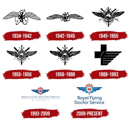
This logo first appeared in the documents of the Victorian Section, a subdivision of the Australian Aerial Medical Service (the predecessor of the Royal Flying Doctor Service of Australia). It features a simple black-and-white design, fitting for that era. Despite its primitive form, each element of the emblem holds special meaning.
- The large, blurry figure with a dark outline represents Australia, hinting at the organization serving all residents of the country. However, Tasmania is absent, possibly to balance the logo’s shape.
- The black Maltese cross in the center is associated with healthcare. It is an ancient symbol of medicine, originating from the Knights Hospitaller, who provided medical care on the battlefield and used the stylized Cavalry cross as their emblem.
- The letters “A,” “A,” “M,” and “S” at the ends of the Maltese cross represent the name Australian Aerial Medical Service, the predecessor of the Royal Flying Doctor Service of Australia.
- Two zigzag lightning bolts symbolize the pedal radio. This technology, invented by an Australian engineer, enabled residents of the vast continent to contact medical services. The radio transmitter operated on energy generated by pedaling. It didn’t require complex telegraph systems or expensive batteries. The Australian Aerial Medical Service used the pedal radio to establish communication between all its subdivisions.
- The two large wings on either side of the Maltese cross symbolized aviation. However, the white bird wings with two rows of long feathers do not evoke airplanes and would be more fitting for a livestock farm emblem.
1942 – 1945
In 1942, the organization was renamed the Flying Doctor Service of Australia, which was reflected in its logo. Now, the ends of the Maltese cross display the letters “F,” “D,” “S,” and “A,” representing the new name’s abbreviation. The designers removed the two zigzag lightning bolts, possibly because they didn’t strongly associate with radio. This allowed the image of the Australian continent to be reduced and made more compact. The wings became narrow and elongated to balance the emblem visually. Although the redesign didn’t bring significant changes, it demonstrated the brand’s aim for a simplified, minimalist style.
1945 – 1955
The medical air service updated its logo, making it clearer and more proportional. The symmetrical forms create an impression of organization, stability, and harmony, reflecting a balanced approach to its work. The emblem includes both old and new symbols.
- The dark circle represents the planet, while the white spot depicts Australia. This shows the organization’s national identity and commitment to medical assistance to all continent residents.
- A wide line outlines the circle, transforming the central part of the logo into a stylish medallion. The name “Flying Doctor Service of Australia” is written along the ring’s length, ensuring the brand’s sign is recognizable and easily identified in emergencies.
- Two dark eagle wings symbolize strength and protection. This represents rapid response, as the medical air service provides aid to those without access to hospitals and family doctors. The wings also signify the service’s high status and authority.
- The central ring and three protruding lines form a three-bladed propeller. Such propellers were once installed on the nose of airplanes to propel them. The propeller highlights the RFDS’s operations since doctors and nurses travel by plane, allowing them to reach even the most remote locations quickly.
- Seven dots on the map indicate where the Flying Doctor Service of Australia’s bases were once located, illustrating the organization’s extensive network.
- The laurel wreath visually unites all elements of the emblem. It is associated with victories and honors. For the RFDS, the laurel wreath symbolizes outstanding achievements in saving lives.
- Electrical charges like zigzag lightning bolts represent radio communication, which replaced the telegraph. This was used for communication between different service units.
- In the background, snakes are entwined around a staff, representing the caduceus, an ancient symbol of medicine and healing.
- The words “MEDICINE,” “AVIATION,” and “RADIO” reflect the core aspects of the Flying Doctor Service of Australia. Without these, the organization could not function effectively and serve the entire continent.
1955 – 1956
In 1955, the Queen of Australia granted the RFDS the honorary status of “Royal” to emphasize the service’s national importance and enhance its prestige. This recognition acknowledged the organization’s valuable work over the years. Designers added the word “Royal” to the logo, placing it in the ring alongside the original name.
Another less significant change was moving the ends of the laurel wreath behind the propeller’s blades. This made the emblem cleaner and more proportional. Increasing the space between the feathers gave the wings a sense of lightness. They symbolize the ease with which the planes cover long distances and reach remote areas of Australia.
The central circle finally includes Tasmania, the small island located south of the mainland. Now, the logo represents the entire territory under the RFDS’s care.
1956 – 1988
Shortly after the organization received the Royal status, it updated its logo again. The dots representing the bases of the Flying Doctor Service of Australia were almost twice as large, indicating the gradual expansion of the national network and the increased demand for its services.
The artists redesigned the emblem, adding more details. The updated design reflects a heightened attention to detail, which is particularly important in medicine. The traditional symbols remained in their original places: the map of Australia with Tasmania, eagle wings, three-bladed airplane propeller, laurel wreath, zigzag flashes, and caduceus.
1988 – 1993
In 1988, some RFDS divisions began using a new logo that became more memorable due to its simplicity. It omits outdated symbols like the lightning bolts representing pedal radio; as technology advances, what once was important is now outdated.
Unlike previous versions, the current emblem is minimalist, consisting of only two elements. In the background is a cross, the identifying mark of many medical services. It is partially covered by a stylized bird wing made up of six horizontal stripes. This logo highlights the Royal Flying Doctor Service of Australia’s connection to medicine and aviation.
- The wing emphasizes the organization’s aviation aspect, as its doctors fly in planes. It also symbolizes rescue and protection, reflecting the medics’ ability to respond in emergencies.
- The cross is associated with the International Committee of the Red Cross emblem. It reminds us that RFDS’s mission is to save lives and improve the health of people living in remote regions of the country.
Combining these elements represents the union of two distinct fields: aviation and medicine. The unique blend of the wing and cross in the logo makes the service easily recognizable and conveys the principles on which its activities are based.
1993 – 2009
The Royal Flying Doctor Service of Australia needed a new branding style that was more patriotic, authentic, and reflective of the organization’s national identity. Thus, an emblem was designed in the colors of the Australian flag: blue, red, and white. Blue dominates as it is associated with the sky and airplanes. Red highlights key elements, and white separates them, giving the image a sense of lightness and airiness.
The logo includes many historical symbols that have long been part of RFDS’s identity:
- The caduceus – an ancient medical symbol;
- A three-bladed propeller – a reference to old airplanes;
- Wings – symbolizing aviation.
The wings now have a softer design compared to past emblems. They have acquired a gentle shape, creating associations with protection and safety. The tips of the feathers are smoothed and rounded, and all sharp points are directed upward, making the design appear dynamic.
The outlines of Australia and Tasmania are red, emphasizing the service’s national affiliation. The map is in a white oval with a double blue border, separating it from other elements. The elements’ perfect symmetry and visual balance indicate the structure of the Royal Flying Doctor Service of Australia’s work.
Next to the emblem is the full name of the service. The first four words are on top, underlined by a long horizontal line, with “OF AUSTRALIA” written below. The designers deliberately separated the country to emphasize it.
The thin font with sharp serifs creates a sense of strictness while filling the emblem with visual energy. It indicates the organization’s high professional competence and readiness to assist.
2009 – today
The Royal Australian Flying Doctor Service (RFDS) logo includes a caduceus, symbolizing the organization’s healthcare mission. The caduceus, featuring two snakes coiled around Hermes’ staff, is placed above and partially hidden behind a white circle representing Australia, including Tasmania. This element shows the RFDS’s commitment to serving the entire country.
The logo highlights the RFDS’s aviation capabilities with large blue wings and a red three-bladed propeller. These elements illustrate the organization’s ability to provide quick and efficient medical response through air transport, emphasizing its role in emergency medical services. The blue wings convey protection and trust, while the red propeller signifies energy and action.
Below these symbols, the organization’s full name is written in a modern font. The font conveys professionalism and contemporary relevance, showing the RFDS’s commitment to up-to-date medical practices and aviation technology. Serifs are used only on the capital letters “R,” “F,” and “D,” adding a touch of tradition and stability while keeping a clean and modern look.
The logo combines these elements to create a visually appealing and meaningful design. The caduceus represents the RFDS healthcare mission, while the Australia map emphasizes its nationwide reach. The aviation elements – the wings and propeller – signify the method of service delivery and the readiness to reach remote areas. The modern typography for the organization’s name balances tradition with contemporary practice, projecting an image of reliability and modernity.
This logo captures the essence of the Royal Australian Flying Doctor Service, showing its dedication to providing essential medical care across vast distances, using tradition and innovation to save lives and improve health for all Australians.


