![]()
Ruby-Spears Logo PNG
The Ruby-Spears logo is associated with the 1980s era, a time when the studio was popular in the world of animation. It evokes memories of classic animated series from that time and conveys the creative spirit of the company that produced them. The emblem also reflects the diversity of children’s content and attention to detail.
Ruby-Spears grew out of the careers of Joe Ruby and Ken Spears, who both joined Hanna-Barbera in the late 1950s. Ruby started as an editor in 1959, while Spears worked in sound. They later moved into writing and contributed to shows such as Space Ghost and The Herculoids.
In 1969, Hanna-Barbera asked them to create a mystery cartoon for Saturday morning television. The result was Scooby-Doo, Where Are You!, one of the studio’s defining brands. Ruby and Spears wrote and edited much of the first 25 episodes, then kept working on the franchise after its move from CBS to ABC in 1975.
The pair founded Ruby-Spears in 1977 as part of Filmways while working with ABC’s Saturday cartoon lineup. ABC Entertainment president Fred Silverman wanted a rival to Hanna-Barbera, which was producing cartoons for ABC, NBC, and CBS. Ruby-Spears started with The Puppy Who Wanted a Boy, then launched Fangface in 1978, followed by Thundarr the Barbarian, Plastic Man, Rubik, the Amazing Cube, Goldie Gold and Action Jack, Centurions, Superman, and Mega Man with Ashi Productions and Capcom.
In 1981, Taft Broadcasting bought Ruby-Spears, placing it under the same owner as Hanna-Barbera. In 1991, much of its earlier library was sold, along with Hanna-Barbera assets, to Turner Broadcasting System, which Time Warner later acquired. Ruby-Spears continued as RS Holdings, but new productions declined. The studio closed in 1996, and much of its library later passed to Warner Bros. Joe Ruby and Ken Spears both died in 2020.
Meaning and History
![]()
Ruby-Spears Studio used different logos with its name, either as an acronym or in full. Joe Ruby and Ken Spears tried to immortalize their surnames to gain fame separate from Hanna-Barbera, where they had previously worked. Unfortunately, their business was unsuccessful, and the company closed in 1996. It is now remembered only through old cartoons and the emblems shown in the opening credits.
What is Ruby Spears?
Ruby-Spears was an animation studio that created cartoons like “Centurions,” “Mister T,” “Fangface,” and “Thundarr the Barbarian.” It was founded in 1976 and named after its founders, Joe Ruby and Ken Spears. The company was owned at different times by Filmways and Taft Broadcasting until it was spun off into RS Holdings in 1991. It ceased operations in 1996 due to the lack of success of its projects.
1978 – 1982
![]()
Although Ruby-Spears Productions was founded in 1977, it began using its logo in 1978, when it became the property of Filmways. Essentially, it is a monogram: the letters “R” and “S” are connected in sequence. At the top, they appear symmetrically, like mirror images, as the “R” has the same opening on the left as the “S” has on the right. At the bottom, the glyphs are connected by a wide, smoothly curving band. Four thin horizontal lines underscore the emblem. This version was seen in animated series like “Fangface” and “Thundarr The Barbarian.”
1982 – 1991
![]()
In 1981, the company was acquired by Taft Broadcasting. Designers altered its logo, giving the monogram a new shape. Now, the right part of the “R” connects to the “S,” which resembles a zigzag with evenly spaced lines. Both letters are tilted to the right, creating an effect of movement. The emblem appears three-dimensional due to the golden gradient and sharp transition of shades, creating an impression of shadowed and illuminated sides. This graphic sign first appeared on the screen on September 12, 1981, and was featured in cartoons such as Dink the Little Dinosaur, Centurions, and It’s Punky Brewster.
1992 – 1996
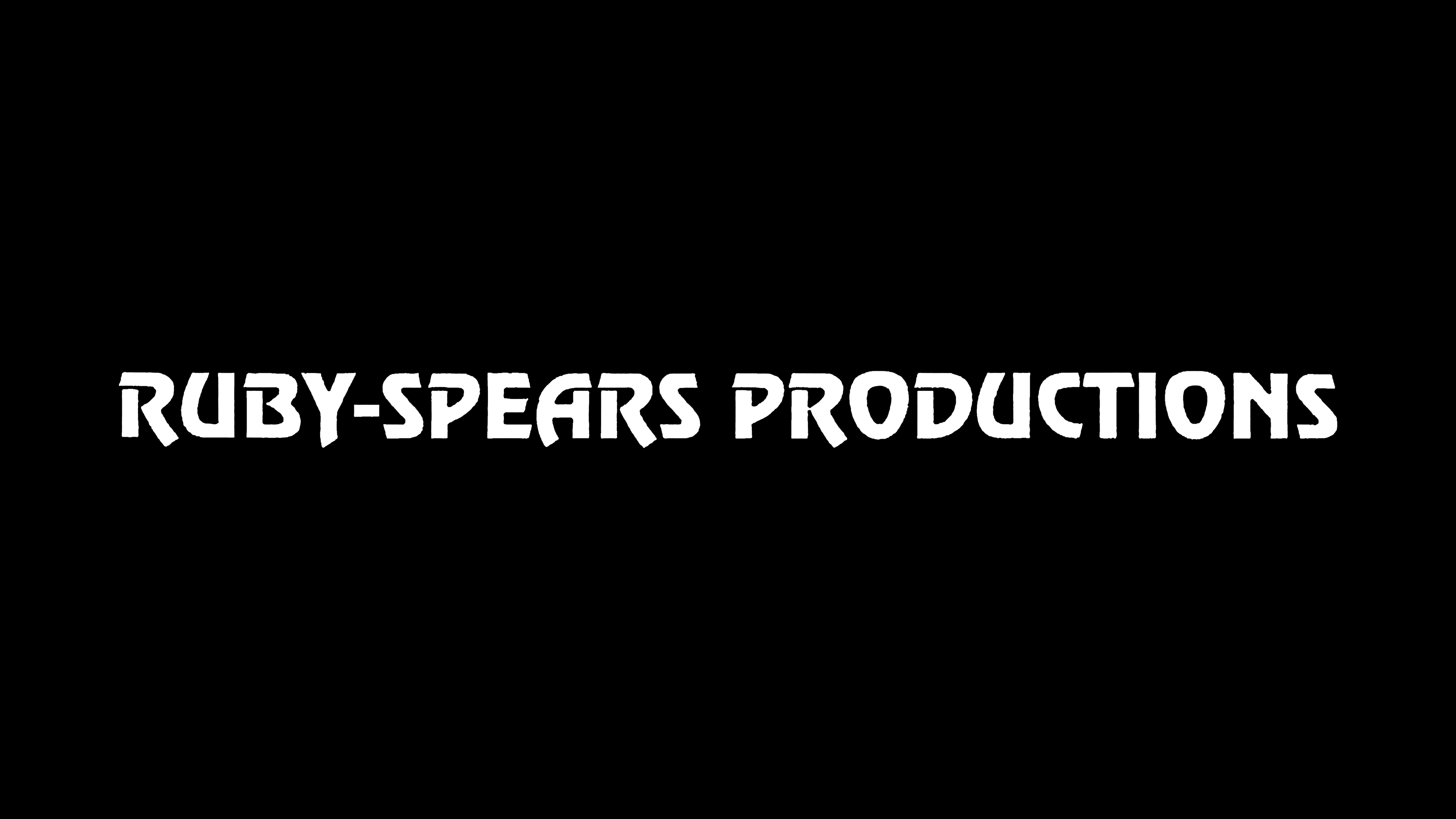
![]()
In 1991, Ruby-Spears separated from Taft Broadcasting and operated independently until it closed in 1996. The logo of this final period features the inscription “RUBY-SPEARS PRODUCTIONS” in a bold font. All letters are in uppercase, with some having barely noticeable horizontal openings on the left. This wordmark was only seen in two shows: Mega Man and Skysurfer Strike Force.
Font and Colors

In the emblem used until the animation studio’s closure, the inscription was set in the Revue font. Colin Brignall developed it for Letraset. Officially, it is considered sans-serif, but several capital letters have small protrusions in the upper left corner.
The primary version of the logo is black and white. However, on the screen, it could appear in other colors, including a shimmering golden gradient, a remnant from the “RS” monogram era.